zetafonts
Navigation Menu

type blog

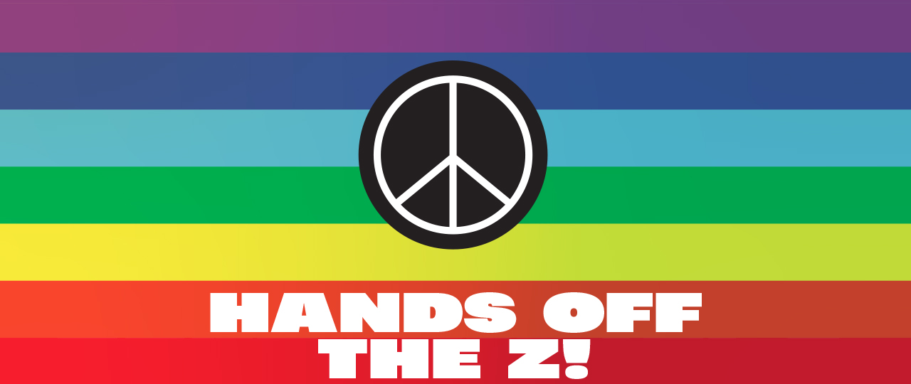
The right of letters to be free

Posted by in News on Mar/2022

It’s not a secret that the letter ‘Z’ has become a symbol for Russians who support the invasion of Ukraine. As a team deeply tied to the ideals of peace, kindness, and collaboration we can only repudiate any kind of war action. We believe that war is a primal, immoral language. Languages that we, letter lovers, prefer to be entrusted to peaceful and constructive communication. We claim the free meaning of a common letter. Let’s save the fate of the letter Z! Z is for zeal Z is for zappy…read more

Zetafonts guide to Instagram happiness

Posted by in Uncategorized on Apr/2021

Ever wondered why some Instagram accounts have the ‘swipe up to link’ option in their stories, while yours doesn’t? This is because this feature, along with some others, is enabled only after you have gained 10.000 followers on your Instagram account. Crossing this milestone helps your IG account to get even more reach and unlocks special features & benefits. If you want to add the “swipe up” link to your stories and direct traffic to your website from Instagram, getting more than 10K followers is essential. Naturally, everybody wants more social following, but…read more

Aldo Novarese and the exploration of Design Space

Posted by in New releases on Mar/2021

A true work of art – a poem, a statue, a melody – is a form that pre-exists in the possibilities of language, of marble, of musical notation. The artist discovers it like a theorem. Italo Calvino 1. Archive discoveries Our exploration of Aldo Novarese’s design space began in 2019, with a visit to Archivio Tipografico in Turin. Born as a love project from a bunch of graphic designers and typographers, Archivio Tipografico is a collaborative space for the preservation, study and practice of the typographic arts, set in a printing office that hosts…read more

Post-Pandemic: the 2021 Typographic Trends Lookbook

Posted by in Trend Reports on Mar/2021

In the early days of March 2020, we shared with the design community our research on the typographic trends of the year. But the year reserved something that we couldn’t foresee and that has been a catalyst for sudden, profound and unexpected changes: the Covid-19 crisis. In a world that is continuously and deeply changing in unpredictable ways, is it still possible to discuss and identify trends related to typography and graphic design? Despite the pandemic, brands didn’t stop communicating and had to face the new expectations of their consumers. Companies learnt to adapt their communication and…read more

Coppa stadio: la radiocronaca

Posted by in Promotion on Feb/2021

Coppa Stadio è il primo torneo italiano di poster design calcistico, ideato da Zetafonts in occasione del revival del carattere Stadio di Aldo Novarese. Abbiamo invitato venti tra i migliori studi grafici e illustratori digitali italiani a giocare con le lettere di Novarese per realizzare un poster dedicato ad una squadra di calcio della propria regione di appartenenza. Ne è emerso un torneo grafico tra squadre di ogni categoria, da capofila di serie A a piccoli club delle categorie più basse. Un torneo inclusivo e ludico, che fa scendere in campo squadre di serie A come il Verona (scelto dai veneti di Happycentro), il Napoli o la Roma (realizzato Allfontsarebastards) accanto a club meno noti come l’Atletico Van Goof (scelto per l’Emilia da Rupert Graphic).

Stadio Cup

Posted by in New releases, Promotion on Feb/2021

On the occasion of the birth centenary of Italian type master Aldo Novarese, Zetafonts foundry has created a revival of Stadio, a typeface created by Novarese in the seventies and published only as a rub-on transfer by R41, Letraset’s Italian competitor. To honour its football-inspired name and its vintage look, Zetafonts foundry has organized the first Italian football poster tournament: Coppa Stadio. Twenty of the best Italian graphic studios and digital illustrators were invited to play with Novarese’s letters to create a poster dedicated to a football team from their home region.

100 Years of Novarese: Stadio Now

Posted by in New releases on Dec/2020

2020 is not only the year of Covid. For typography lovers it also marks the 100th birth anniversary of Aldo Novarese, Italian master of type design. To celebrate it, Zetafonts is going to release the digital revival of Stadio, a forgotten reverse contrast masterpiece designed by Novarese in 1974 and published only as rub-on transfer. Our revival, Stadio Now, is a full family with nineteen variants that explore all the possibilities of the original design space. It is available for pre-release on Zetafonts website, with exclusive perks for supporters.

A brutal victory

Posted by in Awards on Oct/2020

While researching the typography trends for our 2020 Type Trends Look Book we became aware of the many influences of late 19th century sans serif typefaces on our contemporary taste for typeface design. We called this trend “brutal grotesque”, referring to the many quirks and mistakes easily found in vintage pre-digital lead type and printed specimens that had become distinguishing features in contemporary fonts. Slightly off proportions in letters, unexpected calligraphic solutions, uneven and slanted cuts, and the occasional appearance of type design most loved “wrong” feature: reverse contrast. Hagrid and Boring Sans – both presented in the 2020 Trend Book – were our first published explorations in this style. But both were designed while working on a more complex project that ended up being published as the last of our “brutal style” typefaces, that has been chosen as one of the winners of Communication Arts Magazine 11th Annual Typography Competition …

Rediscovering Cairoli

Posted by in New releases on May/2020

This new technique is that of the deliberate anachronism and the erroneous attribution. This technique, whose applications are infinite, prompts us to go through the Odyssey as if it were posterior to the Aeneid and the book Le jardin du Centaure of Madame Henri Bachelier as if it were by Madame Henri Bachelier. This technique fills the most placid works with adventure. (Jorge Luis Borges) Specimen pages for Cairoli Tonda Neretta 1. The case of the old specimen It was at the October 2019 TypeThursday Florence meeting that we first discovered…read more

Type Trends 2020

Posted by in Promotion, Trend Reports on May/2020

At Zetafonts, we know that researching creative trends is a fundamental part of the design process for visual artists. Every year we study the global trends inadvertising, lettering, editorial and packaging design, trying to understand and define the most common choices in typography, type design and font selection. It is a process that allows us to refine and adjust our taste to a global sensibility, making it possible to create typefaces that look contemporary and fresh on the page and on the screen. This year we have distilled this research in a 140-page book: the Zetafonts Type Trends Look Book…read more