Maleficent types and where to find them
We are thrilled to introduce a new addition to our font family, and this time, it comes with the signature style of Valerio Monopoli – an Italian graphic designer hailing from Rome and currently making waves in Barcelona. Valerio has already left an indelible mark on the typography scene, notably with the development of his font families for Pangram Pangram (Gatwick, Migra, and Räder), Blaze Type (Sapfir, Sagittaire), Colllettivo (Absans), and Cast (Gil Modern) foundries, each time showcasing his incredible skill and originality as a type designer.
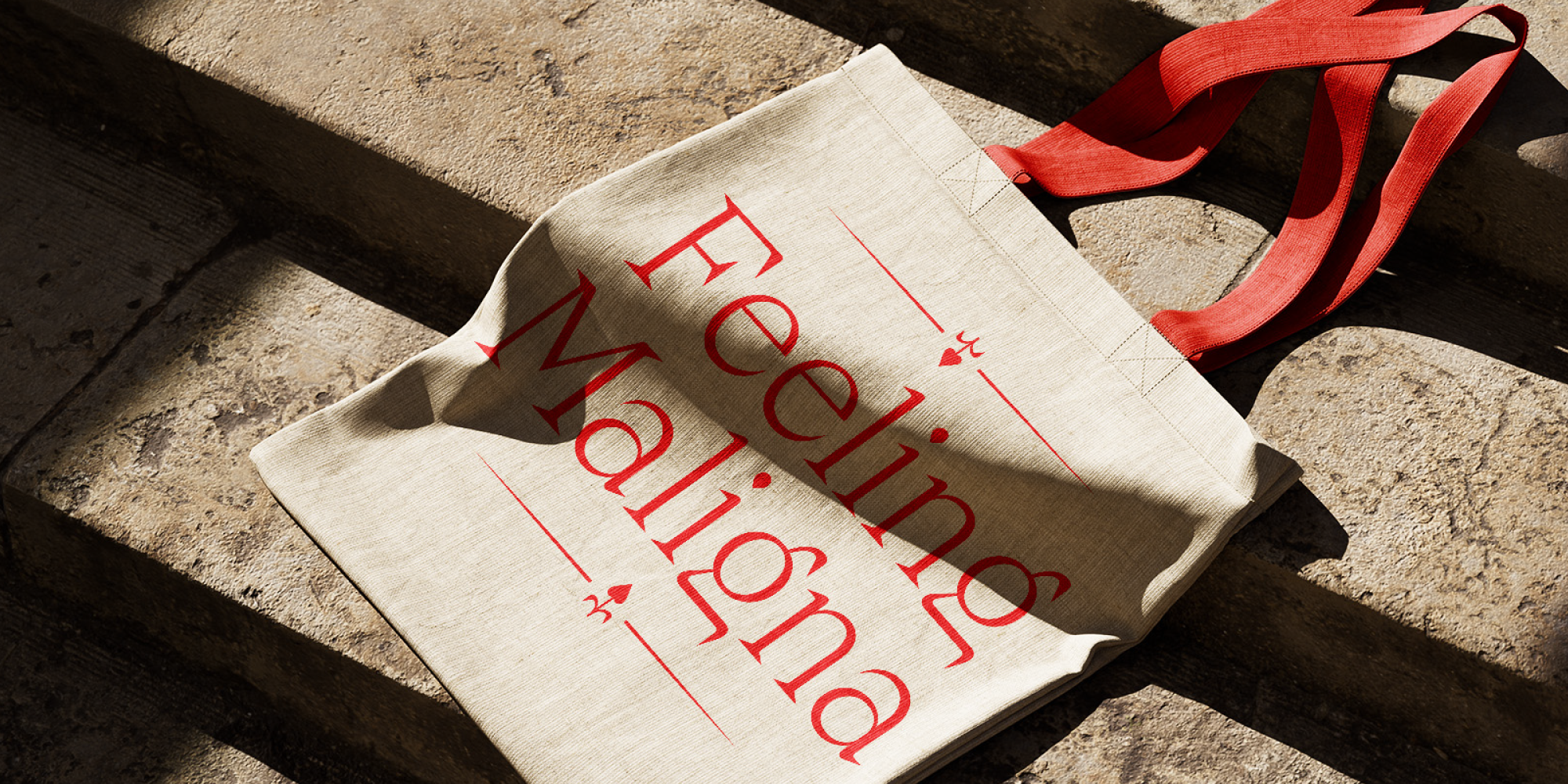
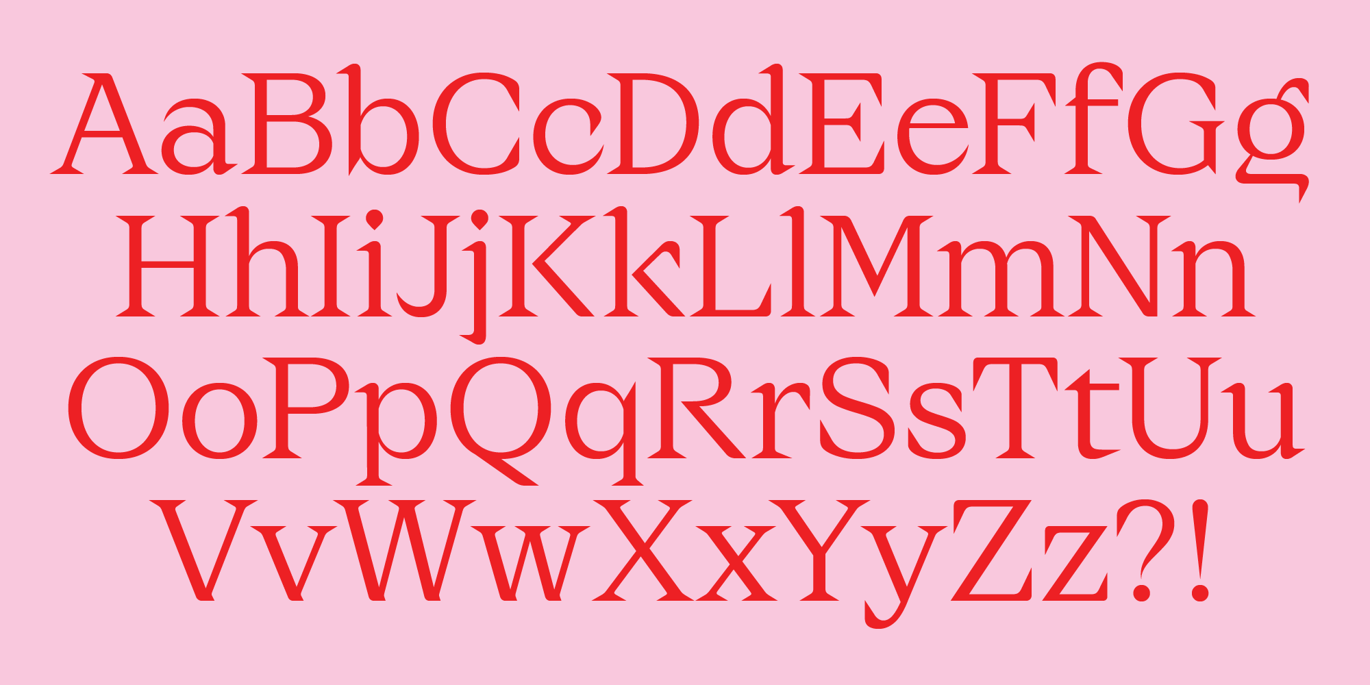
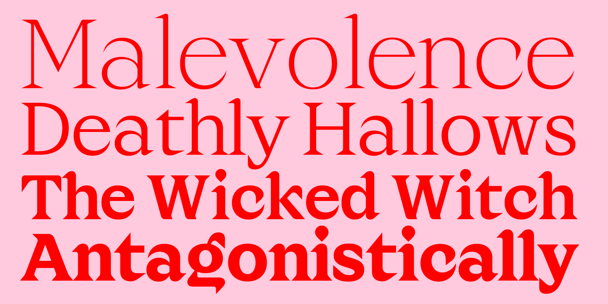
Now, Valerio brings his creativity to Zetafonts with his latest creation: Maligna, a contemporary serif blending great display personality with flawless text readability. Coming in an extensive range of weight from a super sexy thin to an imposing bold, and featuring design details of infinite digital sharpness, Maligna brings Valerio’s unique aesthetic to our Beats collection. As a Beats Preview, Maligna is available for you to download and try for free in your projects. Feel free to engage with Maligna at this early stage, and to contribute to its refinement with your valued feedback. Let’s listen to Valerio speaking about the font, as we follow the journey of Maligna to more updates and its final release!
How did the idea for Maligna come about? What was the starting point of the creative process?
As with many other fonts I have designed, the first sketches of Maligna were the result of laziness. While drawing the first letters, I tried to approximate the structure of a serif display as much as possible. Gradually I realised that what I was doing was actually applying serif details (‘blooms’) to a very rigid and simplified structure (a ‘trunk’), and from there I drew the analogy with the plant world, using the Magnolia tree as the signifier of this formal relationship. This is why the typeface ended up being called “Magnolia” at first.
The name, however, did change… How did the typeface get its final spirit and name?
The serif details I mentioned have characteristic shapes, which only occasionally look like floral appendices. Mostly, they are sharp angles that resemble thorns or spikes. Therefore, although it was born from a docile seed, “Magnolia” has acquired a rather aggressive spirit. It is a type of transformation that I did not expect, but it is not uncommon for a character to change as it grows. Integrating the original idea with this new connotation, Cosimo Lorenzo Pancini and I chose a new name that more directly represented the font: Maligna. The distinctive letters of the old name are still present, but the new name more clearly defines its personality and the attitude with which we expect it to be used.
Are there any fonts that you kept in mind as a reference or for inspiration?
No one in particular: Maligna shapes are simple enough to be drawn through observation and a basic knowledge of contrast in serif typography. Once finished, I noticed similarities with other serif fonts of the same style, but I suppose it’s inevitable when improvising on such a simple and popular motif.
Are there “signature” aspects of the design that you are particularly pleased with?
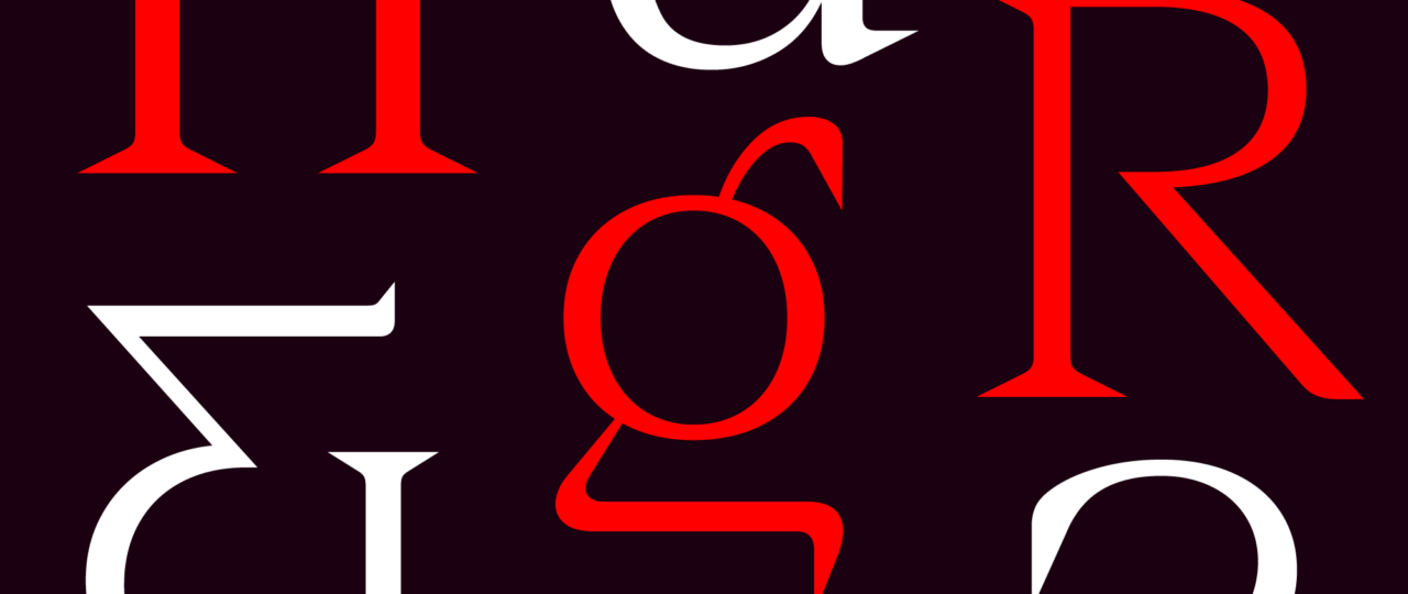
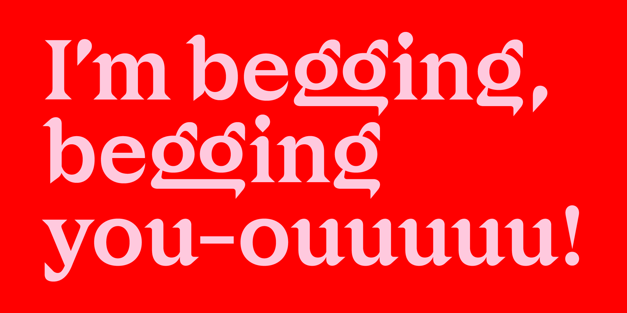
The bold “R,” the first character I designed, already contained many hints about Maligna’s personality: mischievous, simple, and modern, softened by the rounded interlocks of the serifs. It’s my favorite letter, but I believe the one that stands out the most is the “g,” whose truncated horizontal stroke hangs slightly below the baseline, making it immediately recognizable—a further example of the “radical” minimalism mentioned earlier.
Has exploring the design space with the addition of styles allowed you to add new features to the font?
I was quite concerned about translating the Bold design into a Hairline: sharp details could be lost if elongated excessively. For this reason, the font starts with an Extralight weight, where differences in contrast are still clear, but some shapes like “R” and “k” break down, leaving room for internal sharp angles reminiscent of thorns. Creating a typeface family is exponentially more complex than creating a single style, and Maligna is no exception, but most common problems (non-isometric growth, non-linear interpolations, inconsistent spacing) were preemptively addressed due to the simplicity of the design.
How do you see the font being used? What type of graphic communication do you see it suitable for?
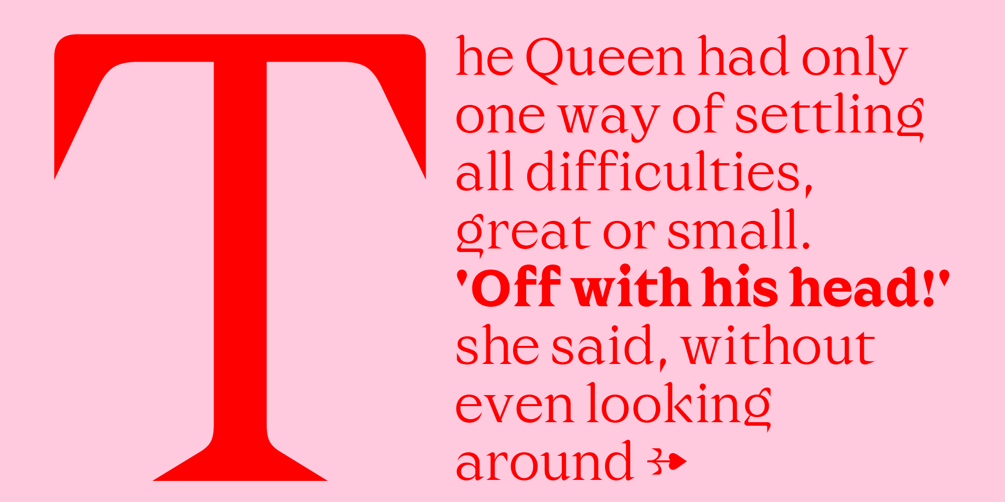
Although it is somewhat cliché to say, the use of Maligna depends on the intentions of the user. The low contrast and extensive character set make it suitable for composing relatively small text, but its dimensionless vertices remain sharp at any size, making it an extremely versatile tool.
In which creative industry do you see the spirit of this font fitting? What are the best uses for it?
While not inherently corporate, I anticipate it will be used, especially in digital marketing. However, I wouldn’t mind seeing it used as a text font for contemporary books.
Do you have ideas for future developments for the font? Things you haven’t explored?
There is already an italic version in the works that should serve as a dynamic counterpart to the upright, which, by its nature, is quite rigid. This way, I hope to provide users with enough tools to compose all elements of a complex text, declaring Maligna fully mature.
Maligna font family
Click here to find out more