Aldo Novarese and the exploration of Design Space
A true work of art – a poem, a statue, a melody – is a form that pre-exists in the possibilities of language, of marble, of musical notation.
The artist discovers it like a theorem.Italo Calvino
1. Archive discoveries
Our exploration of Aldo Novarese’s design space began in 2019, with a visit to Archivio Tipografico in Turin. Born as a love project from a bunch of graphic designers and typographers, Archivio Tipografico is a collaborative space for the preservation, study and practice of the typographic arts, set in a printing office that hosts a design studio and a huge collection of specimens and lead fonts dating back to the era of letterpress printing.
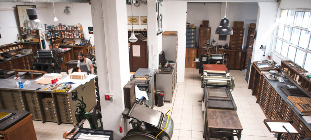
Inside Archivio Tipografico in Turin (photo courtesy of Archivio Tipografico)
Naturally the most important typographic heritage in the Archivio is the one of Nebiolo, the Turin foundry that dominated the type design scene in Italy in the last century, at the same time producing some fanciful display typefaces that are still influential today. Fonts like Eurostile, Estro or Stop, were all designed by Aldo Novarese, Italy’s most prolific type designer, who directed Nebiolo Art Department for almost twenty years.
The love and reverence for Nebiolo and Novarese’s work could be felt in the enthusiasm of Emanuele Mensa, founder of the Archivio and our guide in this wonderland of lead printing. After a generous offer of the “aperitivo del tipografo” (the typographer drink, in Turin tradition: 50% mineral water, 50% Carpano Punt e Mes Vermouth) he opened to us the treasure vault of his print specimens and rare book collections. He showed us a rare copy of the 1964 masterpiece Alfa-Beta – a book that Archivio Tipografico has made available to the public thanks to a succesfull kickstarter re-issue project.
We also had the chance to see some copies of Il Segno Alfabetico, the out-of print collection of all Novarese’s ouevre, editied by the typographer himself in 1990, just few years before his death. A copy of Il Segno Alfabetico was on sale, so we got hold of the most complete archive of Novarese’s typographic work, that provided specimens of his most famous typefaces while also featuring some more obscure ones, featuring a bunch of studies and unpublished fonts too.
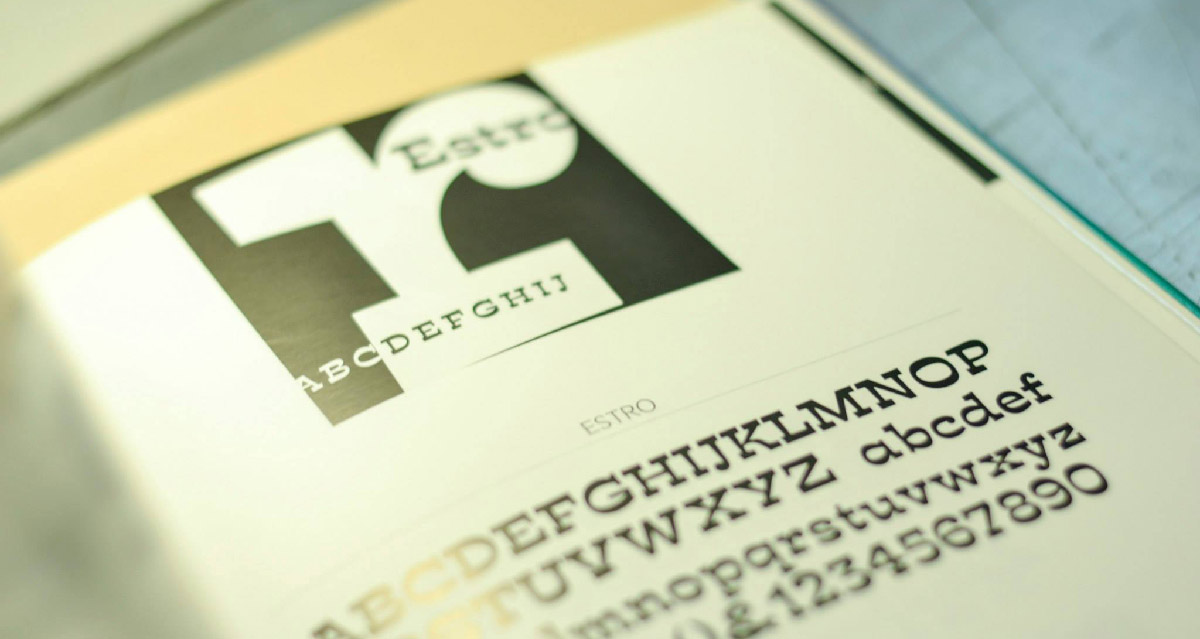
A page from Aldo Novarese’s “Il Segno Alfabetico” (photo courtesy of Archivio Tipografico)
Many of the unpublished typefaces shown in Il Segno Alfabetico are interesting to study as they help in understanding better Novarese in his late years of activity. Having left his place at Nebiolo, after the nightmarish experience of the “committee design” of Forma, he used his skills and knowledge to freely develop typefaces that mixed with ease the most avant-garde design tendencies of his age along with a deep respect of the typographic tradition. Novarese knew how to approach modernity without renouncing to the past, as visible in his “fantasy” typefaces, characterized by experiments such as reverse contrast, unusual cuts and mono-case alphabets and at the same time by classical shapes and historical conventions.
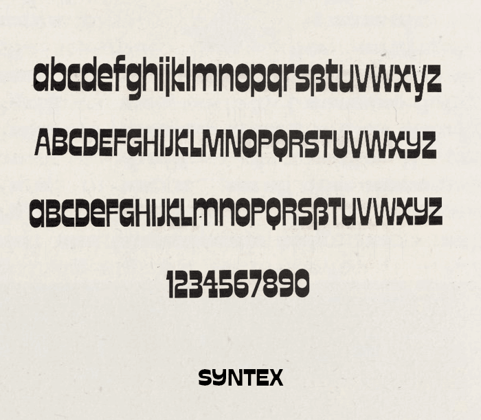
One example is New Uncial, designed for Tygra, where a modernist sans serif proportion is imposed over a revised uncial skeleton; another example is Sintex, where the so called “italic” reverse contrast is married to geometry creating an interesting mix between old west and space age modernism. The most surprising discovery for us was however Stadio, described as a “decorative display typeface, in the so-called nineteenth century ‘Italian’ style, but sans serif. Horizontal proportions have been visibly enlarged, offering a very intriguing graphic effect”.
Stadio specimen from Aldo Novarese’s “Il Segno Alfabetico”
We were immediately hooked by Stadio’s unique appearance and personality. Its name literally means “football stadium” and one can easily see the connection between its sturdy shapes and sports. While the reverse contrast and the extrabold weight gives letters a powerful energy, the unusual curved shapes of Y and K, the playful shapes of C,G and S, and the slight tapering of all stems give Stadio a unique dynamic feeling.

Stadio was fascinating for us also because, like many other typefaces presented by Novarese in the book, it seemed not to have ever been digitalised. There was no trace online of a Stadio typeface: our only chance was to search for information on the listed publisher, Reber. A Google search quickly gave us the answer: there was an online website for Reber, and it was dedicated to a brand that we, being Italian graphic designers, were very much familiar with: the rub-on transfer brand R41. We contacted Caterina Piatti, granddaughter of the company founder, and discovered the little-known links between Aldo Novarese and the rub-on lettering world.
2. Dry transfer tech: the future of the past
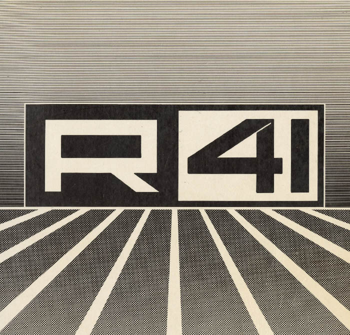
R41 logo in its full halftone glory
Reber was created in 1960 by Renato Bernardi, a brilliant entrepreneur from Verona, who developed his own version of the rub-transfer technology invented by Letraset. Marketed with the R41 brand, these rub-on-transfers were hugely successful with designers, architects and creatives who appreciated the small size (9cmx25cm), the affordable price and the variety of alphabets and designs available. Before becoming obsolete with the advent of digital desktop publishing, more than 25,000,000 sheets of R41 transfers sheets were sold worldwide.
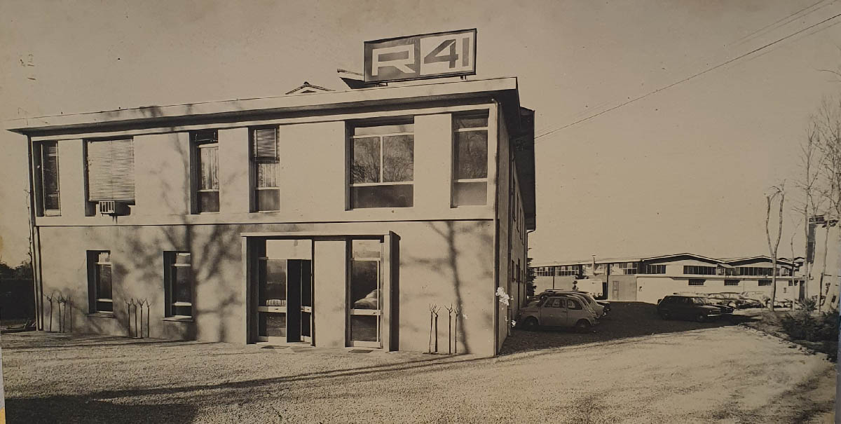
R41 offices in the seventies
A firm believer in the quality of Italian craftmanship, Bernardisoon got in contact with Nebiolo and Novarese, who since 1952 had been the director of its Artistic Studio. The friendship and esteem between the two companies translated into a privileged relationship that filled R41 catalogs with Nebiolo fonts, ranging from Novarese’s modern classics like Eurostile, Estro and Stop to the company latest attempts at creating an Italian universal grotesque – with Recta and Forma. Novarese’s experience in typeface design and marketing was very useful to R41, and they asked him to design brands, catalogs and advertising posters for them. Novarese proposed to include in the R41 catalogs, for example, a “stylistic chart for typeface pairing” that he had designed following the principles of his own type classification, based on the shapes of serifs.
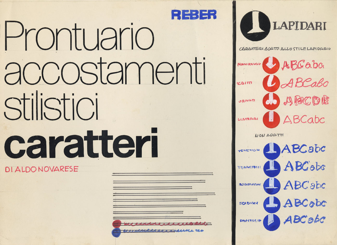
Handmade mockup by Novarese for the R41 “stylistic chart for typeface pairing “.
When Novarese retired from Nebiolo, he kept his close connection with Reber, both as a graphic and as a type designer. He proposed to Reber some new designs like Metropol, Orbital, Divulga and the unpublished Stadio. We found it mentioned in a letter from Novarese to Bernardi, written in 1974, where the designer enquires about the future of the typeface he had previously offered to R41. “I would like to know if you’re going to realize Stadio… if we keep waiting it will lose its novelty factor” – a worried Novarese writes by hand, under a letterhead featuring both Forma and Stop.
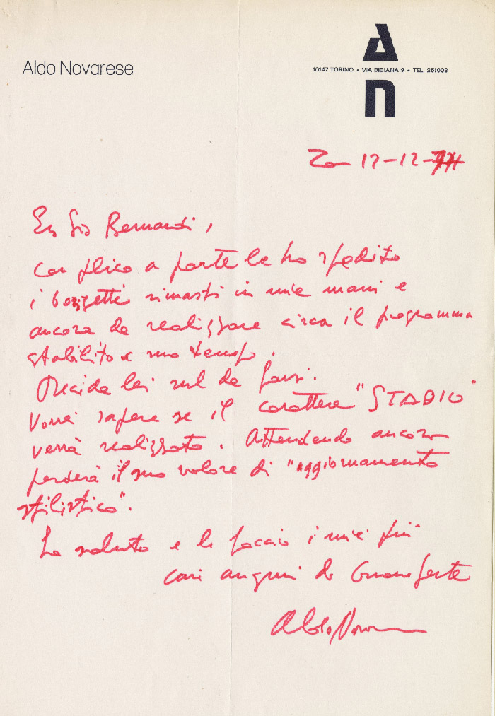
Letter from Aldo Novarese to Renato Bernardi
In the end Stadio was published in 1975 by Reber in six different formats: with a range from 4.3 mm to 13.5 mm height in the smaller sheet format, and a giant 30 mm size in the bigger 25×35 format. The different sizes are all derived by the same base drawings through photographic reduction, and show no differences apart from the swelling in the smaller formats caused by the physical characteristics of the adhesive transfer film.
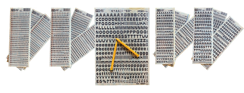
The full range of dry transfer lettering sheets from R41 featuring Stadio typeface
In 2020, still belonging to the same family after three generations, R41 is still continuing its historical heritage, offering online the original rub on transfer sheets as well as offering a collection of revivals engineered by Onice Design. We were pleased to discover that Stadio had not been considered yet. Then, we proposed to R41 a collaboration, with the idea of releasing a revival of Stadio for the birth centenary of Aldo Novarese. Our aim was not only to digitize the original designs, but also to expand the typeface in glyph range, weights and styles, to express all the possible potential of Novarese’s design ideas.
3. Exploring design space with Stadio
Since their introduction by Adobe as “Multiple Masters” in the nineties, the font morphing technologies that are behind today’s variable fonts have been expanding the concept of what a typographic design is. With multiple masters, a typeface is defined not much by a single design, but rather by the range of the possible variations that can be obtained by calculating the intermediate steps between two different “master” designs. For example, if I have a Regular Weight and a Bold Weight, I can easily obtain a Medium and a Semibold weight as “interpolations” between them. Weights outside the range can likewise be calculated by a process of “extrapolation” which – though prone to errors and distortions – can lead to the definition of a full range from Thin to Heavy.
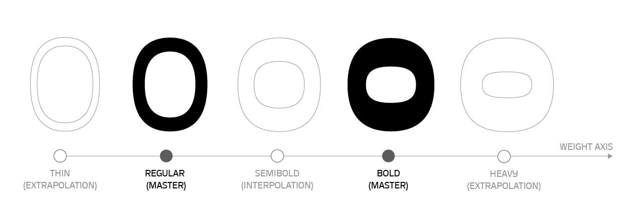
Developing Stadio along the weight axis
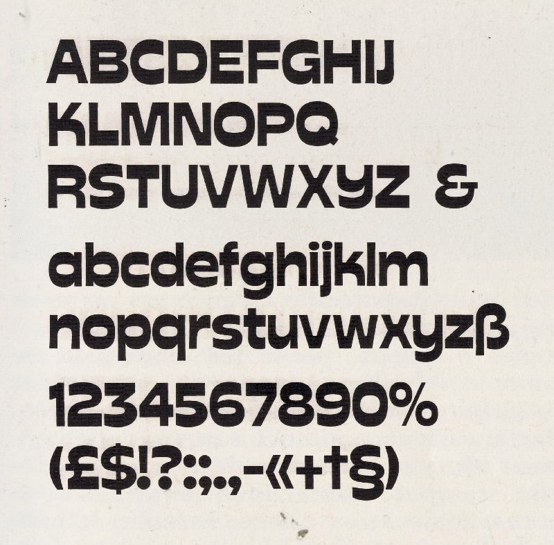
Stadio is a very bold display typeface, so our first step was to try and extract its DNA along the weight axis, by expanding Novarese’s concepts towards different weights. We decided to lower the contrast in the lighter weights, setting them to almost monolinear proportions. The result was quite consistent with Novarese’s original intent, but also allowed a wider usage rang, as the lighter weights were far more readable in smaller sizes and the darkest designs acquired a much more expressive range.
The full range of Stadio Widths animated
It was at this point that we decided to extend the design space of Stadio further. Today we are used to seeing variable fonts that have multiple variation axes, and the logical thought would have been to try and extend Stadio on different widths, adding a Width axis. Pushing Stadio towards other designs than Novarese’s would have been interesting, making the extracondensed width meeting the proportions of Sintex:
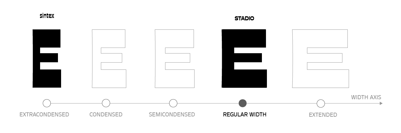
Moving on the width axis, Stadio meets Novarese’s Sintex
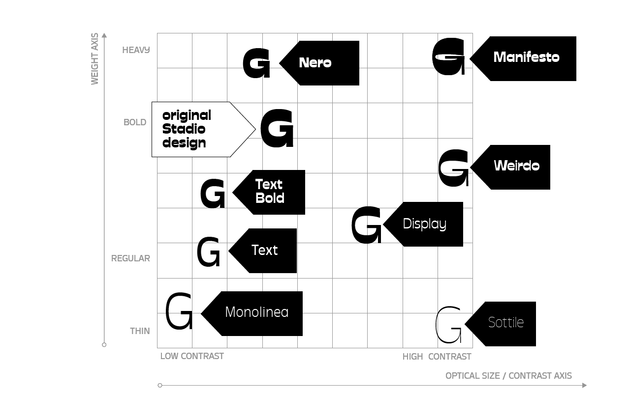
Seeing R41 transfers live opened our eyes to another possibility. Stadio worked wonderfully in the biggest sizes, with his bulky, display appearance, but became too dark and flat in smaller sizes, while at the same time making it less interesting and more difficult to read. In the past, this common problem was solved by changing the design as the point size diminished (as we discussed in our article on Cairoli). In contemporary type design, this is obtained by adding an “optical size axis” that extends the design of a letter, making its shape change according to the preferred usage size. A typeface is so defined by creating two masters that differ in proportions, contrast and metrics to accomodate different typesetting sizes. The “small size” master is usually wider, less contrasted, more loosely spaced than the “big sized” design, that requires a higher contrast, tighter spacing and sharper design details.
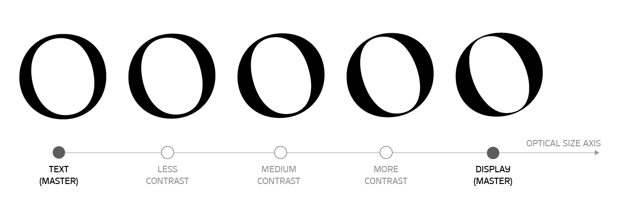
Since Stadio is designed with a reverse contrast proportion, increasing the contrast would make the letter shapes bulkier and more extreme looking, while decreasing it would bring the typeface to a more regular sans serif colour, not dissimilar from that of typefaces such as Eurostile.
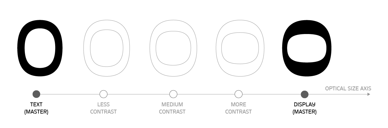 Adding together the weight and the optical size axis, a “design space” is defined: each point in the grid defines a design that changes from the less contrasted, more open and readable shapes in the small size/low contrast area to the more extreme, contrasted and flamboyant designs in the high contrast area, much better suited to display use. Novarese had chosen a set of proportions for his design that – though belonging to the display area – managed to be close enough to the text area to be still readable in text sizes, though not optimally so.
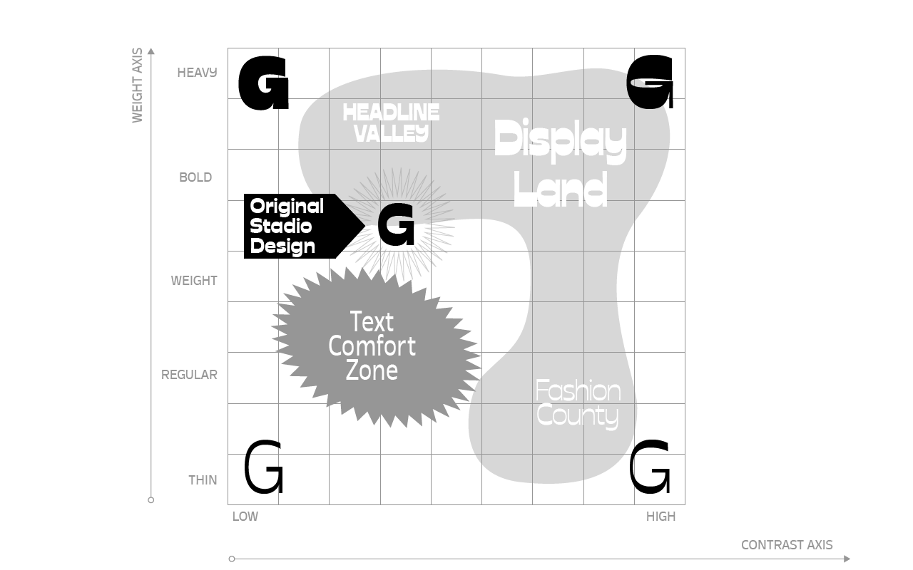
To extend the typeface usage, we decided to expand on the whole design space, finding combinations of weight and contrast that would be right for diverse purposes. For example, we chose to develop for text usage a low-contrast, low-weight version that we also designed with a more relaxed spacing, to make it more easily readable.
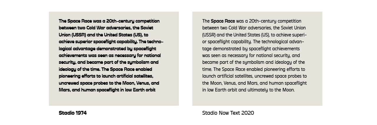
This text version, that also sports a more regular design on the legs of R, K and k, was then developed in a Bold version, essential for body text typesetting.
On the other side, we developed a range of display weights, including a ultrathin Sottile, two poster versions (Banner and Manifesto), a medium contrast Display alternate to text and a high contrast Weirdo version.
The final project fills the space around the original typeface with a constellation of variants. Further variants can be obtained thanks to the option of a variable version, covering the whole design space.
Animation showing the full design space of Stadio Now
4. Going further: italics, alternates and foreign scripts
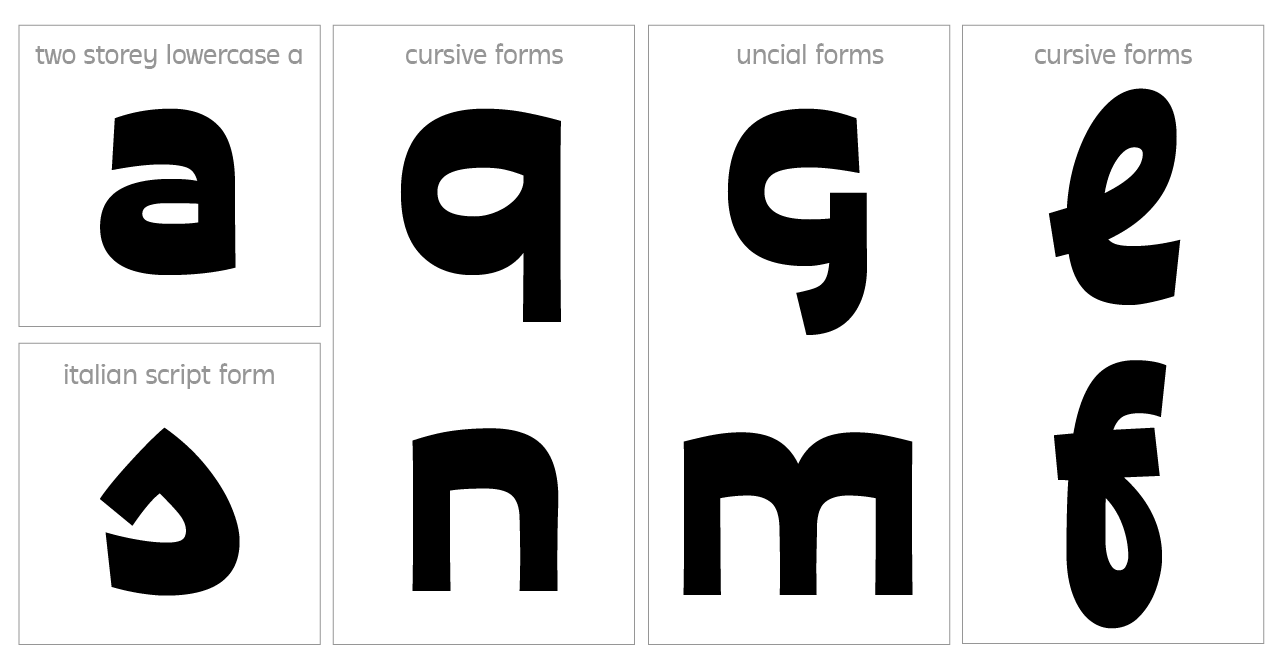
Having designed a text version for Stadio, we felt obliged to think about an italic form. Though many of Nebiolo italics are simply slanted forms, we thought that we could be more inventive, and decided to opt for a italicized version with some cursive elements, adding bent legs to many lowercase letters.
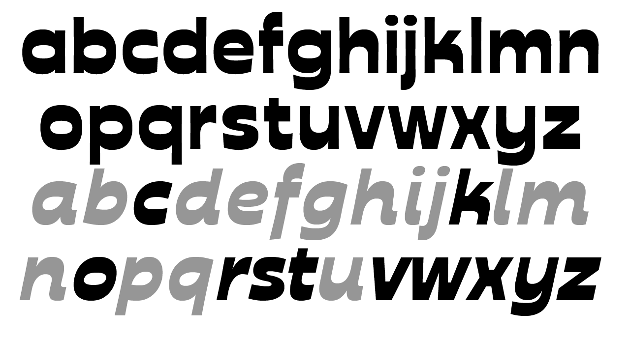
Stadio Now italic showing (in grey) the letters that are not slanted versions of the roman counterparts.
Developing the italics was also the chance to work on some alternate letterforms and experiments that we included in the typeface as stylistic sets. The upright cursive led us to try some script forms, so we couldn’t avoid trying some of the uncial shapes discovered in New Uncial and in “Il Segno Alfabetico“.
Finally, the last challenge for us was to extend the glyph set to cover additional languages. Apart from adding over two hundred accented characters, we decided to develop Stadio including non-latin scripts. The first script to be developed was cyrillic, designed with the help of the talented typedesigner Vika Usmamova. We already knew that she loved reverse contrast formsfrom her fantastic work on Geekette for Typetype! So, we happily let her guide us in the jungle of cyrillic cursive, and breathe new life into Stadio. It was the first step into a further voyage towards new extensions of the original design space: the new uncharted territory of non-latin scripts.
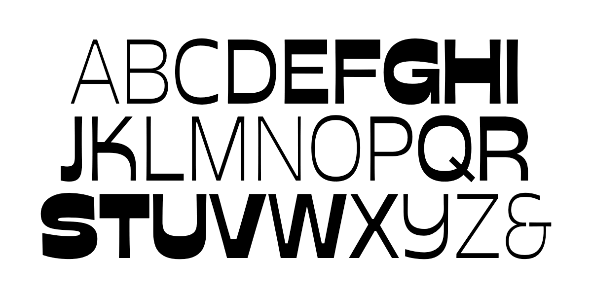
Stadio now font family
Click here to find out more