A brutal victory
How typography trends research made our typeface Stinger a winner of the 2021 Typography Competition by Communication Arts Magazine.
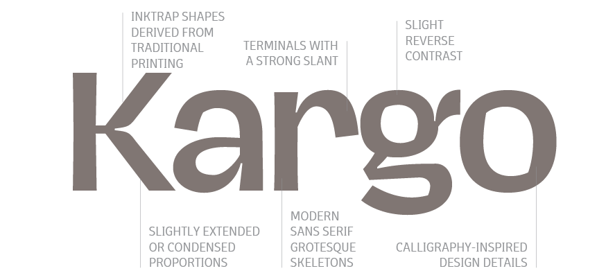
While researching the typography trends for our 2020 Type Trends Look Book we became aware of the many influences of late 19th century sans serif typefaces on our contemporary taste for typeface design. We called this trend “brutal grotesque”, referring to the many quirks and mistakes easily found in vintage pre-digital lead type and printed specimens that had become distinguishing features in contemporary fonts. Slightly off proportions in letters, unexpected calligraphic solutions, uneven and slanted cuts, and the occasional appearance of type design most loved “wrong” feature: reverse contrast.
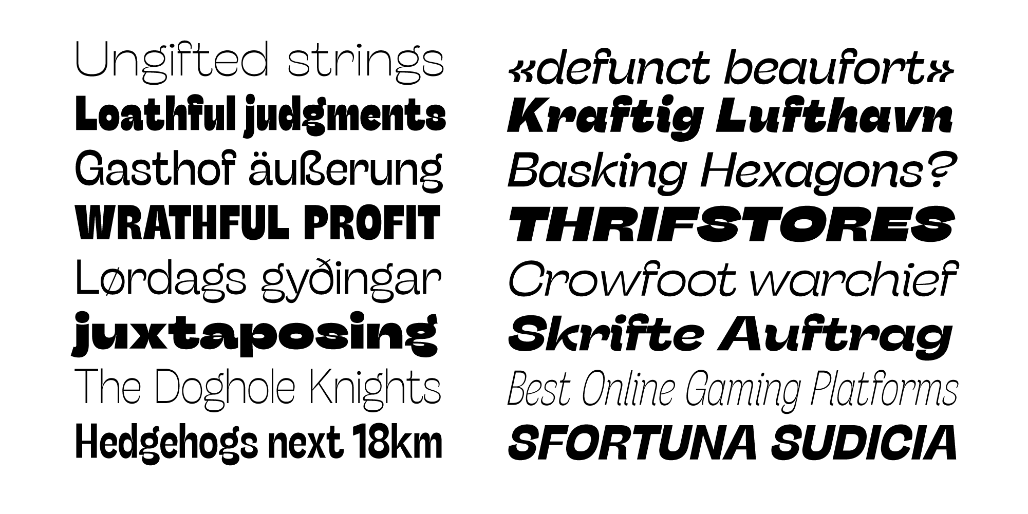
Hagrid and Boring Sans – both presented in the 2020 Trend Book – were our first published explorations in this style. But both were designed while working on a more complex project that ended up being published as the last of our “brutal style” typefaces: Stinger, a super-family with four widths, each in five different weights, and coverage of latin, cyrillic and arabic script.
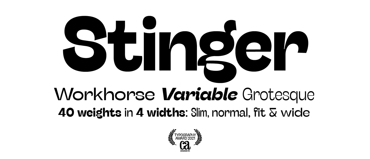
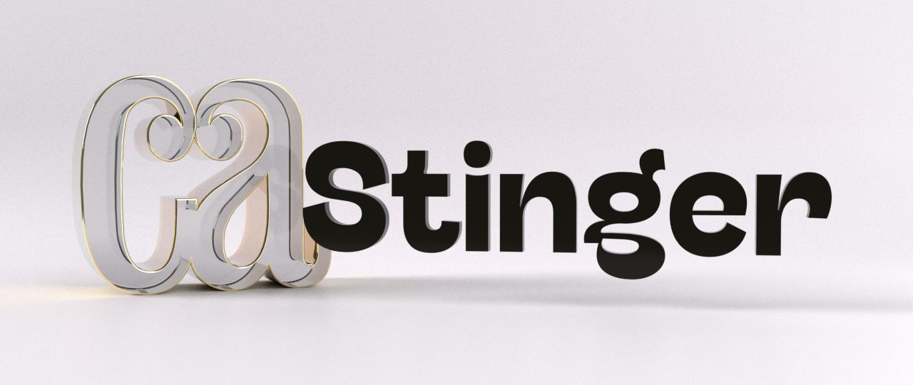
It’s with great pride that we can now announce that Stinger has been chosen as one of the winners of Communication Arts Magazine 11th Annual Typography Competition. An international jury composed by Valentina Casali, Lucho Correa, Katy Fischer, Gloria Kondrup, Wael Morcos, Morcos Key and Carmichael Lynch has voted Stinger as one of the best eleven typefaces designs of the year, selected among the 1189 entries submitted to the competition. The winning projects will be reproduced in the January/February 2021 issue of Communication Arts, a professional journal for designers, art directors and design firms that has been promoting the highest professional standards for the field for over sixty years.
This award is for us the confirmation that each design project must start with the keen observation of the contemporary visual panorama. In designing Stinger, the Zetafonts design team lead by Cosimo Lorenzo Pancini with the help of Andrea Tartarelli, Francesco Canovaro and Maria Chiara Fantini has tried to make the trendy usable, by marrying the “brutal grotesque” stylistic details with the “workhorse approach” of modernist sans serif super-families like Univers.
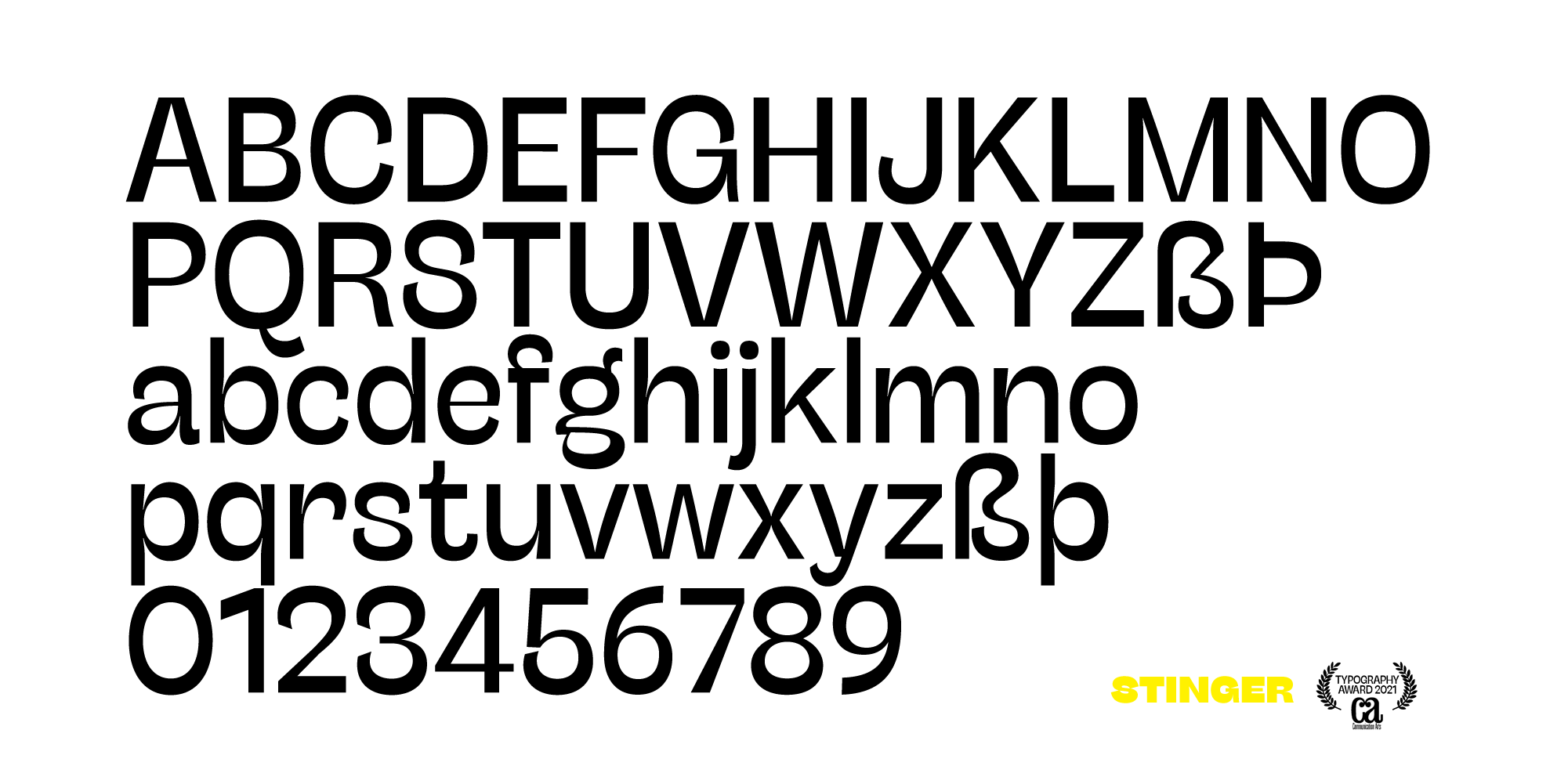
We tried to follow the lesson of the modern reverse-contrast classics designed by Excoffon or Novarese, that mix bold choices and strong personality with the aim to give the designer a powerful tool for type setting.
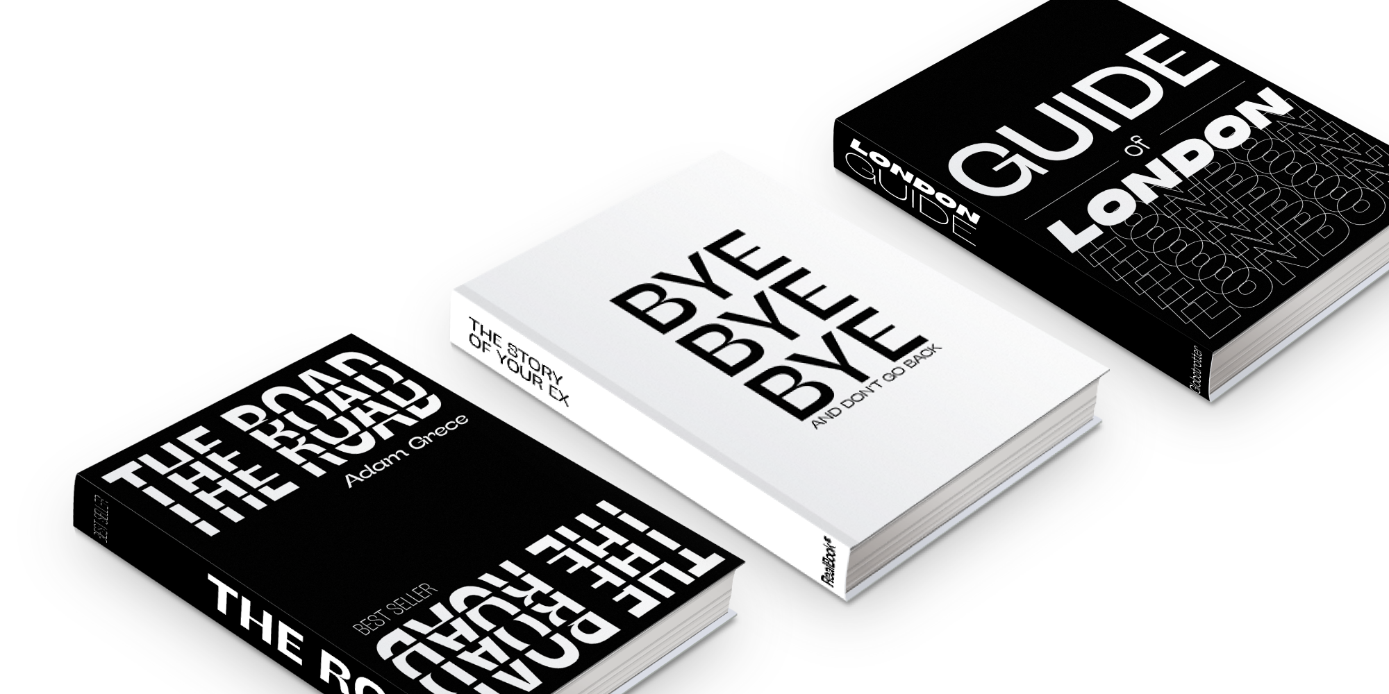
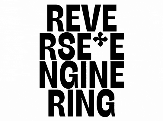
In the crowded panorama of contemporary sans serif typefaces, all aiming at stark geometric perfection, Stinger stands out with its calligraphy-inspired details, sculptural approach and striking shapes. Mixing modernist abstraction with bold gestural noise, Stinger is our best attempt at the unapologetic mood of brutal design.
And Communication Arts Jury seems to agree with us: brutalist graphic design is here to stay.
Stinger font family
Click here to find out more