An Interview with Typography.
Io sono la Tipografia. Manifesto was conceived and written in 2022 by Enrico Solfrini as a thesis in Communication and Design for Publishing at the Isia of Urbino (Italy); it has been produced in this revised version by Zetafonts following a special mention awarded in the Neologia competition (Graphic Days Torino). Not only a specimen for our typeface Evans, Io sono la Tipografia. Manifesto is an unconventional operation involving verb, typographic form, and graphics. In this interview, Zetafonts editor Dario Manzo speaks with author Enrico Solfrini about the thought process behind “Io sono la tipografia”:
How did the idea of “Io sono la Tipografia. Manifesto.” come about?
Io sono la Tipografia. Manifesto. originated during the final months of writing my thesis “On Typographic Shape”, completed to obtain a Second Level Diploma in Communication and Design for Publishing at the ISIA in Urbino. This thesis stemmed from my strong interest in typographic signs, not only as a code and means of communicating a message but also as a true sign, a form capable of communicating something through its appearance. During my two years at ISIA, I began to explore the concept of text legibility in contrast (but not necessarily) with the visual expressiveness of the text itself. I have always thought that legibility is somewhat overrated, in the sense that I do not believe it should always be the primary characteristic sought when laying out typographic content. During the extensive research for the thesis, I came across “The Typographic Medium” (The MIT Press, 2021), a book in which the author Kate Brideau investigates – historically, but also in the contemporary context – the concept of typographic shape. Reading this book – along with avant-garde texts such as Tschichold‘s “Die Neue Typographie” or Marinetti‘s “Rivoluzione Tipografica”, foundational articles in the typographic field such as “Ambition/Fear” (“Emigre,” n.11, 1989) by Licko/Vanderlans, and more recent essays like Kenneth Goldsmith‘s “CTRL+C CTRL+V (scrittura non creativa)” (NERO, 2019) – spurred me to update a series of concepts that I considered fundamental. Thus, Io sono la Tipografia. Manifesto. came to life, a manifesto in which typography itself, in the first person, asserts its role as a form independent of the linguistic code to which it is normally bound. I then used the manifesto itself, to further validate the concept, as text for a series of typographic experiments on typographic shape, from individual glyphs to paragraphs, from legibility to complete illegibility.

Leafing through “Io sono la Tipografia. Manifesto.”
The term “Manifesto” is dear to artistic avant-gardes, but in graphic design, it has also been used more recently from a postmodern and activist perspective, as in the case of the “First Things First Manifesto.” What sense does a manifesto (especially a printed one) make in today’s digital age?
A manifesto represents a collection of concepts deemed crucial by its author. It’s a powerful means of expression that can convey ideas, values, and visions clearly and decisively. In the past, it has been a disruptive element, a bearer of innovations, a means of communication, a statement of intentions. Does it still hold the same significance today? What I’m sure of is that in the contemporary context, characterized by a frantic pace and a constant search for novelty, it’s sometimes appropriate to freeze concepts in time. The materiality and physicality of a printed product also lend these concepts a stability and tangible presence that can make them even more memorable. I say this as someone interested in trends, even in the world of graphic design, and inclined to explore novelty rather than obsessively seeking timelessness in design. However, I firmly believe in the importance of communicating one’s ideas and seeking constructive dialogue with others. Writing a manifesto can be a way to do that.
Your product fits into a tradition of self-referential and metatextual texts, where form and content are inseparably linked. How has the text influenced the layout, and vice versa?
The answer partly lies in the question: form and content are inseparably linked. The two continuously influence each other: form is the very expression of content at the precise moment when content speaks about shape. To put it more concretely, I would say that the text was influenced by the layout because I already had abstract conceptions of what typographic signs could do as a form. The layout, on the other hand, was influenced by the text because it wanted (and needed) to be a visual representation of what was expressed in words. In general, I believe that the influence of a text on the layout is a natural consequence of the text itself as a shape composed of shapes. In the specific case of Io sono la Tipografia. Manifesto., this relationship is accentuated by the fact that the text used is always the same, even though the layout changes from page to page.
Front and back cover of “Io sono la Tipografia”.
How did you find working with Evans typeface? What are its peculiarities that you appreciated the most?
Working with Evans was both easy and stimulating. Its vast variety of styles, weights, and glyphs make it an extremely versatile typeface capable of conveying different sensations. It perfectly suited Io sono la Tipografia. Manifesto., allowing me to replicate what I had done previously with another typeface (LL Bradford by Lineto) while also exploring new possibilities. What immediately struck me about Evans is definitely its semi-condensed nature, a characteristic that has always fascinated me in typefaces. Evans allows for an evocative filling of the page, an interesting balance between solid and empty spaces, and it performs excellently both with large body text and very small sizes.
Were there any changes between the first version created and the one produced by Zetafonts?
Certainly, the biggest difference between the first and second versions was the introduction of a second level of “reading” the product. The first version prioritized the enjoyment of the newspaper through a natural flipping motion. The second version still allows the newspaper to be flipped through, but, thanks to a different arrangement of pages, it offers the possibility of “unrolling” the individual quarters that compose it, using and observing them as posters. This new layout of the pages perhaps makes the product even more interesting due to the “communication” and intersection between different layouts on the double page spread. Although this second version was conceived as a “reissue” of the first with a different typeface, there were still changes in some layouts, inspired precisely by Evans. Other minor variations include a slightly smaller format, paper with slightly higher grammage, and the introduction of a central quarter containing an English translation of the text and a photograph of the project itself.
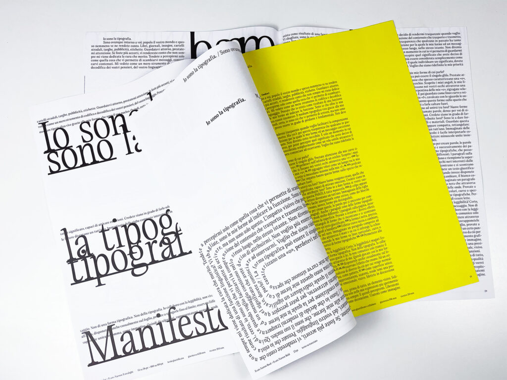
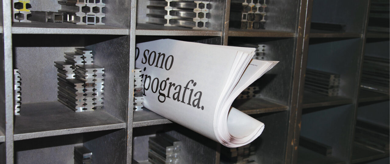
The unbound tabloid is made by 20 folded typographic posters.
What projects are you currently working on? Is your typographic research ongoing?
At the moment, I’m involved in the artistic direction and graphic design of communication for ISIA in Urbino. Through this work, I have the opportunity to experiment extensively with digital animation, delving into the world of kinetic typography, which has always fascinated me but which I had not yet had the chance to explore from within. The addition of motion to typography is providing ample confirmation of its validity and expressiveness as a form. Typographic shape is and will continue to be increasingly vibrant.
About “Io sono la Tipografia. Manifesto”:
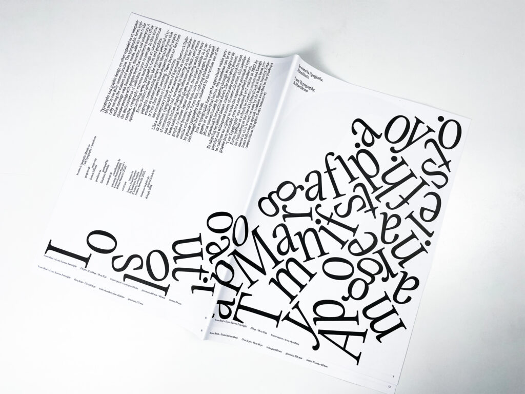
Enrico Solfrini delves into the expressive potential of typography, transforming letters into liberated shapes that emerge as autonomous visual elements, distinctly separate from their verbal meaning. These shapes are free from any constraints or functional necessities. Like a contemporary visual version of Raymond Queneau’s Stylistic Exercises, typographic shape asserts itself as an unconventional communication tool, narrating its identity in the first person and only in Italian, shaping this collection of stylistic contortions. From analysing individual glyphs to composing words and paragraphs, to various layout solutions, the project unfolds in a crescendo of deconstruction from outer to central pages. It exalts essential and modular shapes first, exploring elaborations inspired by grunge typography then, enhanced by the random use of letters through the p5.js code.
Just as typographic shape can be appreciated within paragraphs or as individual letters, this manifesto can be explored conventionally by flipping through its pages or by separating it into printed sheets, like individual posters. By adopting the tabloid format, traditionally considered the most popular and widespread means of communication, this manifesto reaffirms its urgency to make the expressive potential of typographic shape accessible, even to a non-specialised audience.
Evans font family
Click here to find out more