Rediscovering Cairoli
This new technique is that of the deliberate anachronism and the erroneous attribution. This technique, whose applications are infinite, prompts us to go through the Odyssey as if it were posterior to the Aeneid and the book Le jardin du Centaure of Madame Henri Bachelier as if it were by Madame Henri Bachelier. This technique fills the most placid works with adventure.
(Jorge Luis Borges)
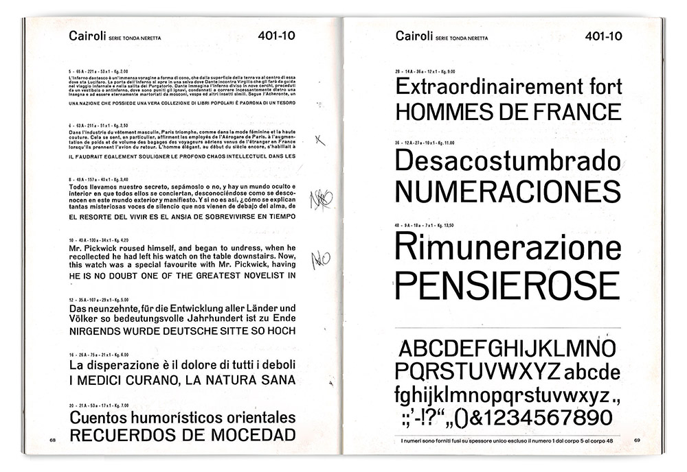
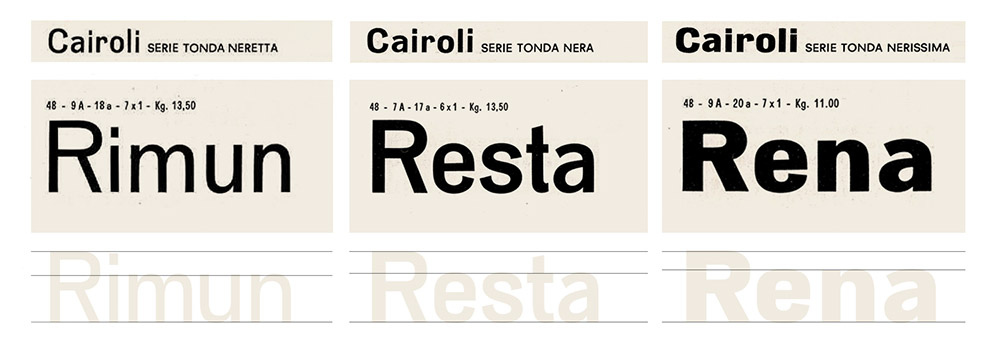
Specimen pages for Cairoli Tonda Neretta
1. The case of the old specimen
It was at the October 2019 TypeThursday Florence meeting that we first discovered the existence of the typeface Cairoli, on the pages of a old specimen that Samuele Formiconi – type lover, art director and founder of Lungarno magazine – had brought with him.
TypeThursday is a wonderful event format. Created in New York and now replicated all over the world, it’s a monthly meeting of lettering and type aficionados where you can exchange nerdy chat, drink a beer, and take part in small type design crits on work by both professionals and beginners.
In the crowded conference room of TSH Florence, Samuele showed us with great pride his prized Nebiolo catalogue from the seventies – probably one of the last issued by the famous Italian foundry, that would have gone bankrupt in 1978.
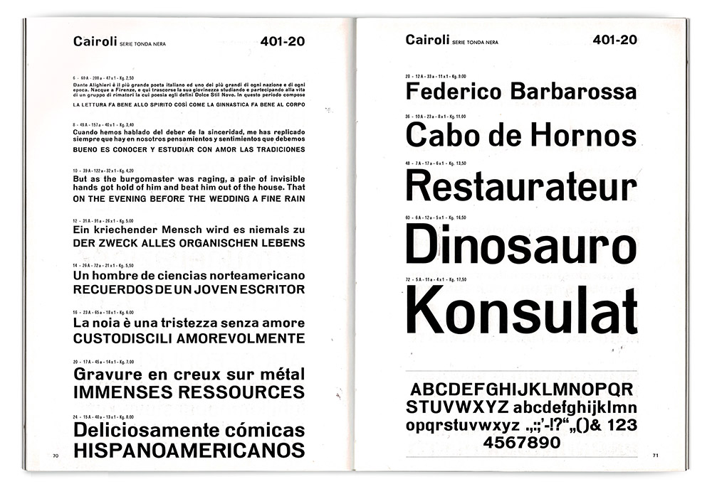
Specimen pages for Cairoli Tonda Nera
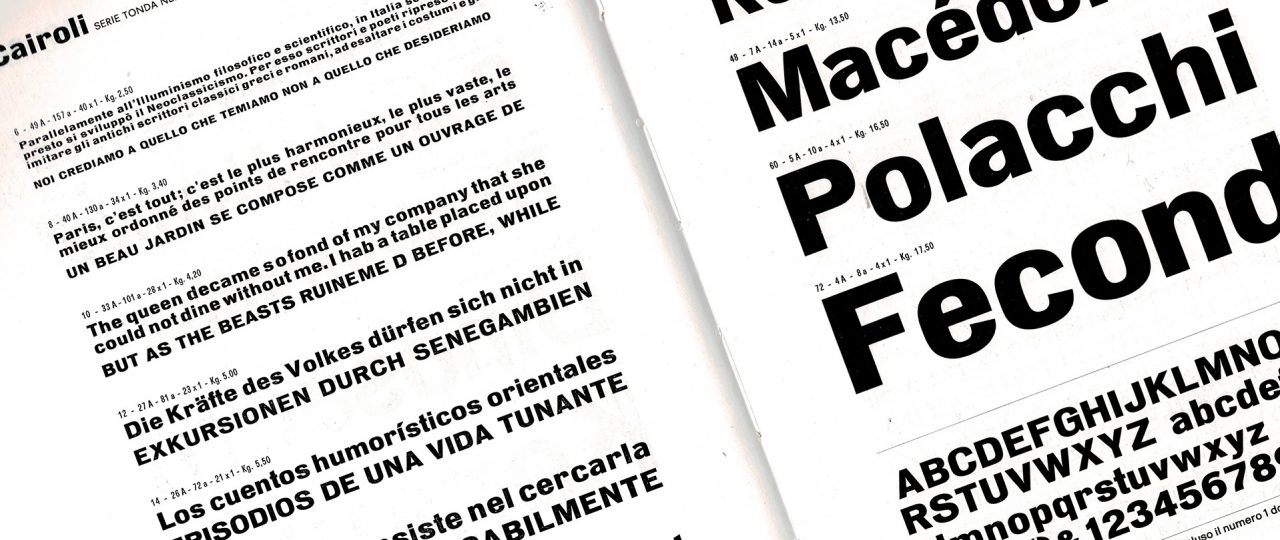
The booklet, with pages slightly yellowed from time, showed samples of some well known Novarese typefaces (masterpieces like Eurostile or Stop, next to the little-known but beautiful Metropol), together with the wide range of more commercial Bodoni and Garamond redesigns that the foundry offered. And then there was Cairoli: a simple grotesque with slightly squared round shapes, similar to those of DIN, that complemented the Eurostile samples in the previous pages.
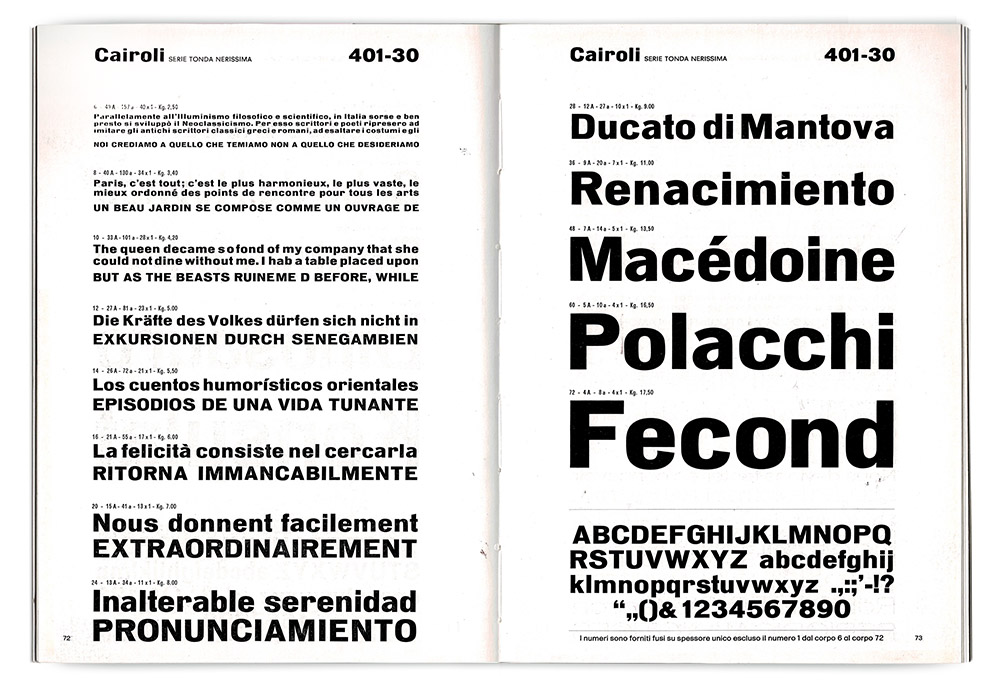
Specimen pages for Cairoli Tonda Nerissima
Samuele was so kind to allow us to scan the pages, so that Cairoli ended in the folder of the working materials for our Course in Typography & Calligraphy at IED Firenze. This short, intensive course is an opportunity for us not only to connect with master calligraphers like Luca Barcellona, Anna Schettin and Francesca Biasetton, but also to investigate exciting and forgotten fonts from the past, picking interesting pages from old specimens and lettering manuals to give the student as research assignments.
Lorenzo Donzelli chose Cairoli and, starting from the ultrabold tonda nerissima weight, produced a first digital incarnation of the typeface.
Cairoli digital test by Lorenzo Donzelli
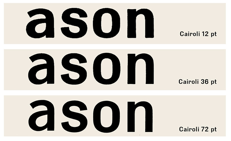
When faced with the results of Lorenzo’s experiment, we were immediately hooked. Lorenzo had faithfully reproduced all the inconsistencies in the original, but had demonstrated that a revival was possible. We decided to test another weight, and we digitized the tonda neretta weight, that showed a far lower x-height and a slightly more condensed proportions.
In Cairoli, width and x-height are increasing with weight
As we noted the many differences between the Cairoli variants we became even more curious on the story of this particular grotesque. Could it be some forgotten, hasty work by Butti or Novarese? We decided to investigate, and soon found the answer thanks to the beautiful flickr collection of renowned type historian Indra Kupferschmid. Cairoli was not an original Nebiolo product, but rather a design that the Turin foundry had acquired (or maybe copied) from Leipzig-based foundry Wagner & Schmidt, originally known as Neue Moderne Grotesk.
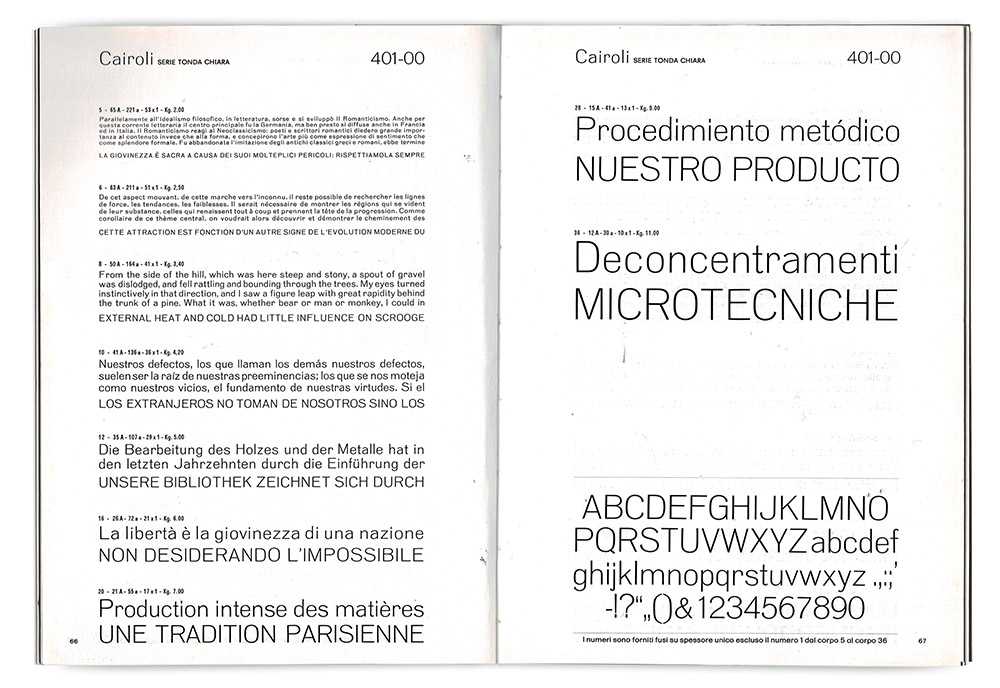
Specimen pages for Cairoli Tonda Chiara
2. A font with many names
It was pretty common for foundries at the beginning of the century to acquire and rename type matrices. The situation was made even more messy by foundries – like Wagner & Schmidt – that used not only to supply other foundries with the same design, but also to usedifferent names for it in their catalogues. Here’s why Neue moderne Grotesk can be also found as Wotan or Edel: Wagner & Schmidt, as Indra Kupferschmid noted in her 2014 Atypi Barcellona talk, loved to complicate type history.
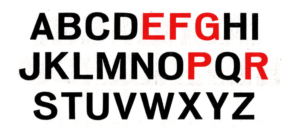
High waisted capitals in Neue Modern Grotesk/Cairoli.
Similar to other “grotesque” typefaces of the period such as Venus by Bauer Type Foundry, Neue Modern Grotesk had a minimal design, with low contrast and semi-condensed proportions. A notable feature were some unusually high-waisted capitals (like ‘R’, ‘G’ and ‘P’), probably an influence of Art Nouveau and Secessionist lettering of the period. It was a “modest but beautiful” typeface but was at the time quite successful. It was sold to many different european foundries who commercialized it with names such as Salon-Grotesk (Stempel), Elite-Grotesk (Poppelbaum), Normal Grotesk (Haas). In the 1927 catalogue of Dresden foundry AG Schriftguss it even had a different planet name for each weight, like Saturn,Jupiter and Neptun.
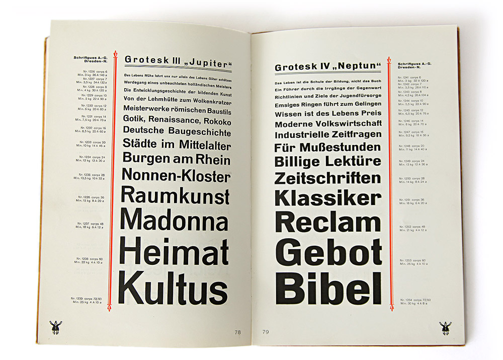
Neue Modern Grotesk in the 1927 catalogue of AG Schriftguss (source)
Some foundries even expanded its design, with Weber developing it into the typeface known as Aurora Grotesk. Aurora included italics and a condensed version with design variations, and was later digitized by Bitstream.
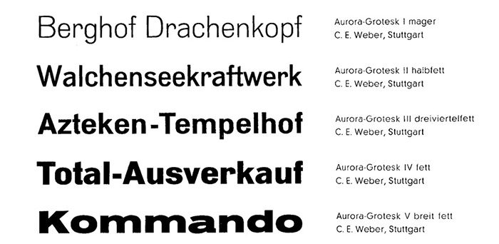
Aurora Grotesk from Weber Foundry, Stuttgart (source)
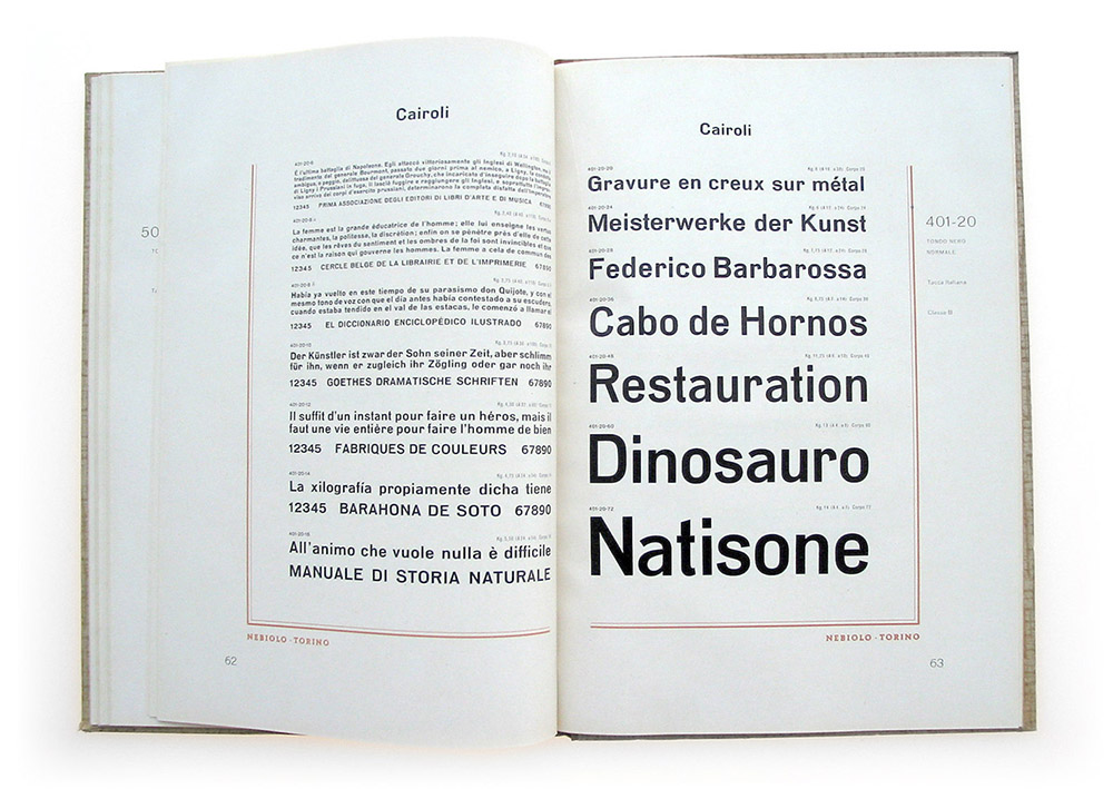
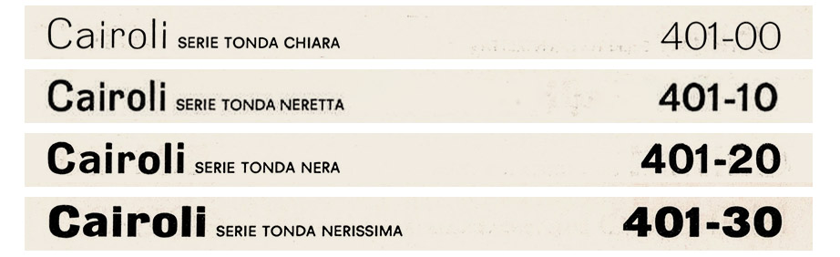
Under the name of Cairoli, Neue Modern Grotesk was sold in Italy by Nebiolo since 1935 in five variants: tonda chiara, tonda neretta, tonda nera, tonda nerissima and nerissima larga.
Cairoli Neretta in another Nebiolo Specimen
Four of them were still in Nebiolo’s catalogue forty years after, having in the time graced countless designs around Italy.
Cairoli series in the 1970 Nebiolo catalogue
We felt that it was the time, fifty years after that last printed catalogue and over a century after their first design, to give the shapes of Neue Modern Grotesk a new chance. We were intrigued by its weird design, full of inconsistencies and idiosyncrasies but still gracing grotesque forms with a different note. To our eyes that humble design, lacking the polish of later sans-serifs like Helvetica or Univers, managed to be far more interesting and less neutral, with its uneven letter width, variously angled stroke terminals and unusual x-height range.
We knew we were not the first to be attracted by the shapes of Neue Modern Grotesk: Cyrus Highsmith had been inspired by them for his Scout typeface, designed for Entertainment Weekly in 2008, while Dada Grotesk published by Optimo Foundry in 2011 had been created using Aurora as an inspiration.
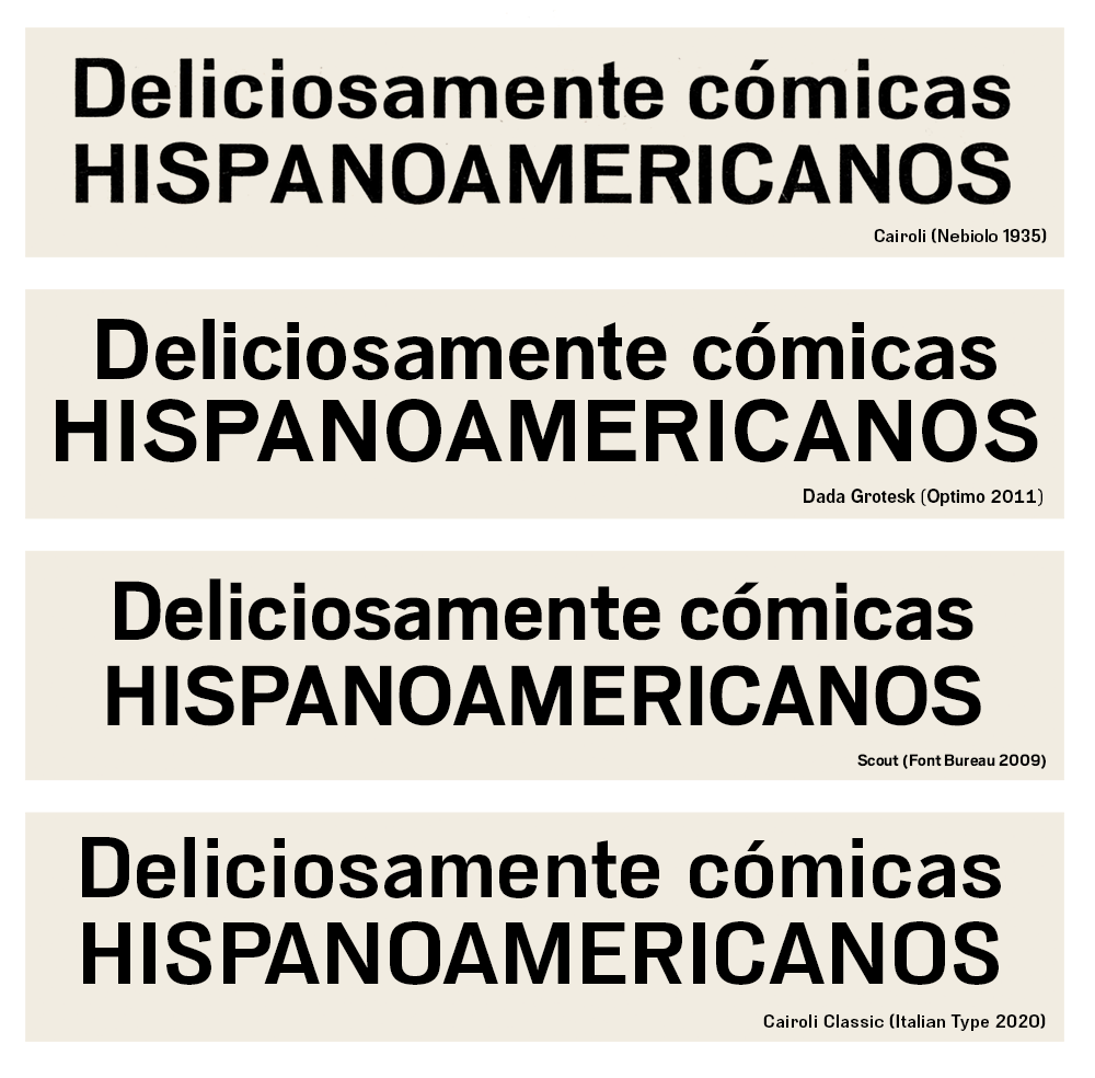
A comparision of Neue Modern Grotesk revivals
But our revival started from the idea of redesigning not Wagner & Schmidt’s Neue Modern Grotesque, but Nebiolo’s Cairoli. We consciously decided to keep the Italian name as a symbol for what we wanted in our redesign: to work on Cairoli as it had been a product of Nebiolo’s Studio Artistico.
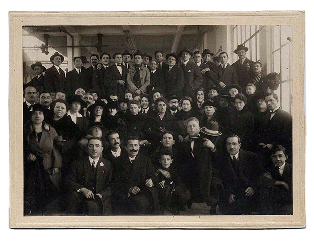
Group photo of Nebiolo workers from 1923 (source)
We felt, in a way, very similar to the protagonist of the 1938 short storyPierre Menard, Author of the Quixote by Jorge Luis Borges in which the eccentric 20th-century French writer Menard decides to go beyond a mere translation of Don Quixote by actually trying to re-write it identical line for line, as he was the author of the text. As Menard decides to write not a version of Don Quixote, but the Don Quixote we would make Cairoli not as the Neue Modern Grotesk spin-off it was, but rather Cairoli as if it really was a grotesque family designed in Turin in 1935.
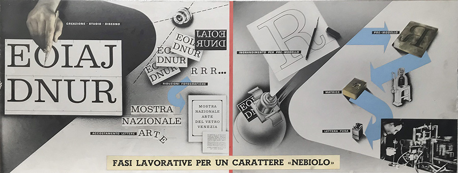
Nebiolo type design process from a period advertising
Was this a borgesian “deliberate anachronism”, ready “to fill the most placid works with adventure”, or just a typographic swindle?
We knew the question had not an easy answer.
3. The chimera of original type
The more one immerses oneself in the history and practice of type design, the more it becomes evident that fundamental questions of authorship, appropriation and interpretation are raised. The extremely limited design space of letterforms, where a minimal variation of detail or proportion on a base design can lead to a result with completely different qualities, challenges continuously our presumptions of originality. For naive graphic designers, typefaces like Bodoni or Caslon exist in a discrete space where single authors have created well-identified designs – in the same way that one would consider the uniqueness of a Gioconda or a Ferrari.
But the reality is far more complex – especially if one considers that, before the advent of digital typography, the design of letterforms was heavily influenced by print techniques. Before the 19th century, the concept that different point sizes had to match in design was not established, so that size, paper and press quality all made very difficult to pinpoint a coherent typeface design. As noted by Riccardo Olocco and Jonathan Pierini in their notes on the design of Parmigiano, cuts for smaller sizes were often very different from those for bigger sizes, featuring “enlarged counters, shortened ascenders and descenders, thickened serifs, decreased contrast and wider letter spacing”: in the end there’s not a single Bodoni, but rather a cloud of similar but distinct artefact in a continuous, ever evolving space.
The evolution of digital typeface design has not certainly solved the problem. As the hundreds of geometric sans typefaces available on the digital markets show, we are getting used to call different fonts that have between them far less dissimilarities than the ones we could see in the various cuts of a letter from the same punch-cutter. So few are the basic shapes of letters, and so little the possible variations, that the design of an original typeface seems something doomed to fail from the start. It’s not by chance that almost all the copyright laws in the world deny the right to patent letter shapes: copyright requires a clear element of distinction and innovation, and a letter shape that is clearly distinct from the known ones would be – by definition – unreadable…
Contemporary type design seems to appear then as another form of calligraphy, one based on digital means rather than physical ones, but however one in which – rather than producing original forms, we are simply creating little personal variations on existing ones.
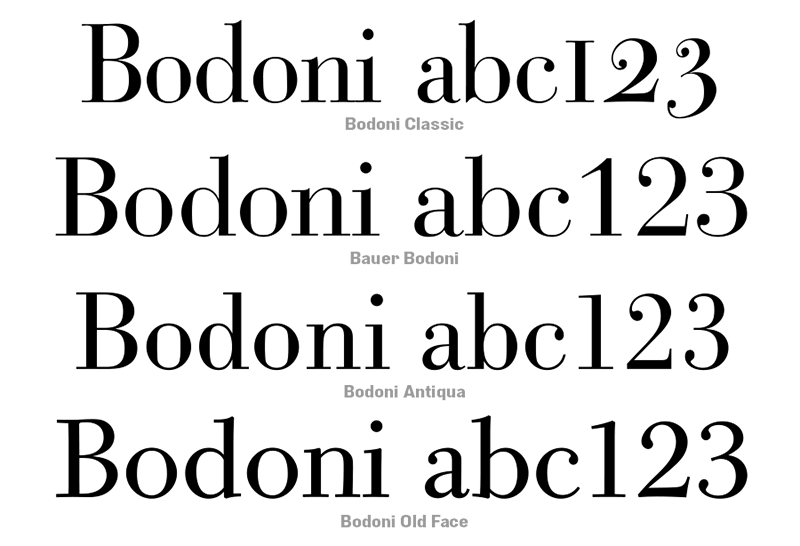
Various digital interpretations of Bodoni’s cuts
Does this mean that all new typefaces are in fact revivals of previous ones? The history of type design would suggest that this is nothing new, as we discover that any great typographer has basically been reworking and adapting previous ideas. Take Caslon, described by William Berkson as “a kind of revivalist”, inspired by “faces from different Dutch and English punch cutters”; or Bodoni – who notoriously started his career by copying the designs of Pierre Simon Fournier, who in turn had been inspired by the Roman du Roi letters – the same letters, engraved by Simonneau and cast in metal by Philippe Grandjean, that would have been an inspiration for John Baskerville…
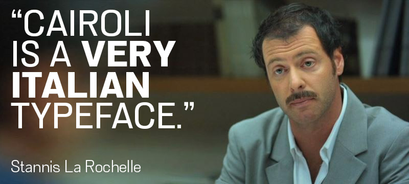
Before falling down the rabbit hole of typographic influences, we decided that the only way to go was forward, following the initial inspiration. We had discovered Cairoli on the pages of an Italian type foundry catalogue, and had seen its sloppy yet ambitious design as something that looked – to quote our beloved Stanis La Rochelle – very italian.
We sat together with the designers of Italian Type: Valentino Coppi, Manuel Alvaro and Mario De Libero, and proposed them to bring forward the project. Add their sensibility to the already fleshed-out type sketches, and work with Nebiolo printed specimen as the only guidance.
4. Putting the Now in Cairoli Now
The first thing that we decided to do was to split the project into two subfamilies: a more strict, display oriented revival (Cairoli Classic) and a heavily re-proportioned text version (Cairoli Now). With both versions we tried to balance between being faithful to the model and trying to correct some of the most visible excesses and mistakes.
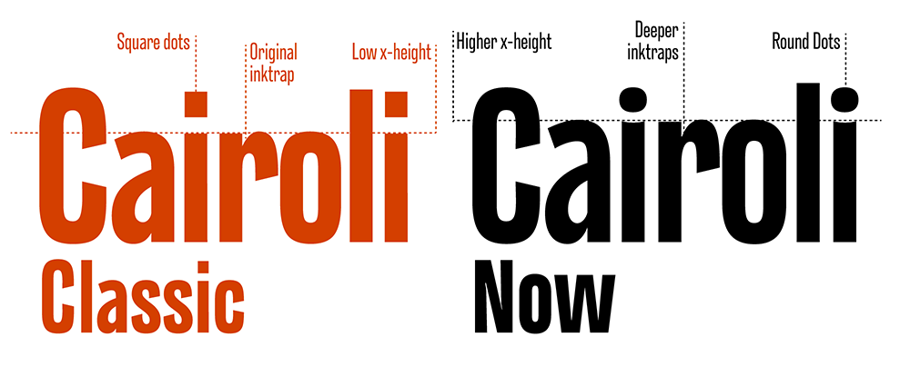
The design of Cairoli is very peculiar and sometimes sloppy as contrast, width and roundness of letters varies a lot between the chiara (light) and the nerissima (extrabold). The nerissima larga (extended extrabold) becomes almost a different typeface, more similar to Venus or Aurora: rounder, with horizontal letter cuts, and a tail added to lowercase ‘a’. We managed to control this by developing Cairoli as a variable typeface with a width and a weight axis, so that we could identify precisely every variant in the design space. Having defined such a wide variation range allowed us to extrapolate the master weights for both an extended and a condensed width, allowing us to expand the original range to 3 widths of 7 weights each.

For both families, we expanded the original character set to include all the extended latin accents, creating new shapes for missing letters, special signs, and multilingual diacritics. Feeling that the two families needed a stronger distinction for non-typographers, we decided to adopt for Cairoli Now a round punctuation. For both Cairoli Classic and Now we developed a simple, slanted italic; and introduced a full set of open type features with positional numbers, stylistic sets and alternates.
Born as an exercise in subtlety and love for lost letterforms, our revival Cairoli stands, like its lead ancestor from a century ago, at the crossroads between artsy craftsmanship and industrial needs. Its deviations from the norm are small enough to give it personality without affecting readability, and the expanded weight and width range make its 84 variants ready for digital design.
It’s our Quixote by Menard, and filled our placid work with a little bit of adventure.
Cairoli now font family
Click here to find out more
[…] problem was resolved by changing the design as the point size diminuished (as we discussed in our article on Cairoli). In contemporary type design this is obtained by adding a “optical size axis” that […]