The Journey of Codec ME
Designed with the precious collaboration of Omaima Dajani for Arabic glyphs and Oded Ezer for Hebrew, Codec ME is the first typeface by Zetafonts to include both Arabic and Hebrew scripts, expanding its language coverage to a wide range of MENA countries. In these challenging times for the Middle East Codec ME stands as Zetafonts’ humble way to celebrate its cultural richness, and the power of cultural exchange. In this interview, Cosimo Lorenzo Pancini answers the questions of guest editor Dario Manzo.
You are an Italian foundry, based in Florence. What led you to study and design non-latin scripts?
The fascination by Zetafonts for non Latin scripts started more than 10 years ago, due to the rich multicultural milieu of the European Design Institute in Florence where Cosimo Lorenzo Pancini, Francesco Canovaro and Andrea Tartarelli are all teachers at the Master in Graphic Design and new media. It was first Anastasia Yakovleva that introduced us to the beauty of the Cyrillic script in 2013, while we were making our first tentative steps in latin type design. Our first typeface with cyrillic glyphs was Panforte, originally designed by Debora Manetti. We added Cyrillic letters, thanks to the help and consulting of Anastasia. Then, in 2016 that we were introduced to Arabic script by Egyptian student Ghada Wali, who had collaborated with Cosimo Lorenzo Pancini on her research project in divulgating Arabic script through Lego bricks that lead her to a much awarded Ted Talk. Together with Ghada we started a project – that is still in progress – to add Arabic to Coco Gothic Typeface. Finally, it was through Shristhti Vajpai that we got in contact with Devanagari script. Shrishti has since then been working with us, producing our first two Deva typefaces: Stadio Deva and Heading Deva.
Why design scripts for a language that is different from yours?
Well, first of all, even the Latin glyphs we design for English can end up in foreign languages where they behave differently. Just think about the diacritic abundance in Polish or Czech, the specific ligature characters in Dutch and German, or the uncommon punctuation in Spanish… So no, we don’t think that knowing the language is mandatory. But naturally, you have to be aware of the script’s typographic as well as calligraphic rules and study proper manuals as well as reference many existing typefaces. In this sense, experimenting with non-Latin letterforms is a way to deal with typographic design in its purest form. You basically have to refer to the universal nature of the calligraphic hand, go back to human gestures, without biases and preconceptions. And naturally, you have to work a lot on traditional models and historical references. This makes it all even more fascinating, as you are dealing with centuries of handwriting tradition, beautiful illuminated manuscripts, forgotten calligraphy styles… It can be as fascinating as challenging, especially for Semitic scripts like Arabic or Hebrew, which, with their right-to-left direction of reading, challenge all our preconcepts about stroke movement and direction in writing. In the end, you go back to the basics, as you study and explore the way to understand and master what exactly constitutes the essence of an alphabetic system.
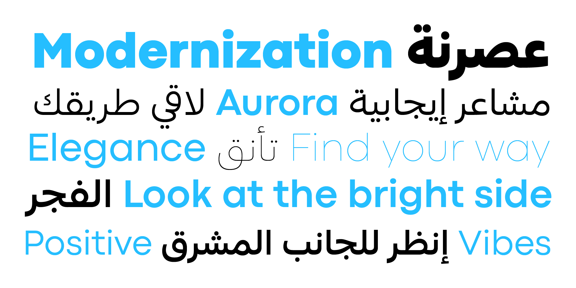
Different writing systems and reading directions live together in Codec ME
Do you feel that you are allowed to work with these scripts even if they aren’t part of your cultural and personal history?
This question came naturally to our minds since our earliest attempts. “Are we allowed to do this?” or “Are we actually risking a cultural appropriation of this heritage?”. It’s an important and difficult question, and we must confess that at first, our enthusiasm was stronger than our concerns. We wanted to try this challenge because it was a learning opportunity, and we were inspired by the example of past famous typographers who did develop foreign scripts – from Bodoni to Frutiger, as well as from the example of some extraordinary contemporary type designers like Peter Bilak. But when we asked these same questions to type designers and experts from different cultures, the answer we usually got is that as long as we allowed ourselves to study the traditional letterforms and experiment with the calligraphy models, we would be allowed to try our interpretation of these scripts. Naturally, we understand that we will always be perceived as foreigners, and we see the potential dangers of dealing with these rich cultural heritages. Once again, knowledge and study can be the only way to overcome biases and preconceptions.
There has been much discussion in typography about the presence of “latinized” or “faux Latin” typefaces…
We had the great privilege to study Arabic typography with Nadine Chahine, a master and inspiration in the field, and a fantastic educator who made us realize the complexity of the issue regarding “latinized” Arabic typefaces. This stems mostly from the fact that for western designers is easy to give for granted the modernist principles of geometry and simplification that are not a given in Arabic graphic design and typography. The Bahuahus principles that gave birth to typographic classics like Futura are far from the nature of the most common and readable Arabic styles like the widespread Naskh, that – as many other non-Latin writing systems – are very much relying on the rules of handwriting and calligraphy.
From calligraphic Naskh style to geometric abstraction in Codec Pro ME
Still, modernism principles of stylization and arabic scripts can be connected by using the intermediation of one of the oldest models for Arabic calligraphy, the ancient Kufic style which, expecially in is square kufic form, has been showing the effect of geometry on letterforms many centuries before Latin. But though perfectly apt for logos and display use, Kufic is not so easy to read in body texts and type designers must consider a careful work of mediation with the written styles: something that Nadine has pioneered with her influential “hybrid Naskh/Kufi” style.
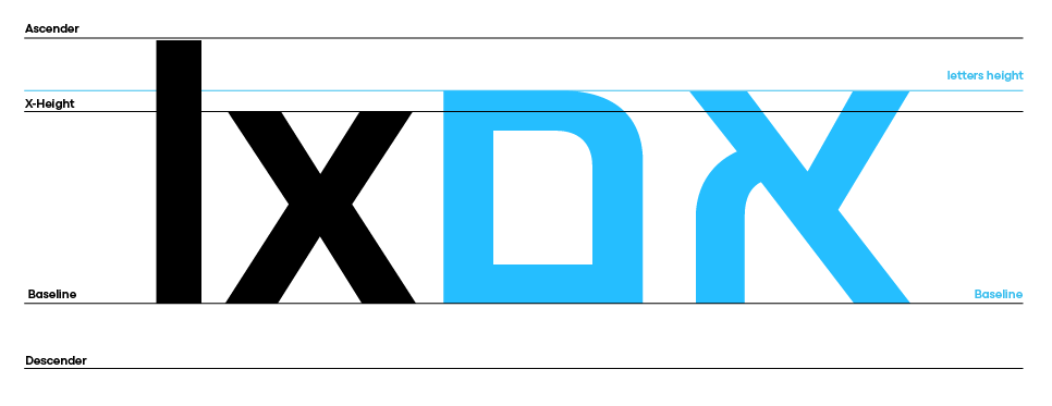
It took us a lot of work to understand that the very natural connection between geometry and letterforms that we can apply in Latin in the wake of the modernist tradition has different connotations and rules in non-Latin typeface design.”Where is the x-height in Arabic?” or “What is the Arabic Futura?” are tricky questions, and can lead to colonial practices, wrongly applying to Arabic typography to the rules of Latin design. We had to study a lot to avoid that, and we must thank Pascal Zoghbi from 29LT for his clear explanation of the complex nature of vertical references in Arabic and its relationship to the simple system of caps/x-height of Latin.
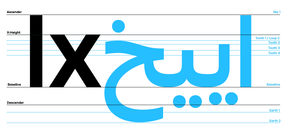
Vertical metrics in Latin and in Arabic typography (terminology thanks to Pascal Zoghbi)
At the same time, the relationship between inner and outer space is very different from Latin in scripts like Hebrew or Devanagari, which are strongly defined by their modular structure and the visual weight of the upper part of the glyphs – something that calls for a completely different approach in designing them.
Vertical guidelines in Latin and Hebrew
Despite all these differences, working with these scripts made us aware of the fact that the underlying principle beneath every type of script lies basically in the movements of the writing hand and their relationship with a flat or pointed nib. It’s beautiful to discover the close connection between anatomy and physics that defines and unifies different scripts, allowing us to see similarities in letterforms and details while simultaneously highlighting profound differences. In this sense, we felt that designing a non-Latin typeface was a way for us to not only expand the reach of our potential customer base but, more importantly, to deepen our connection with the power and the meaning of our work. We realized that working with non-Latin scripts allowed us to open our minds to different shapes and come back to Latin letter design with heightened and deeper understanding.
How all this end up in Codec Pro Me?
Codec, designed by Cosimo Lorenzo Pancini, Francesco Canovaro and Andrea Tartarelli in 2017 was one of the first typefaces that we tried to expand into the Arabic language, initially with mere experimentation. Then, we reviewed completely the design, after having studied arabic type design with Nadine Chahine, at the ILT Academy. Nadine’s experience with Arabic typeface design, her passion, and her capacity to articulate the subtleties, beauty, and semantic heritage of these letterforms naturally allowed us to see very soon that the first designs we had made for Coco Gothic and Codec had much to be corrected.
Nadine Chahine introduced us to the work of Omayma Dajani, whose Lifta typeface is a beautiful example of a modern interpretation of a very traditional calligraphic display design. Omayma guided us into the daunting task of reviewing our first designs for Codec and fine-tuning it to its final form..
In her characteristically poetic speech, Nadine compared Latin type design to a jungle overcrowded by plants – as the design space is completely filled by many similar fonts. Arabic typography, on the contrary, is much more akin to a desert where solitary oasis of creativity are separated by a wide, unexplored space. One such uncharted territory in Arabic type is naturally the connection between geometry and calligraphy, full of the previously described design pitfalls.
As foreigners and non-native speakers of the Arabic language, as well as users of calligraphy, traversing that space was daunting and exciting at the same time. Our first experiments in that field involved trying to adapt the geometric letter forms of Codec and Coco to that space, and we soon realized how much work we had to do to free ourselves from the constraints, attitudes, and clichés of latinocentric typography that made much less sense with Arabic typography. At the same time, we recognized that some fundamental principles of typography, like inner-outer space balance, stroke consistency, general contrast, and stroke energy, translated very well from different scripts. As we studied and perfected the knowledge of the calligraphic models underlying the Arabic script, our Codec was slowly adapted and underwent almost twenty rounds of revision.
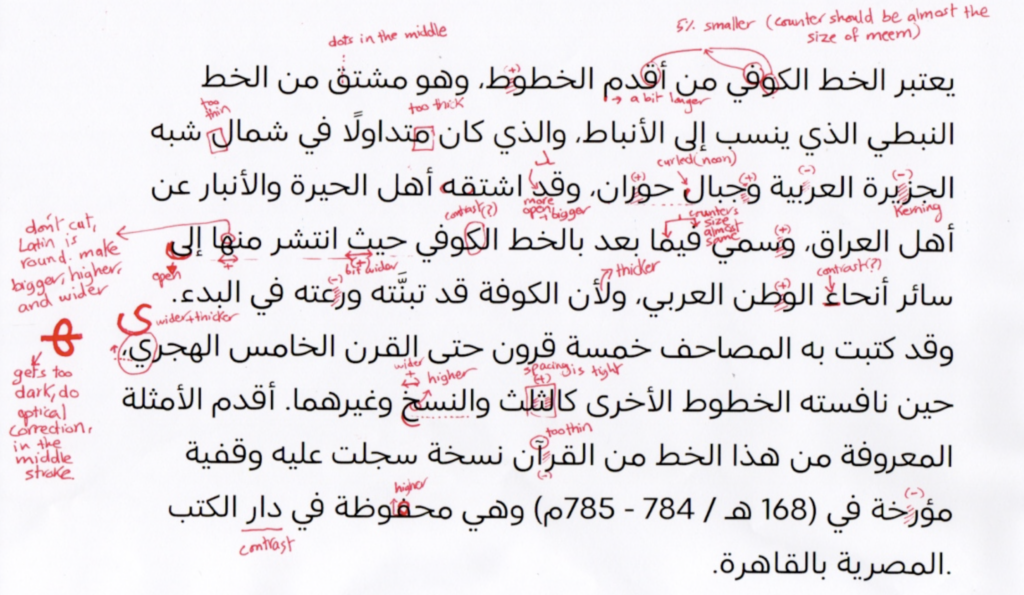
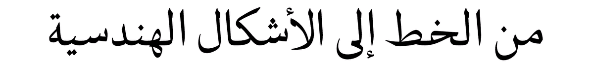
Omayma Dajani handwritten notes on the Arabic of Codec Pro ME
More than a simple work in progress, Codec became our journey in creating a personal, deep connection between Latin and Arabic scripts and cultures. We realized that working with such a typeface for us was a way to communicate the need for a more inclusive and connected world. We also felt an important cultural obligation towards our students, who could be exposed to multicultural media and could still not understand the subtle difference between accepting and understanding different letter forms and mimicking them with “faux Arabic” or “faux Chinese” scripts.
The culmination of that experience come when, after participating to the Tel Aviv 2022 OFFF Festival, we were contacted by one of our design heroes, Oded Ezer. We interviewed him for our ‘Type Trends Look Book”, and we soon felt a great connection with his work philosophy, open to experimentation and dialogue. We started speaking about possible collaborations and worked for a little while with him on the latin counterparts of his spectacular Kadim and Hillel typefaces. We then realized that, as we were finishing our review of Codec Arabic with Omaima, it would have been great to include Hebrew glyphs in Codec with the intention of producing our first-ever Middle East typeface.
In a natural, unplanned way, this project invited us to develop the ideas of inclusiveness and cultural bridging that had led us to develop our first Arabic typeface, Tarif, designed by Andrea Tartarelli as an homage to the multicultural utopia of Convivencia that played an important role in bringing to Europe the classics of Greek philosophy, togheter with Muslim culture and aesthetics.
With his proposal to add Hebrew glyphs to Codec, Oded gave us a wonderful example of a typographic conversation, following the strong geometric nature of Codec letters seamlessly along the wide design space of the Latin original, from the ethereal ultralight weights up to the black shapes of the fat weight, which had been added to Codec by Francisco Canovaro as an exercise in minimizing internal space of the letters.
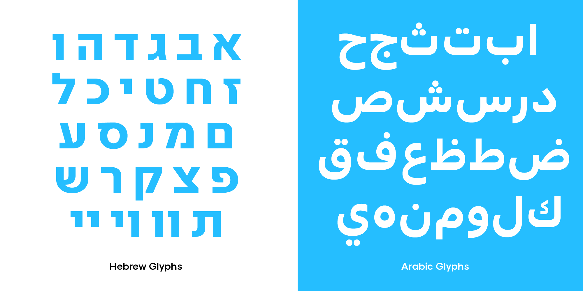
Arabic and Hebrew Glyphs in Codec Pro ME
For over a year, working on Codec ME has been a personal voyage of acceptance and listening. We had to deal with our failures and our biases, and our colonial heritage that forced us to think about other scripts in the terms of Latin. At the same time, we had to experience the difficulty to create a common language for such different scripts, while at the same time recognizing the many similarities and the common semitic heritage of both. Working on Codec ME made us feel that even a simple typographic project can be a way to dream about a possible world of intercultural dialogue and communication.
Can a typeface be a way to imagine the future?
We Italian writer Chiara Valerio has said it much better than us, so we will quote her directly her:
Despite everything, I envision the future.Because I have faith in human beings.I believe that each one of us safeguards the sacred: the feeling of believing that, despite its complexity, the world can be represented through the alphabets we have and will have at our disposal.
Chiara Valerio
على الرّغم من كلّ شيء، أتصوّر المستقبل. لأنّ لديّ إيمانًا بالإنسان. أعتقد أنّ كلّ واحد منّا يحمي «المقدّس». «المقدّس» هو شعور الإيمان بأنّه -وعلى الرّغم من تعقيداته-، من الممكن تمثيل العالم من خلال الأبجديّات الّتي نمتلكها، والّتي سنمتلكها
كيارا فاليريو
למרות הכל, אני רואה את העתיד. כי יש לי אמונה בבני אדם. אני מאמינה שכל אחד מאיתנו שומר על הקדוּשה. הקדוּשה היא תחושת האמונה, שלמרות מורכבות העולם – ניתן לייצג אותו באמצעות אותיות האל״ף־בי״ת שלנו
קיארה ואלריו
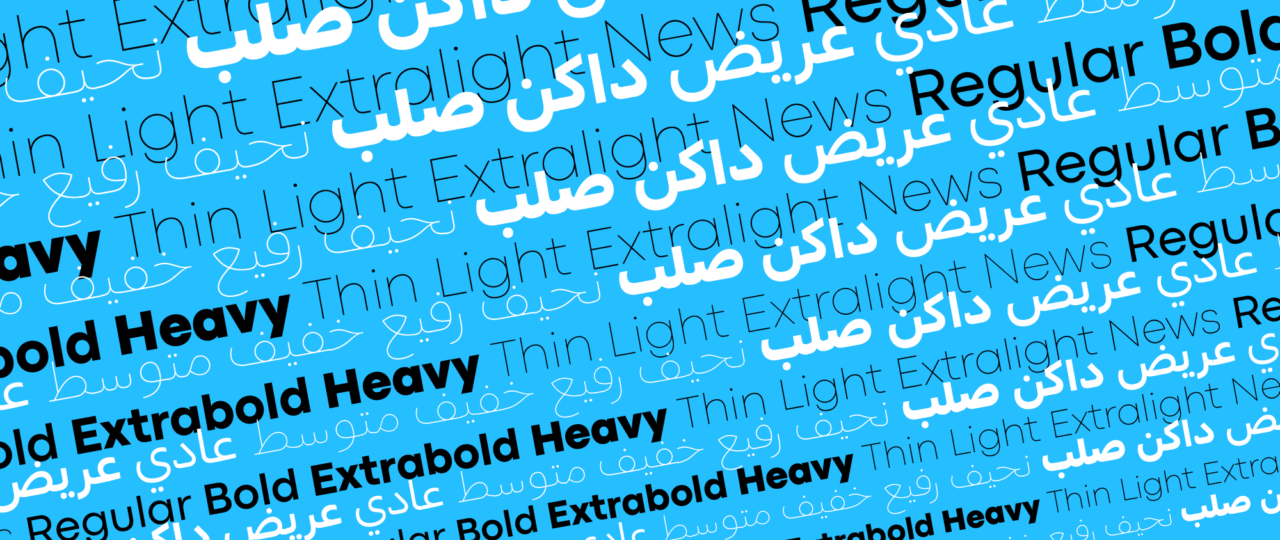
Codec pro me font family
Click here to find out more