A brutal victory
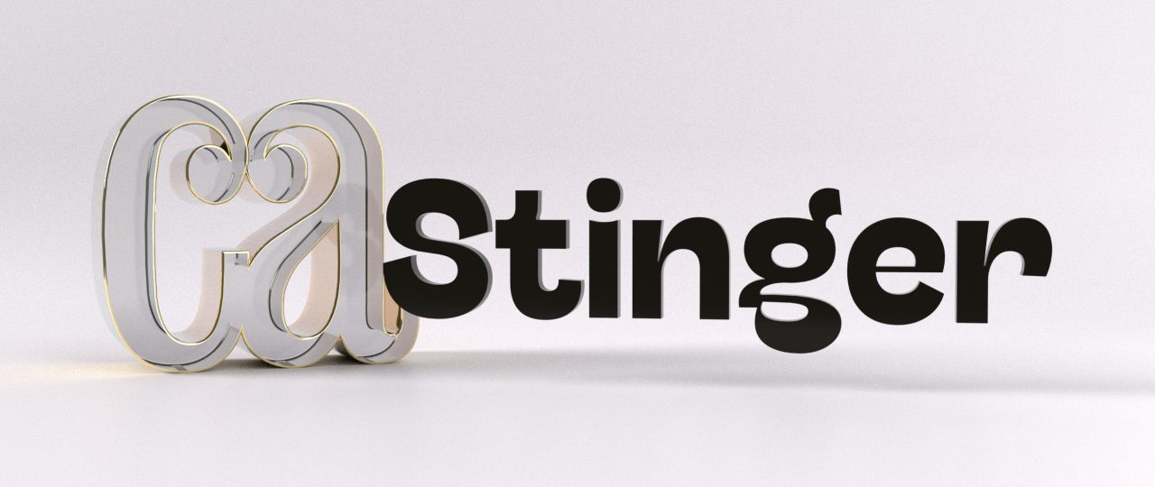
While researching the typography trends for our 2020 Type Trends Look Book we became aware of the many influences of late 19th century sans serif typefaces on our contemporary taste for typeface design. We called this trend “brutal grotesque”, referring to the many quirks and mistakes easily found in vintage pre-digital lead type and printed specimens that had become distinguishing features in contemporary fonts. Slightly off proportions in letters, unexpected calligraphic solutions, uneven and slanted cuts, and the occasional appearance of type design most loved “wrong” feature: reverse contrast. Hagrid and Boring Sans – both presented in the 2020 Trend Book – were our first published explorations in this style. But both were designed while working on a more complex project that ended up being published as the last of our “brutal style” typefaces, that has been chosen as one of the winners of Communication Arts Magazine 11th Annual Typography Competition …
