The History of Alfabeta
[La versione Italiana di questo articolo è disponibile sul sito di R41]
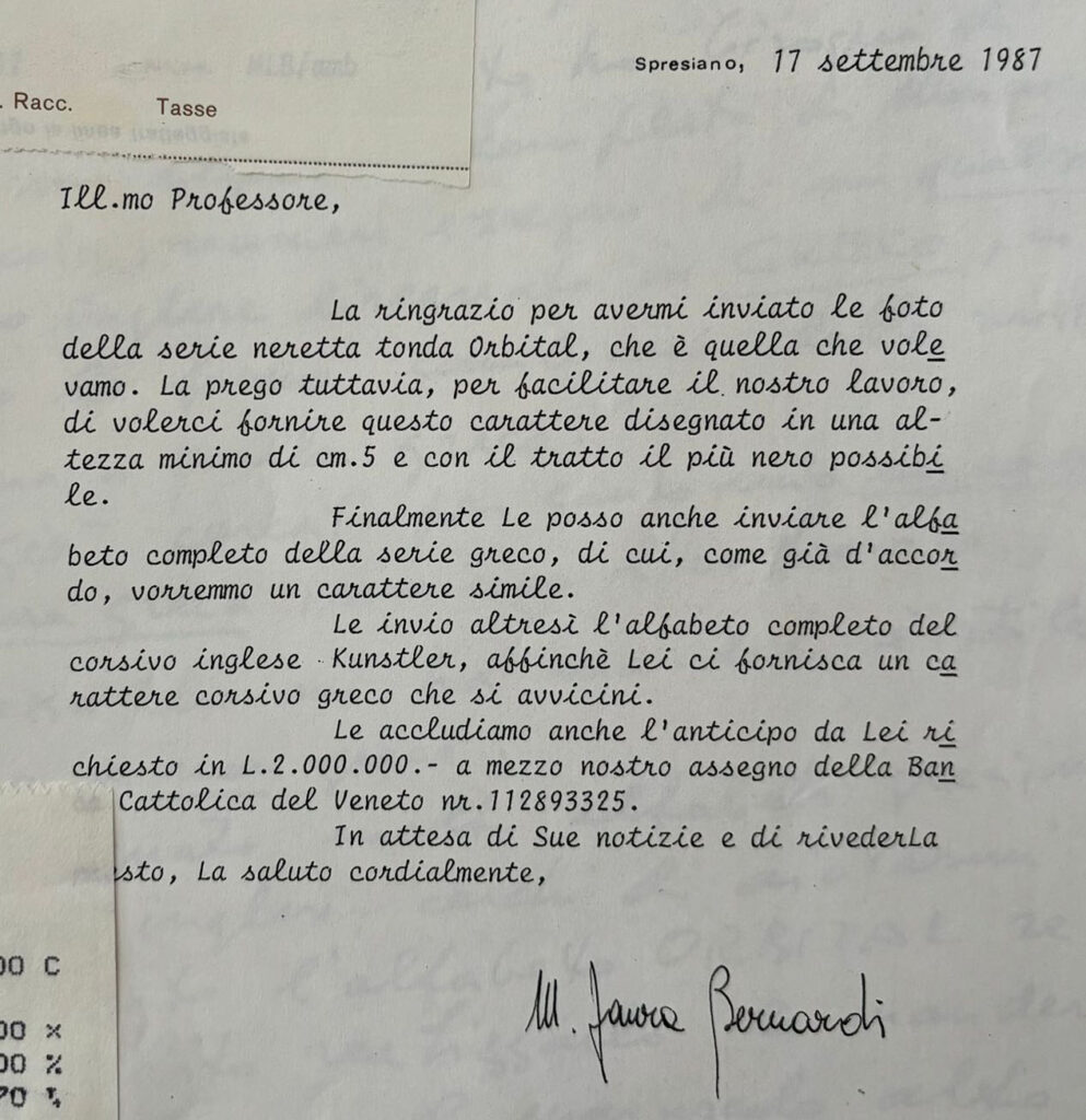
Alfabeta is a typeface designed by Aldo Novarese commissioned by Maria Laura Bernardi of Reber Spa in 1987. She envisioned the development of an English cursive font that could complement Kunstler, already present in the R41 catalog.
(The original letter by Laura Bernardi in 1987)
This commission demonstrates Reber’s keen attention to the interests of an international market, as evidenced by the presence of Cyrillic and Arabic alphabets in the company’s catalog. Alfabeta is not the only Greek alphabet designed by Novarese for Reber; it’s worth mentioning the elegant Olympia, which expands on the lessons of Forma. However, Alfabeta stands out as the most complex execution for Novarese.
(Olympia in the R41 catalog)
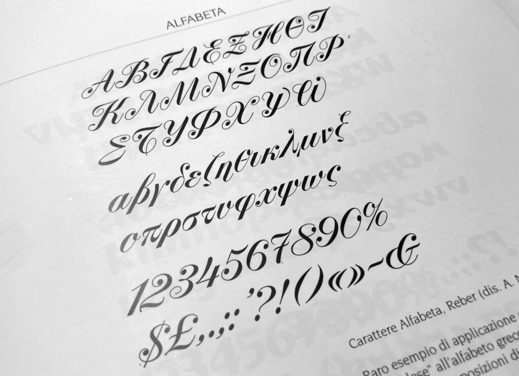
Novarese had to adapt Greek letters to the style of copperplate writing, thus bridging two different traditions not easily compatible. The result is an elegant and unusual typeface, which offers an interesting cultural fusion ahead of its time, characterized by Novarese’s typical technical precision and creative idiosyncrasy.
(Alfabeta in the R41 catalog)
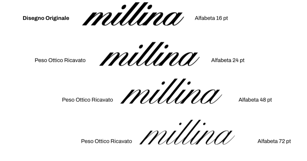
In 2021, Caterina Piatti, CEO of Reber R41, asked the team at the Florentine foundry Zetafonts to create a digital translation and expansion of Novarese’s typeface, using the letters found in R41’s transfer sheets to also derive a new corresponding Latin alphabet, and including the design of the Cyrillic alphabet as well. The working team, led by Cosimo Lorenzo Pancini and Andrea Tartarelli, developed the digital version of Alfabeta into a complete family, adding an optical development axis to the original design, thus creating 4 different optical weights suitable for various character sizes. Novarese’s original (Alfabeta 16) is suitable for smaller sizes and has thicker strokes; the three derived weights (Alfabeta 24, Alfabeta 48, Alfabeta 72) have a display appearance with thinner strokes.
(The optical weights of Zetafonts’ revival of Alfabeta)
1.Novarese’s Transition from Nebiolo to Reber.
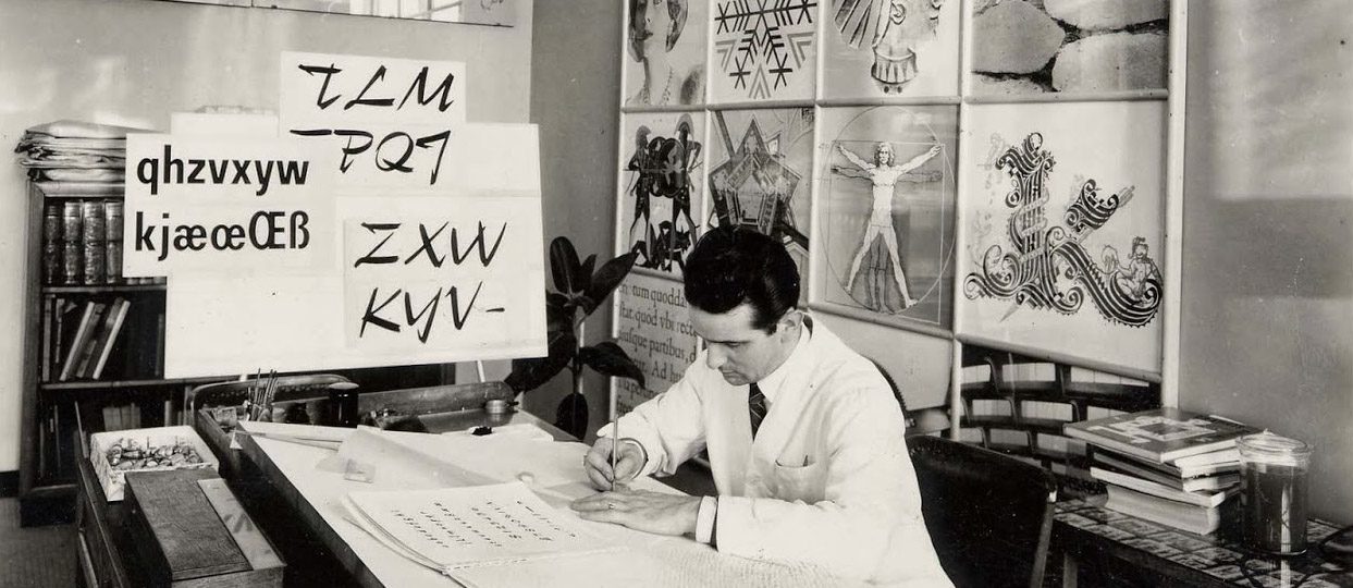
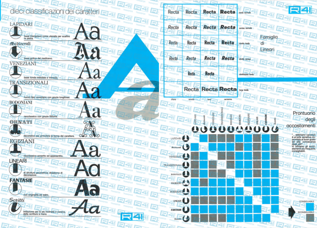
In 1972, Aldo Novarese left his position as director of the Artistic Studio at Nebiolo, Italy’s most important type foundry, to begin a freelance career. Among the many foreign brands he collaborated with in the last twenty years of his life (ITC, Visual Graphics, Berthold, Tygra), there was only one Italian brand: Reber S.p.a. of Spresiano (Treviso), owner of the historic R41 transfer letter brand, Italy’s answer to Letraset‘s technology. For Reber, Novarese positioned himself not only as a type designer but also as a consultant for graphics and texts. His influence is evident from Reber’s transfer character catalog, which opens with tables on writing development created by Novarese for his 1964 volume “Alfa Beta.” Novarese also includes tables on type classification and linear design space from the same volume, along with his “Pairings Guide.”
(R41 brochure designed by Aldo Novarese)</>
It was a collaboration that continued throughout the rest of his career, leading R41 to publish the transfer version of several Novarese typefaces during the ’70s and ’80s. These included fonts from Nebiolo’s catalog (in addition to the well-known Eurostile, the R41 catalog includes Forma, Recta, Estro, Elite, Stop, Metropol, and Dattilo) and previously unpublished fonts (such as Orbital or Unipol). The collaborations between Novarese and Reber are numerous and often poorly documented. They include several typefaces such as Center, Equator, or Proclam, which Novarese published in his book “Il Segno Alfabetico” without indicating the publisher. However, certain typefaces are definitely attributed to Reber in Novarese’s volume. These include the aforementioned Olimpia, Stadio (a bold reverse-contrast sans-serif, for which Zetafonts has licensed the revival Stadio Now from R41), and, of course, Alfabeta.
(Alfabeta in the pages of the book “Il segno alfabetico”, 1998)
2.Design of Alfabeta.
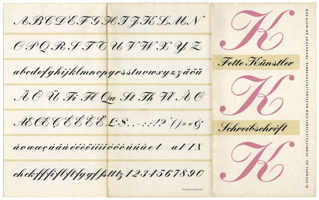
Although many of Novarese’s most famous fonts have calligraphic influences (consider Estro, Cigno, or Slogan, for example,), he was more of a “type designer” than a calligrapher. His typographic constructions owe more to the compass than to ductus, as evidenced by his personal obsession with constructive grids, which led him to describe calligraphic scripts such as uncial and gothic in geometric terms. In this sense, his approach to designing the Greek alphabet in the style of English cursive is more indebted to a Bodonian and intellectual conception of design than to calligraphic practice. The letters of Alfabeta are evidently drawn one by one, without concern for the natural movement of the hand, with a typographic focus on shapes and counterforms. And the Kunstler he used to develop Alfabeta is not the original, rigorous Künstler-Schreibschrift from Stempel (1903) but rather Hans Bohn’s Fette Kunstler, which was present in the R41 catalog.
(Depliant of Fette Künstler-Schreibschrift by Hans Bohn – Stempel)
Bohn’s typeface served as a basis for Novarese’s expansion into the Greek alphabet, with proportions that suited the transfer technology, as the strokes were much thicker and more solid. Novarese added his own movements and intentions to Bohn’s work in the finals, alternating monolinear strokes, drop terminals, and variable strokes, creating a more graphic effect reminiscent of lettering rather than calligraphy.
(Letters of Alfabeta derived from Novarese based on the Bohn model)
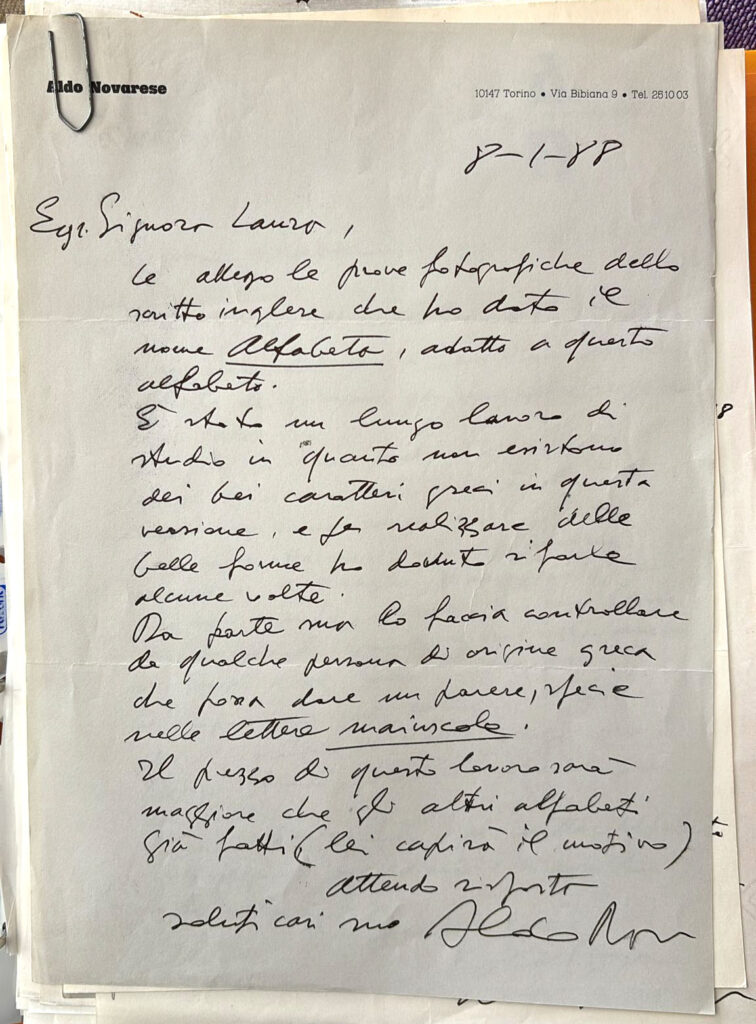
The challenge, as Novarese himself admitted in a letter from January 1988, was the difficulty of drawing other letters, especially uppercase ones, for which it was hard to find a reliable model. Novarese wrote to the client, “It has been a long study because there are no beautiful Greek characters in this version, and to create beautiful shapes, I had to redo them several times.” He also requested feedback, especially on uppercase letters, from someone of Greek origin.
(Letter of Aldo Novarese, January 1988)
3.The Logic of Redesign.
The request from R41 for the designers at Zetafonts led them to retrace the steps of Novarese’s research, carried out over four decades earlier. Rather than following the historical model of English calligraphic cursive, it was necessary to confront how such a style had been rendered in movable lead typefaces.
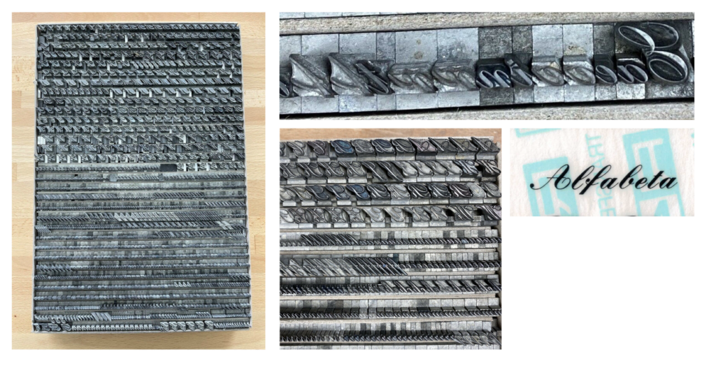
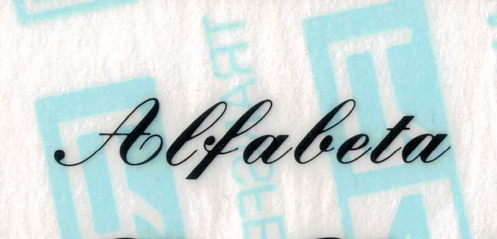
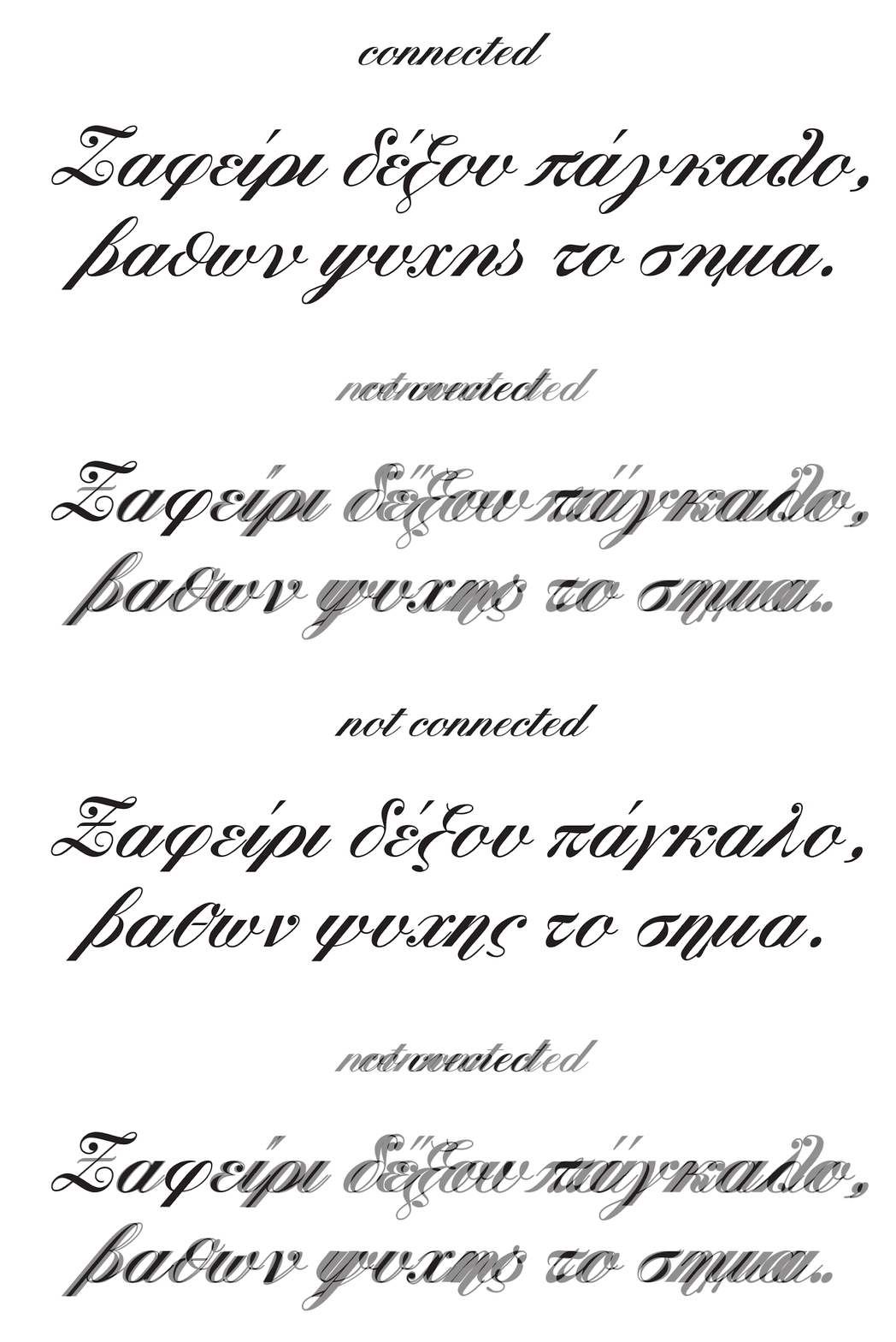
The modular nature of these typefaces made it very difficult to achieve continuous connections between letters, resulting in a visual rhythm that only appeared fluid. Observing the transfer sheet of Alfabeta, one can see how the name of the typeface is composed of separate letters, precisely composed in Bohn’s Fette Kunstler, arranged according to typographic logic, that is, not connected to each other.
Initially, Zetafonts designers considered developing the Latin of Alfabeta following this disconnected logic, but they soon realized that the risk was to reproduce in digitalization a technical limitation that the digital medium easily overcame. It was also necessary to propose a solution that distanced itself from the one chosen in the digitalization of URW’s Fette Kunstler, which presents an indecisive solution unacceptable by contemporary graphic design standards.
(The Fette Kunstler by Bohm used in transfers with disconnected characters compared to the semi-connected URW digitization)
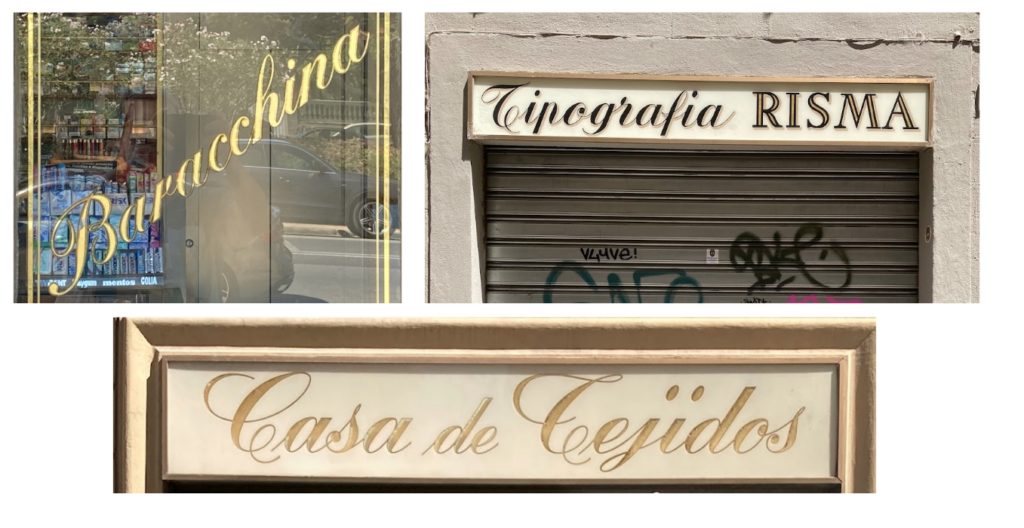
In the end, more than focusing on typographic philology, Cosimo Lorenzo Pancini and Andrea Tartarelli chose to apply to Alfabeta‘s Latin an expressive logic of continuous writing. Not only because it was the same one Novarese had followed in designing his London for Nebiolo, but also and above all to connect the typeface to the vernacular tradition of Italian signs. The idea was to create with the revival of Alfabeta a versatile typeface capable of evoking an aesthetic of highly legible cursive, with reduced ascenders and descenders, representing a strong identity sign in Italian streets.
(The vernacular cursive in Italian signs from the late twentieth century)
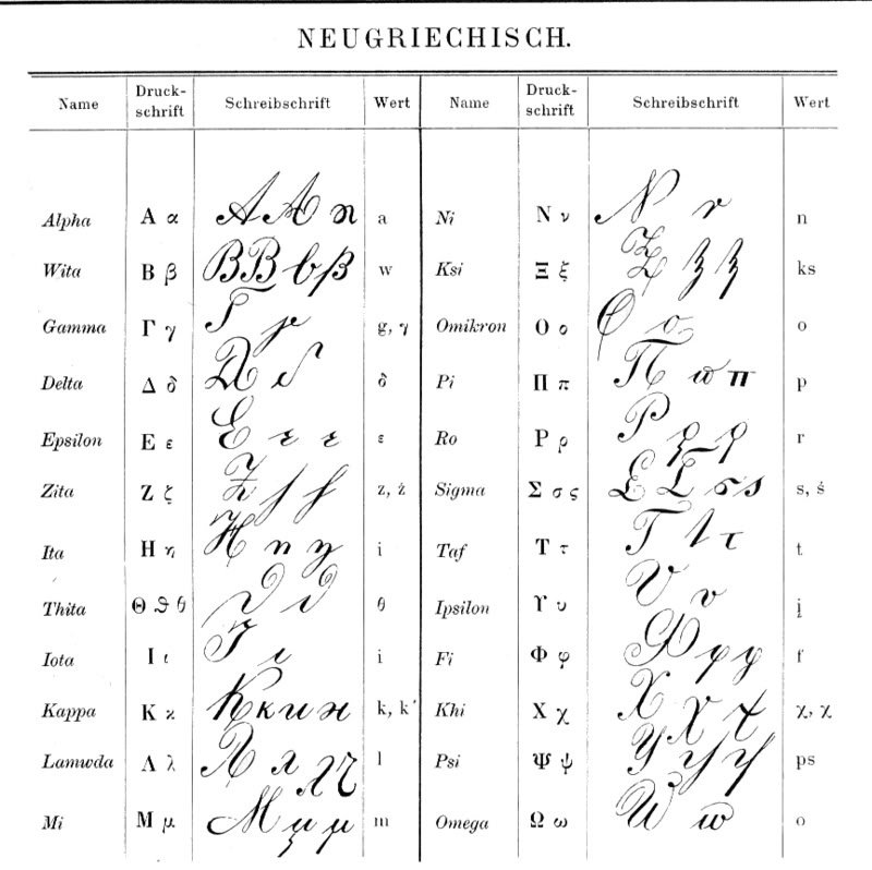
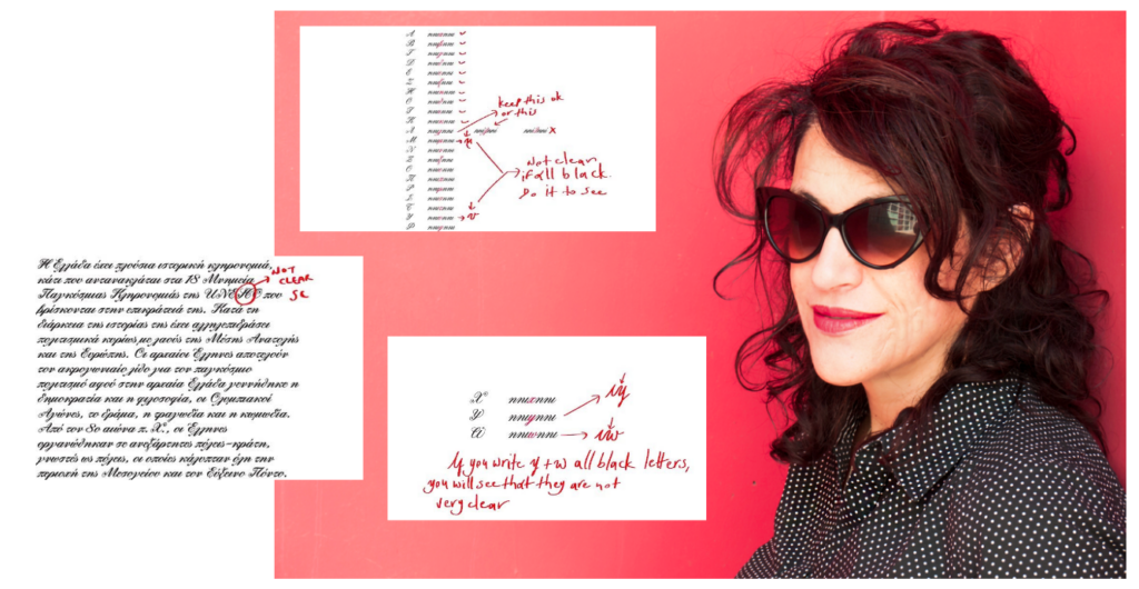
Choosing the logic of connected cursive also allowed Zetafonts designers to address and solve the technical problem left open by the brief proposed by R41 to Novarese, namely, to transport the aesthetics of a Latin copperplate to Greek writing. This is an interesting problem because, despite there being many historical uses of cursive in Greek, including a curious model inspired by Nastaliq used by Orthodox ecclesiastics, fine-point Greek cursive lacks a precise formalization. There are disparate cursive forms in common use, but the models developed at the beginning of the century based on Copperplate calligraphy manuals fell into disuse by the late 1950s. Furthermore, in everyday Greek cursive, the forms of different letters are fundamentally different from those of the non-cursive version, with kappa often taking the forms of u, pi taking the form of an omega with a diacritic above, psi resolved as a y, lambda drawn with or without a descender.
Zetafonts designers thought to verify Novarese’s choices not only on traditional models and the limited production of comparable typefaces but especially by studying the work of contemporary Greek calligraphy practitioners. The consultancy of Lena Septemvri was crucial in guiding the team in defining a correct style, almost forty years after Novarese’s desire to submit his work to the review of a native speaker.
(Corrections on Alfabeta by Lena Septemvri)
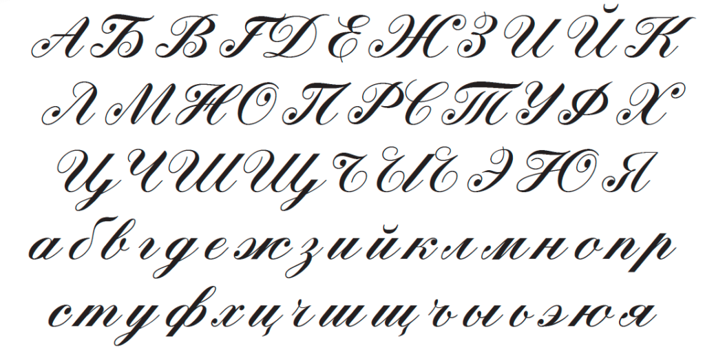
Collating this information made it possible to create an alphabet respectful not only of the Latin model and the original design intentions but also of the writing habits currently in use in Greek, and the numerous variants found in literature. This work necessarily brought the typeface back into the realm of connected cursive, and precisely because of this nature, it was possible to extend it to Cyrillic glyphs, largely derived from the logics of the Latin and Greek alphabets. That’s why, in addition to the extended Latin, the typeface includes the glyphs related to the Cyrillic alphabet, created thanks to the consultancy of Vika Ustmamova.
(Cyrillic glyphs in Alfabeta)
4.A New Alfabeta.
Starting from Novarese’s original, the new Alfabeta made by Zetafonts for R41 aimed to preserve and safeguard a little-known design by Aldo Novarese. However, we didn’t want to limit ourselves to a philological and museum-like reconstruction, merely aimed at recovering a typographic curiosity. Respecting the original spirit of Renato Bernardi’s entrepreneurial and multicultural project, we sought to expand the potential of the project and recover its usefulness in the contemporary design landscape. The use of OpenType features allowed us to reserve a “stylistic set” in the typeface for anyone wishing to use Novarese’s original design philologically. For those interested in a design tool respectful of the original concept but equipped with contemporary potential, R41 Alfabeta offers a whole series of glyphs that, thanks to Zetafonts‘ meticulous work, expand and enhance the original.
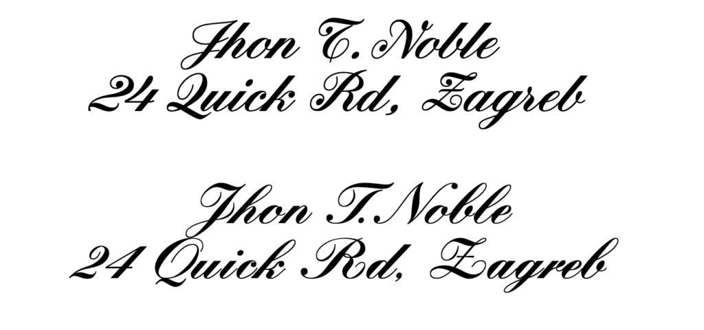
Firstly, a set of characters extending to the entire Latin alphabet Novarese’s translation choices based on Bohn’s model: less inclination, taller lowercase letters, and simplification of shapes. All typographic taste modifications that lead to better long-distance legibility.
(In the top: Alfabeta Latin, at the bottom: Kuenstler)
Secondly, a decisive embrace of the logic of the connected typeface, ignoring the technical limitations of Bohn’s work and integrating Novarese’s work on Greek done in the late 1980s with the knowledge available today through digital methods.
(Alfabeta in the original and in the redesign)
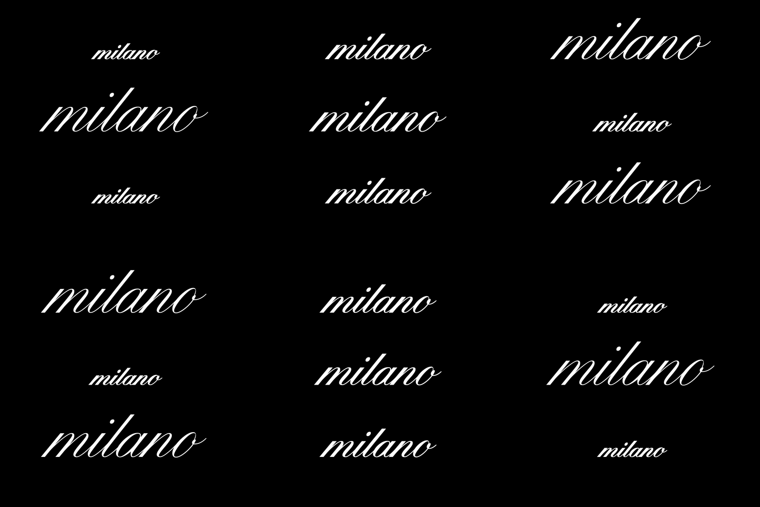
Finally, to bring Alfabeta into the 21st century, Zetafonts developed an optical axis capable of generating typeface versions suitable for display uses requiring a finer design and more delicate contrasts. R41 Alfabeta thus offers four optical weights and a variable version to move freely in the design space.
(Different sizes require a different treatment of contrast and details, available thanks to the variable version of Alfabeta.)
All these characteristics make R41 Alfabeta not only a well-deserved tribute to a great Italian master of typeface design but also a way to make available to an international and young audience a cursive typeface that, although originating from Anglo-Saxon models, is characteristic of our culture and omnipresent in the visual landscape of our cities. The collision of this type of writing with the tradition of Greek and Cyrillic calligraphy continues an intercultural discourse that Novarese had to face with difficulty almost four decades ago, and which today, thanks to the joint work of R41 and Zetafonts, finds a new life in the expressive possibilities of digital design.
R41 Alfabeta Original Client:
Original Client: Maria Laura Bernardi / Reber R41
Original Design: Aldo Novarese
Digital Revival Client: Caterina Piatti / Reber R41
Digital Revival: Cosimo Lorenzo Pancini and Andrea Tartarelli for Zetafonts
Additional Greek Consultancy: Lena Sepemviri
Additional Cyrillic Consultancy: Vika Ustmamova
Stadio now font family
Click here to find out more
