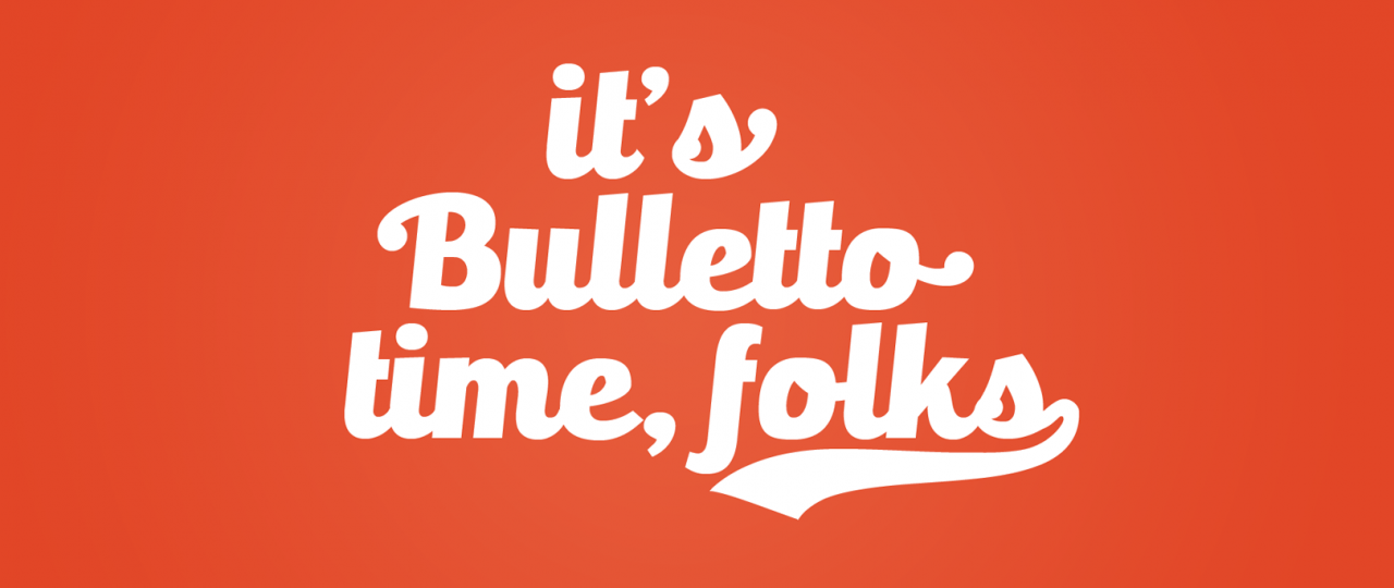
It’s Bulletto Time
Script logos and calligraphy-inspired fonts are a big trend today.
But script typography is not easy to use. Legibility issues, long ascenders and descenders, problems with all-uppercase words. We saw some interesting typefaces trying to address at least the readability issue – like the ubiquous Lobster font – but we were still not satisfied. We wanted to create a script typeface that was a bit like a swiss knife for designers, with easy to use features and a good result in display use but also in typesetting for short texts.
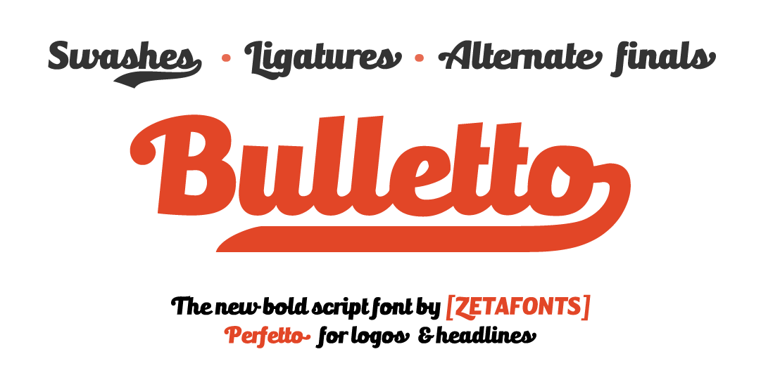
This led us to create our new typeface: Bulletto.
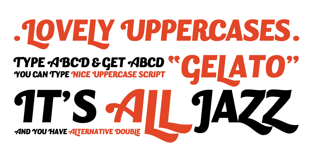
Bulletto was designed to maximize legibility in bold italic characters. Its shapes take inspiration from Digitalino, the fat typeface designed by Francesco Canovaro for Digitalic brand identity. To add a script flavour all uppercase letters have a small swash with a round ball terminal, and to avoid clashes between letters in all-uppercase words, a secondary set of uppercase was designed:
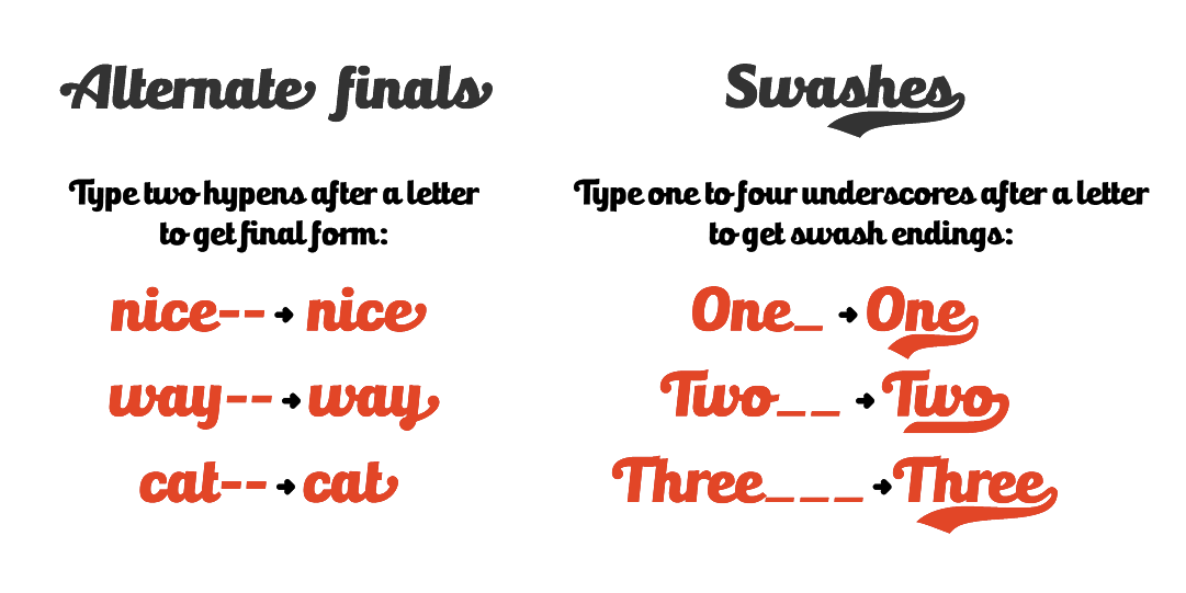
This effect is obtained by open type substitution and can be disabled by switching off standard ligatures. A set of final forms for lowercases and some swash endings where added too. To obtain the final form, allow opentype final form alternates or simply type two hyphens after the letter. Similarly, type one to four underscores after the last letter to get swash endings:
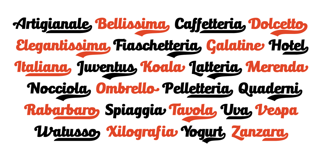
The use of swashes and alternates makes creation of simple logos very easy.
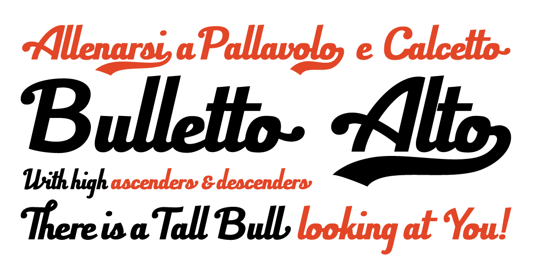
From the original Bulletto design (Bulletto Killa), many different variants were developed. Bulletto Monoline, is a light monoweight version, while Bulletto Alto is a version with taller ascendants and descendants and a slight slant.
Like all Zetafonts typefaces, Bulletto is free for non commercial uses. Try it now!
Bulletto font family
Click here to find out more