Virus Fonts, London
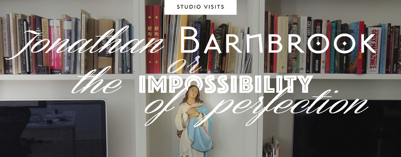
Jonathan Barnbrook is one of our design heroes.
He created some of the most successful postmodern typefaces for Emigre, including Mason – now part of the digital collection of MOMA.
He designed the definitive art book for Damien Hirst, I Want To Spend the Rest of My Life Everywhere, with Everyone, One to One, Always, Forever, Now.
In 1999 he participated in the First Things First Manifesto signed by graphic designers, students and photographers who proposed a reversal of priorities in the way graphic design was used commercially.
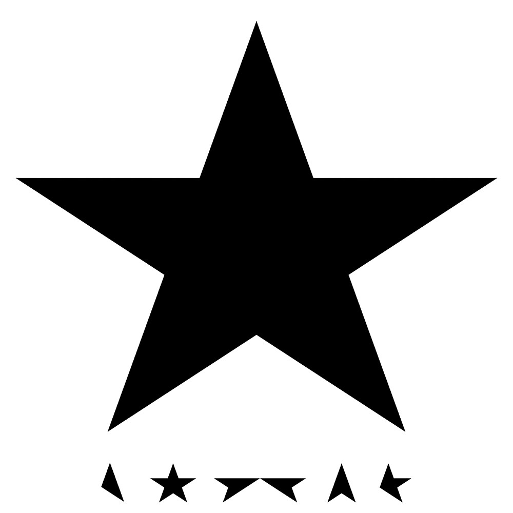
He designed the covers for David Bowie last albums, including the minimal masterpiece Black Star.
And despite his worldwide success, he managed to stay faithful to his own deep belief that design ‘can change the world when it works in service of the right people and gets an issue on the mainstream political agenda’.
We meet Jonathan Barnbrook in his studio in London to talk about his latest projects, find a definition for the type design scene of the nineties that saw him as a typedesign rock star, and discuss his work philosophy.
I must start by stating how much your work, both as a graphic and typeface designer, has had an influence on our studio early designs. We had discovered your typefaces in the pages of Emigre magazine and were incredibly inspired by that experimental type design scene of the late nineties…
Digital typeface design had just been invented at the time and designers picked up that software a bit like the young in the fifties had done with electric guitars – more to express themselves than to create anything to sell. So each foundry was a bit like a music label, not a mainstream label but rather an underground one – each font being an obscure vinyl record that a few people would understand. But sometimes the ideas were understood – a bit like the way that everybody ended up listening to the Velvet Underground. In the end these experiments are still being taken on and used by the type industry today. That rule breaking had to happen to make designers understand better the nature of today’s typography, to go back to values of legibility and usable fonts.
Where you part of a scene of likewise minded designers at the time?
I think the scene was international, though mainly based in California around Emigre: Jeff Keedy, Elliot Earls, the LettError boys, Max Kisman and the early FontFont releases… And Brody, naturally. He was the one who for me started it. He was so far ahead of everybody when I was still at art school and he was doing his own typefaces and designing his own unique visual language. It felt like it was completely personal vocabulary that you responded to first on an emotional level, a world away from the corporate identity stuff we were being taught.
Digital design allowed for experimentation in analogue form too, with all those grunge looking fonts… I remember a typeface you did inspired by bad rubdown lettering from porno mags and christian leaflets…
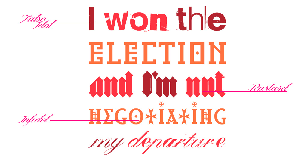
Yeah, it is called “False Idol”. The idea was working with an aesthetic that everybody hated, bad letrasetting which to many looked amateur but I loved the look of. I can also remember Barry Deck’s Template Gothic and people complaining because it was badly drawn: and actually that was the point. Or think about Jeff Keedy: he was an incredibly intellectual designer but he chose to modify typefaces ‘badly’ with the freedom that postmodernism gave designers and it gave typography something very contemporary.
This is something I miss in today’s new releases, it seems every typeface is nothing more than a slick revival. I’m thinking about some beautiful and successful typefaces like Archer and Neutra by Hoefler…
It all started with Jonathan Hoefler in a way. The technology that made it possible for him to make these amazing releases was the same that made me and other do much more ‘niche’ stuff.
Do you thing is there a type design scene nowadays in the way that the Emigre scene was? A community of likeminded people, with the same spirit of those pioneering years?
I think there are many more people doing typeface design now. And i think there are certain places like Reading University and the Hague that are very important hubs of serious discussion about type design and where it is going. But at that time it was literally a group of no more than ten-fifteen people I was in contact with after I left college. We weren’t really businesses and were intensely disliked by a lot of older designers but we felt like we were doing something new.
I like this music comparison you made – each typeface being like a song, having an history or an idea. Yours were often labelled as provocative, due to their names taken from drugs (Prozac), weapons (Exocet), diseases (Tourette) or even serial killers (Manson)…
You know, it’s a combination of being serious and also making a witty observation which makes you smile. Not trying to provoke people but to make people think. When you do research you often go somewhere else, somewhere completely different from where you imagined. And that somewhere else can be quite upsetting to some people- as with the name of the typeface Manson / Mason.
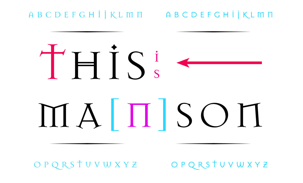
I didn’t do it to try and shock people: that would be pointless. It was more about the duality of language and this is a theme which seemed quite a legitimate one to me. So there’s no intentional provocation: it was about thinking things through on the subject of language and what a typeface does.
It seems to me your themes of typographical research are often linked to a sort of primeval culture, connected to the occult, the runic and the primitive and many people felt this connection…
I didn’t know I was a researcher at all to tell the truth. But thinking about Mason, I didn’t really get the connections at the time. I simply drew it using the signs that were directly around me in London and those places which had some kind of… magic. So, yes: there is the runic element, but not consciously put into it. People thought I was referring to the history of typography but I was really more interested in the psychology of perception. Because typography it’s about the whole world, it’s not just about letterforms. That may be part of the problem today: people just think that typography is typography when it actually underpins all communication and has therefore all those associations and meanings. The way people use letterforms can show the way they think – and using a letterform that was done thirty years ago is related to the power of people who put that letterform there, even to its political significance.
The way that culture and politics influence your typeface design is evident in your latest two projects, the Rattera typeface and the Northern Ireland fonts. Rattera is probably the most extreme typography project I’ve ever seen: you translated into a pictogram font the ideas and concept of scholar, artist and schizophrenic Alfred Rattera (1942-2001), trying to condense thousands of pages of handwritten notes…
My idea of transforming Rattera ideas in a typeface was influenced by much of the stuff I was reading at the time, JG Ballard and some writings by a movement called the Hauntological Movement. It is very difficult to describe it – like a mythology of the close past and very British. It comes about partly because British culture has been neglected, partly from melancholic feelings about growing up. Rattera work is very much about that, and the way all things link together: mathematics, art, typography. But also about the power structures that are around us, nowadays there are a lot of conspiracy theories and I think it’s so easy to become taken in: it’s a terrible thing to point out but I think human beings can be very easily manipulated. You know this is the thing that the Nazis found out and this is the thing that most people won’t understand: that there’s a simple way to manipulate people using insane elements with a mystical – often mathematical – connection to science.
And the Rattera project, it was about understanding – and that may be influenced by the psychotherapy books I was reading at the time – how people deviate from normality. And how they enter into their own universe, into their own creative world… and how we “normal” are not so far as well from that. He was a perfect example to study to show my concerns at the time.
I felt it as very connected to your work but it was also very interesting as a typography project, because as a typeface it was almost completely unusable. And this made me think of someone speaking about your work and saying “I like to consider Barnbrook’s typefaces as works of art rather than design tools”…
You know Rattera was published as part of Fuse, and Fuse typefaces were meant to be used as well collected, though some of them have become quite surprisingly hits. The main point with the release of Rattera was to talk about those mystical elements in relation to expression in basic symbols. Something that underlies most graphic design even though we are not aware of it. There’s also an element of humour, I mean when you look at Rattera’s writing, the concepts he’s interested in, and the way he’s enclosed in his own universe – it’s at the same time completely believable and completely absurd. And this reflects the prejudices and the interests of the time of when those ideas were born.
This reminds me of Apocalypso, your typeface of “dingbats for the end of the world” – a sour meditation on the feelings at the end of the millennium. I think that this end-of-the-millennium fear was there in many of your projects… I think about your Mason and Exocet typefaces who were adopted by the videogame and film industry as perfect fonts for horror games and movies, to express anxiety. Maybe your design strategy was not rational – as you said – but it struck some chords.
Well, in working with David Bowie I realised that something similar happened to him. I mean, you listen to his previous music and realise he’s channelling something that represents that age which I think that maybe even he didn’t understand at the time. An expression of the way people felt or the ideology that surrounded him. Only ten or twenty years later can you understand it. That’s the way it goes with these typefaces too. Mason and Exocet were done in the early nineties, and at that time you know they already had that pre-millennial apocalyptic feeling quite ahead of the time. There were other reasons to design them in that way, one major one is that we as designers felt that Modernism was finished, people just couldn’t take the grey concrete buildings everywhere and miserable typefaces, they needed something in their life and Post-modernism came with things like Memphis. It felt so exciting at the time…
I remember living through the euphoria of that age. Something I maybe miss in today’s more controlled design scene.
Well, I think there are still many interesting people around, and a lot more typefaces around today – it’s like music: you have access to so many blogs, creativity and online streaming… but you still need to know where to go to find the right stuff. I think it’s out there: it’s just maybe harder to find.
Speaking about typeface and politics, can you tell me something about the Northern Ireland typefaces project?
I’ve always been interested in the marriage of politics and letterforms and I have been doing work on an international basis about this, but I wanted to look at something that was unique to Britain. Also I was interested in the educational aspect: I needed to inform people more about a situation which I think it’s widely misunderstood here and even more misunderstood in America.
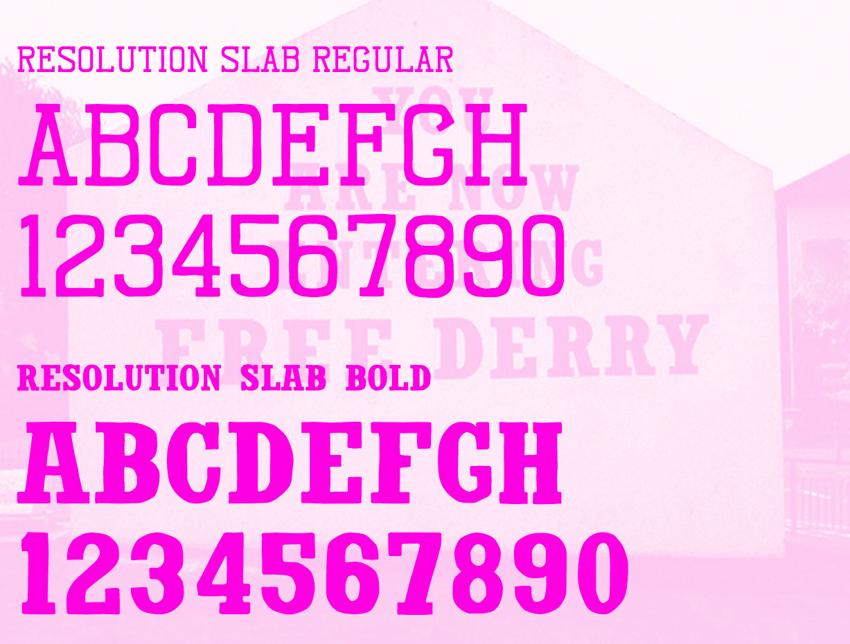
I was also very interested in working on something which I thought was undervalued: the murals from that time, because of their strong messages, are not consideras as actual graphic design pieces worth keeping, but actually they are – they have no monetary value, are displayed in public using image and typography. I think they are incredibly powerful pieces of design. The messages may not be so refined and actually disturbingly violent, but they understood the tools of design in creating them. I wanted to express this so the typefaces are all made of pieces of key bits of typography from those murals. The mural that inspired the sans serif font I released is already destroyed, but the mural that inspired the slab is still there in the Bloody Sunday area of Londonderry / Derry. It’s an incredibly significant piece of typography in terms of politics. I wanted to see what would happen if people were given that font now, how they would use it. I was wondering if the people on the Catholic or Protestant side would actually design with it in a derogatory or positive way. I’m hoping some would – and contact us and let us know (laughs).
I think your work tends to be very often provocative in a very subtle way – like your use of the celtic cross in the Exocet typeface that generated so much interest in the typeface from right wing groups…
I know. But that is because typography does use basic symbolism and Exocet incorporates that use an ancient symbol of Earth for the O. But yeah – it’s also a symbol of fascism and that generated interest in some people, not something I calculated at the time though.
Not the only case in which your work had been misunderstood or criticized for weird reasons… I saw mixed reactions from people to your Bowie cover for The Next Day, with some very harsh critiques…
Yes, but also good in a way. I mean – at the time it really upset me. At first I got angry, and then I realised that people were actually talking about ‘record cover design’ which they haven’t done for about twenty years. I thought it was very healthy to have a debate about something which actually nowadays is usually about marketing but was once a very powerful expression of visual contemporary language.
In the end the problem with graphic design today is that is not affecting people on a emotional level any more. I am thinking about what Stefan Sagmeister wrote, about the idea of touching someone’s heart with graphic design – nowadays probably you can hope for is a handful of ‘likes’…
I agree, there so many images around and so much visual noise we’re bombarded with… is more and more difficult to get through that visual tiredness. Once again, like music. It’s strange, I keep going back to the metaphor of music probably because it is something with no logic and music is why I became interested in graphics. I was educated into believing that good graphic design is based on logic but there’s something else behind music, which is also behind typography, which is mystical, about the spirit. If you picture the cavemen making marks on the walls to represent something, and then you connect to what we designers do now, using marks to go into people’s brains to make stories… well, I don’t know, it’s not about logic. That is what part of what Rattera is, those symbols actually do try to represent concepts but relate to cave paintings as well as airport pictograms and scientific notation.
I remember really enjoying the cultural clash element in Rattera – stuff like Jesus appearing in a supermarket – a sort of surrealist exquisite corpse where you mix concepts and something completely news comes from it. This playfulness – the same that Ii found in your book for Damien Hirst – is something that manages to make your work always enjoyable as “anti-fashionable”
Well there’s always been fashion in graphic design. Graphic design is ephemeral and just about the visual language of the moment. And a lot of time what we do is just to create some visual noise. This always happens in commercial jobs, often all you have to do is just do ‘something’. So I do play with this idea of fashion or anti-fashion a lot.
Italian designer Riccardo Falcinelli told me that when he was studying at Saint Martins he got constantly told “Don’t try to be too beautiful”. I believe this is a wonderful lesson.
Learning that everything doesn’t have to be perfect has been a very difficult lesson for me. In every single piece of work, I have tried to be perfect and it’s impossible. For instance every time I design a book I have to be sure that every single piece of text is kerned correctly, that the lines don’t break badly. I design in that way, because I don’t see there can be any other way to do a good book design.
Now I am a bit more experienced and lets say more mature, you have to let some things go otherwise you are on your way to a heart attack.
And also, it is quite nice to let people build their own stories about what you have done in relation to them, rather than explaining it all as you see it.
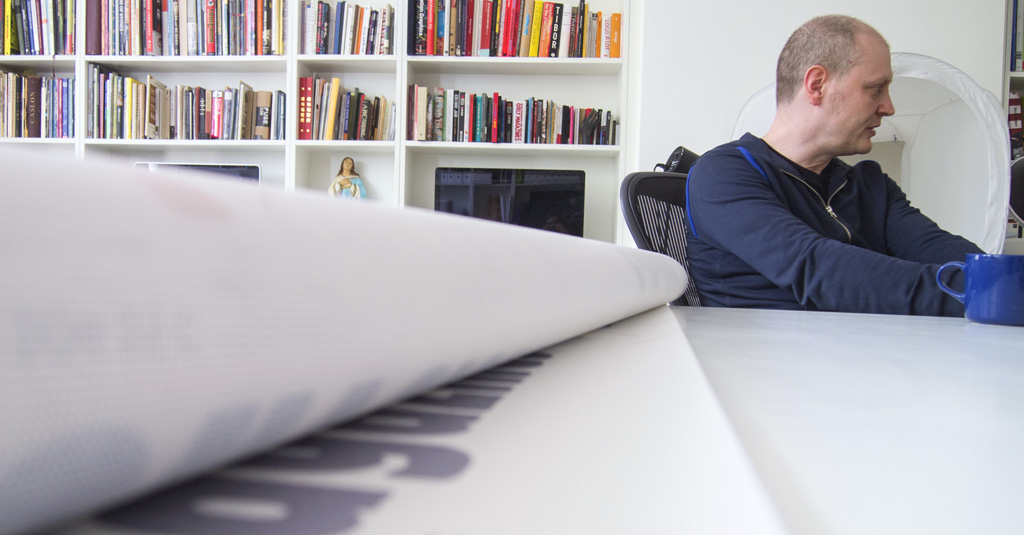
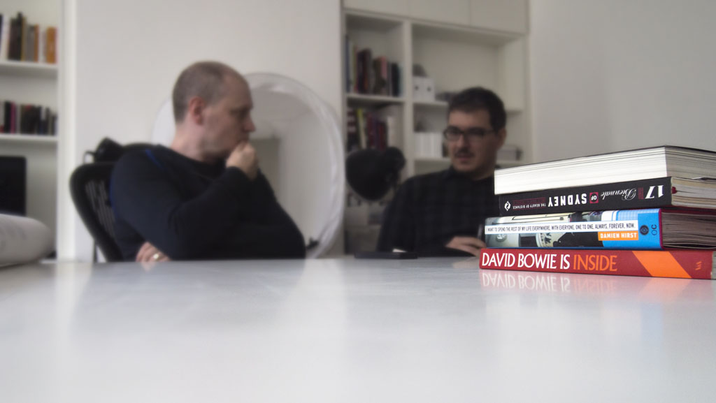
(studio photos in the article by Isabella Ahmadzadeh)
Kitsch font family
Click here to find out more