A walk in deep dreams: designing type with artificial intelligence.
In early summer 2022, two image generation softwares based on neural networks were released in open beta to the public: Dall-E by OpenAI and Midjourney AI. We had been interested in artificial intelligence and creativity assisted by neural networks since long time, and had been already admirers of their “unreasonable effectiveness“. But these new models not only far outperformed the older ones, but even our best expectations on the quality of imagery and design generated by neural networks.
While everybody was hooked on the capacity of these models to produce beautiful sci-fi concept art or realistic photographic imagery from a simple text prompt, we were far more excited to use the tools to explore abstract design spaces, looking for new typographic inventions and exploring visual remixes of historical or contemporary styles. In the same period we were invited to design the catalog of OFFF TLV festival, celebrating creative mistakes, and we decided that our contribution for the book would be a visual essay dedicated to our research on neural network generated typography , with the title “Our Mistaken Futures”.

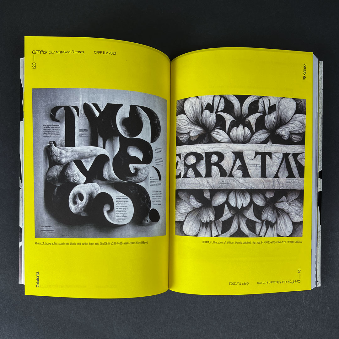
A spread from “A Beautiful Mistake” featuring typography generated with the help of neural networks.
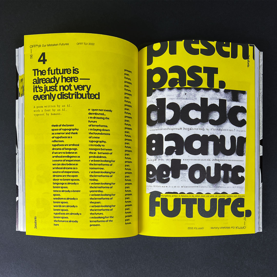
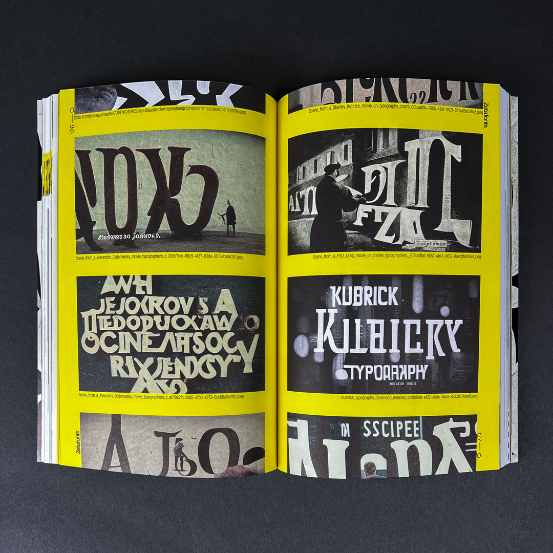
In a few days we generated thousands of images, from which we selected the ones that could suggest interesting creative paths to follow. We asked the machine to generate title sequences for imaginary movies by Stanley Kubrick, Federico Fellini and Quentin Tarantino, ghost typography, fictitious specimen pages, portraits of historical typographers, posters in any style ranging from Bauhaus to 80’s style. We selected the best results and used some of them as the base for the development of the first two typefaces of an ongoing collection project, entitled Deep Dream. And we used these fonts to typeset poetry written by another neural network model, GPT3, which can generate surprisingly coherent text.

A spread from “A Beautiful Mistake” featuring AI poetry typeset in a typeface generated with the help of neural networks.
In all these experiments, we found that the AI systems we were using were as wonderfully advanced and effective as still primitive and faulty. They shared the ambitions and the limitations of any emerging technology – producing messy results that were far more interesting for their promises than for their quality of results. These images, the first ever dreamt by a computer that had been fed the whole visual knowledge of humankind, have the same powerful vibe of 8-bit videogames, analog synthesizers and steam-powered machines, and as such are perfect tools to illustrate the links between mistakes and creativity.

A spread from “A Beautiful Mistake” featuring typography generated with the help of neural networks.
Still, after the initial enthusiasm, we soon realized the many complex implications of the technology. First and foremost are the doubts about authorship and intellectual property, given the way in which these technologies appropriate, remix and regurgitate existing artistic styles, both historical and distinctly personal. Who is the author of these images? While it feels incredibly powerful to summon detailed visual inventions with few words, one can’t deny it feels a little bit like cheating. More than creating feels like fishing: the prompt is like a bait, and you never know exactly what you will get.
Still, Deep Learning is here to stay. And it’s incredibly fun to use – it feels a bit like having the super-talented artist friend you ask to draw weird things just for the sheer pleasure of seeing drawings appear magically on paper. Therefore we decided that we could try and use Midjourney AI and Dall-E as sparring partners using the ambiguous, liquid letterforms produced by these still primitive generative models as a base for new typeface families.
The starting point for the first experiment was an image realized by Midjourney AI as part of a series on the prompt “typographic poster for an eighties movie”. Midjourney AI (then in V2) had answered with an appropriate bonanza of hyper saturated colors, triangular shapes, and pixelated typography. Francesco Canovaro started from this input, tracing the original “eighties movie” logo and trying to create a coherent set of glyphs around it.
Like in any typeface development project, the challenge is to identify the typeface “DNA” so that it can be shared by all letterforms in a coherent way. In this case, Francesco focused on the idea of having a “quasi-bitmap” font, with the regular rhythm of pixel fonts continuously challenged by unexpected artifacts and weird ligatures implied by the neural network’s interpretation of pixel letterforms. The “it” ligature, especially, has been kept straight out of the original image and – since it’s quite a common combination of characters in languages using latin glyphs, it works perfectly in the final typeface.
Another nice characteristic of Midjourney typography is the use of “monocase”, the effect of alternating upper- and lower-case letterforms in the same font. This, again is something that Canovaro kept in the typeface, thanks to a generous use of scripted alternate forms, trying to give the final typeface the dreamy dynamics of the original font.
For the second typeface, Midjourney Zero, Cosimo Lorenzo Pancini started again by a Midjourney image, this time selected from a bunch of images realized after the prompt “black and white typographic specimen”. Once again, the challenge was one of giving meaning to the mindless result of the neural network image by treating it as if it was a coherent input by a creative collaborator. In this case Pancini focused on the way that neural networks had interpreted the rhythm of geometric sans, again inserting noise and uncommon construction in an otherwise standard construction.
The key signature glyph here was the lowercase a in the third row of the original image (or, to be more precise, the formless blob in the original image that Pancini interpreted as a lowercase a). In bold geometric sans it is always very difficult to balance the black in double-story characters like “a” and “g”, and this is why the single-story alternate is often preferred. Here, the idea is to minimize the counter space rather than the lines, introducing something that was repeated also in the lowercase e.
These are only the first steps in our research, and we are hoping to expand the Deep Dream collection in the near future.
Blacker mono font family
Click here to find out more
