Zetafonts wins the Communication Arts Typography Competition 2020
Zetafonts is very glad to announce that Monterchi Type Family is a Winner of the 2020 Typography Competition sponsored by Communication Arts.
One hundred and thirty-one projects were selected by a jury of creative professionals; 1,264 entries were submitted to the competition. The selected projects are handsomely reproduced in Typography Annual 10, the January/February 2020 issue of Communication Arts, both in print and digital editions, and online at commarts.com. With the largest international circulation of any trade journal on visual communications, having work selected is considered a significant professional milestone to the creators and publishers of these award-winning projects.
About Monterchi
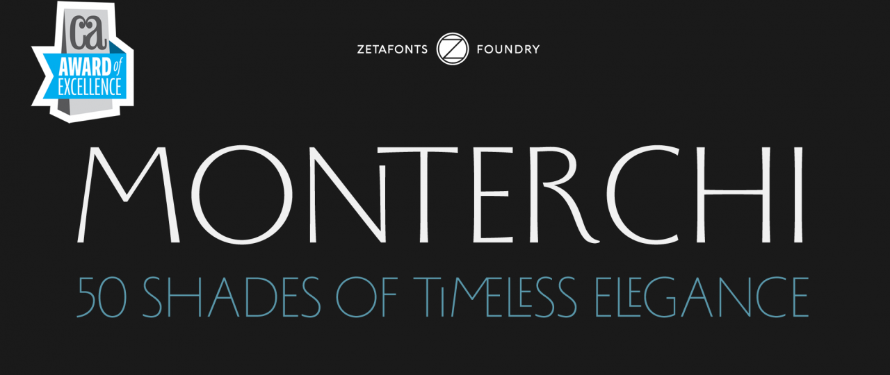
Monterchi type family was created for the rebranding of one of the masterpieces of the Italian Renaissance, the “Madonna del Parto” fresco by Piero della Francesca. His hand-painted autograph inscriptions inspired the elegant letterforms and the quirky ligature forms included in the four variants of this 50-weights ode to the beauty of classical roman letterforms. With his elegant, historical aesthetic, Monterchi embodies the spirit of early Renaissance and the humanist obsession with geometric beauty, while providing designers with over a versatile extended glyph set covering over 200 languages using the Latin alphabet, as well as Greek and Russian Cyrillic.
About Communication Arts
Communication Arts is a professional journal for designers, art directors, design firms, corporate design departments, agencies, illustrators, photographers and everyone involved in visual communications. Through its editorials, feature articles and the annual competitions it sponsors, CA provides new ideas and information, while promoting the highest professional standards for the field. Now in its 60th year, CA continues to showcase the current best—whether it’s from industry veterans or tomorrow’s stars—in advertising, design, photography, illustration, interactive and typography. Everything is reproduced with quality printing and attention to detail unmatched by any trade publication anywhere. With a paid circulation of over 25,000 (21,766 subscribers and 3,424 single copy sales), CA has a rich tradition of representing the aspirations of a continually-growing and quality-conscious field of visual communications. CA’s editorial content, knowledgeable presentation and writing, use of color and quality reproduction are all designed to be consistent with the standards CA’s readers set for themselves in their own careers.
About the 10th Typography Competition and Annual
Published each January, the Typography Annual incorporates special reproduction techniques developed by CA, including quality 200-line color separation and printing on premium 70 lb. coated paper by one of the finest printers in the United States. Everything that was originally in color is reproduced in color at a size that allows the concept to be understood.
Monterchi font family
Click here to find out more