Interview with Valentina Casali
this blog post is typeset in bogart font family
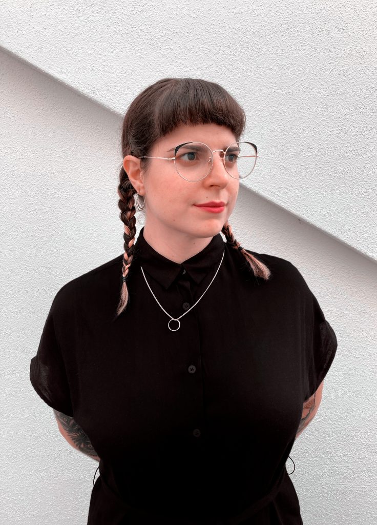
Valentina Casali is a multidisciplinary designer. She deals with lettering, type design, stone carving and sign painting.
Valentina has been working in the field of visual communication since 2010, and since 2013 as a freelancer. She has received awards from design publications such as Communication Arts, SPD and AIAP. She teaches lettering and type design at IED in Turin, at the NID in Perugia and at the Academy of Fine Arts in Macerata.
She is also editor of the project Lettering da Jesi and in her spare time she embroiders textile accessories for home decor under the pseudonym of Tiger Mochi. Together with Marco Goran Romano she founded the Sunday Büro studio.
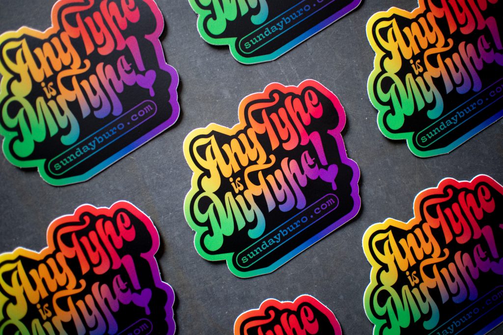
In recent years, hand drawn fonts and script typefaces have become popular in both printed products and digital content. What could be the reason according to you?
I don’t know, I have to admit I’ve never thought about it. I believe that part of the success that this type of fonts has enjoyed in recent times is thanks to social media. In the last years, in fact, there has been a proliferation of calligraphers and lettering artists who have shared their work in progress on platforms such as Instagram, Facebook and Youtube. This has resulted in an increasing number of people falling in love with their works. From there, it was a short step and, obviously, type designers took the opportunity to produce fonts capable of responding to the growing demand of the public.
Going further I could say that in reality script typefaces have never gone out of fashion: they have always existed and have been used in the most disparate contexts. In the history books of Graphic Design we often talk about which were the “breaking movements”, so we talk about Modernism as if in those years only Eurostile or Helvetica were used. Actually, things are different, we were able to identify certain currents of thought on design only because they distanced themselves from what was the common taste of that particular historical moment. Designers have always used and will always use them because through their shapes they are able to convey multiple sensations: elegance and refinement, but at the same time warmth and uniqueness too. Above all, they are the connecting point between writing and typography. Looking back, I believe that in the end the technological limit of movable type printing was a spur for the engravers of the time (and the type designers of today), who aimed to produce script fonts almost indistinguishable from handwriting.
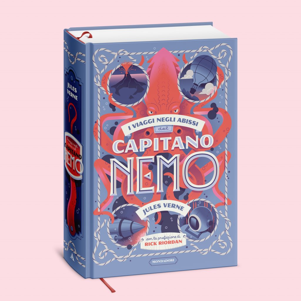
How do you experience the relationship between type design and lettering? And how do you transfer your manual experience into digital projects?
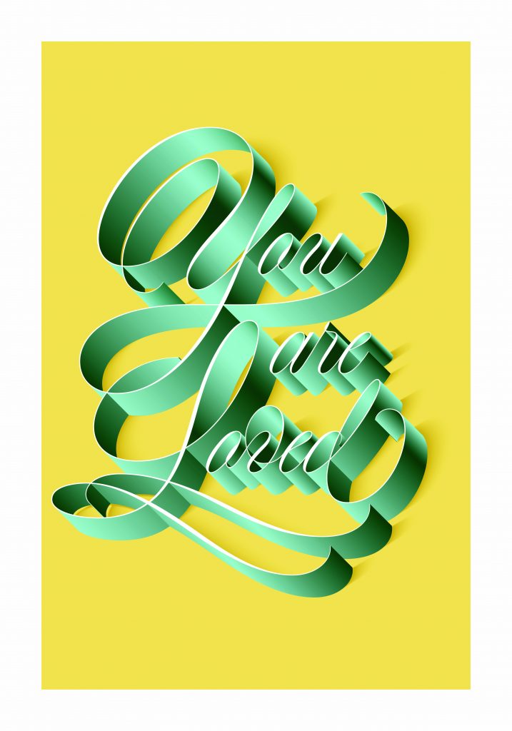
I had a hard time moving from lettering to type design, it is not easy to make compromises in the name of readability and consistency of the alphabetical set. In the past, when I was designing a lettering I always tried to enrich each letter with details in an attempt to make it unique.
Type design, on the other hand, made me realize that even in lettering I can occasionally decrease the complexity of the design in favor of greater cleanliness and uniformity. However, I consider the design of a lettering a much simpler practice when compared to that of a typeface. The latter is undoubtedly more complex, it is ultimately a question of designing a tool that others will use and over which I cannot have control. Obviously, on these occasions, I always draw on my analogue experience, on the know-how to do with hands, on which I have invested so much during my studies. In fact, I believe that knowing certain reproduction techniques is essential to be able to better master the drawing of letters in digital. Otherwise, it is like getting on a racing bike without having learned to maintain balance on a bike.
In your artwork you use traditional techniques such as gold leaf and stone engraving. Why working with these techniques in an era in which the use of lettering is mainly digital?
I want my hands to learn to manage matter. Inside, I really feel the need to gain experience on different supports and with different tools. I am also convinced that over time all these craftsmanship skills are destined to disappear and I don’t want that to happen. I want to be the guardian of certain knowledge, it is almost my mission. Not to mention the fact that I am crazy about the idea that my works can become objects of common use: things that are appreciated for their workmanship and that people decide to welcome into their own homes.
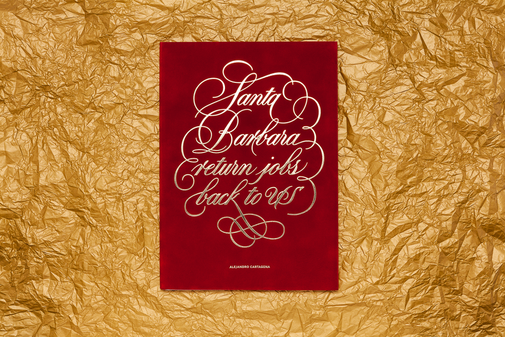
Images Courtesy of Valentina Casali
This is an extract from the 2022 Type Trends Lookbook, developed together with the educational team of Typecampus and including a series of 9 interviews with renowned designers and type experts who discuss the present and future of type design and the visual industry.
READ MORE
this blog post is typeset in
Bogart font family
Click here to find out more
Bogart font family
Click here to find out more
