Interview with Raissa Pardini
this blog post is typeset in bogart font family
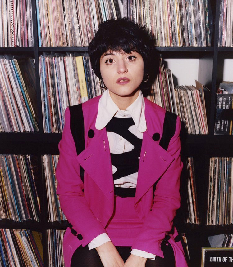
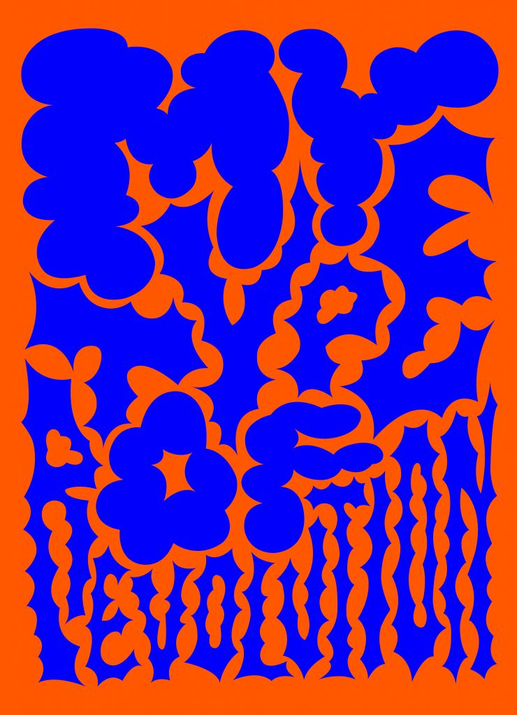
Raissa Pardini is an Italian-born, UK based visual artist who works with typography. She is a Multi-disciplinary designer specialised in Digital Typography, Graphic Design and brand focus. She has been working for many of the most interesting artists and projects around the world. She has been curved her design passion between Milan, Berlin, London and finally, Glasgow. Her work have just been added to the V&A permanent collection. She mixes old-school typography and colourful details with a contemporary eye and critique.
Typography is a clear protagonist of your artworks. You play with letters, deforming and transforming them, breaking the rules of canons, and creating a recognizable personal style. How do you think you managed to build your own personal vision?
I have always thought I’d end up doing something creative but it took me a way to get where I am now. The academic method at uni didn’t help me, in fact I felt even more confused about what to do after my graduation. Working with branding and design for other studios and places bored me after a way and I was going to put my creative carrier on the side to dedicate myself in music. It wasn’t until I decided to give freelancing a chance that I realised I had a style inside me, somehow. I started working on my own projects, choosing my own clients. And I started focussing on letters. I have always had a soft spot for alphabets and typography in general but I’d never thought I’d end up making them my strength. It was something that came as a surprise, without strong illustrative skills I kept experimenting with what I felt comfortable working with and that happened to be letters. It is a passion that grows on me more everyday, I can’t really describe it 🙂
We feel that your works connect a lot with the 70s, the Op Art, Push Pin Studio and many other visual designs created in an era that you are far too young to have experienced personally. What moves you towards this aesthetics?
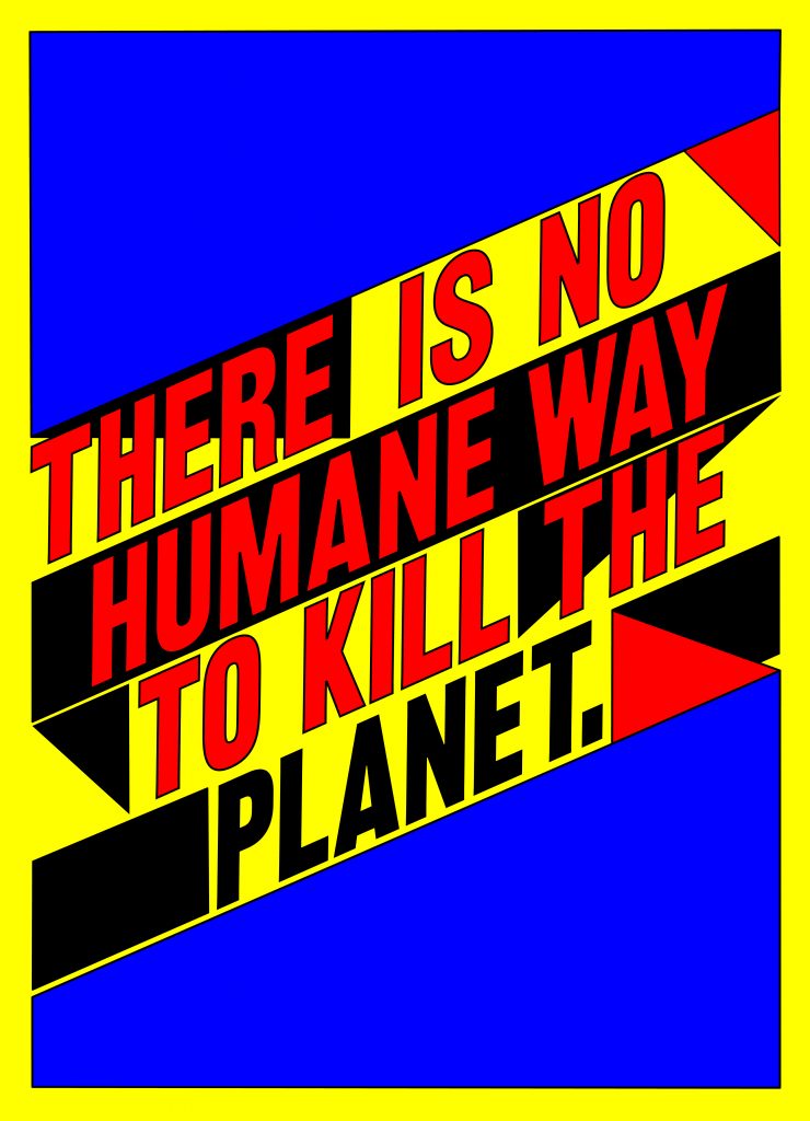
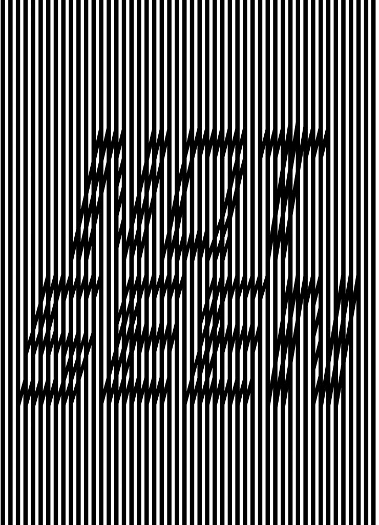
Those decades were the flourishing time of typography in my opinion. If you love type, you can’t escape them. So much was produced then and so many risks were taken that I feel experimenting was really the key of the whole 70s decade. Mine isn’t a love for the retro look, mine is a love towards the method and the way they worked. To learn how to make new fonts, I’ve always felt the need to start getting inspired from the history first. We can break the rules then, but history is there to teach us more and be curious about people who used the same skills we are using today. The primordial instinct of getting inspired by the world around us leads you to work with lines and shapes. Buildings, windows, light, shadow. That’s probably why there’s some OP art in what I do. They were inspired by geometrical composition as much as I do.
Can you name your favorite ten typefaces?
At the moment? Louput, Künstler Schreibsch, Flash Regular, Lucky, Pretoria, Shatter, Volume Four, Karin Pro, Euphoria and Brass. You’ll ask me tomorrow, I’ll have a different list I’m sure 🙂
Images Courtesy of Raissa Pardini
This is an extract from the 2022 Type Trends Lookbook, developed together with the educational team of Typecampus and including a series of 9 interviews with renowned designers and type experts who discuss the present and future of type design and the visual industry.
READ MORE
this blog post is typeset in
Bogart font family
Click here to find out more
Bogart font family
Click here to find out more