Interview with Francesco Franchi
this blog post is typeset in calvino text font family
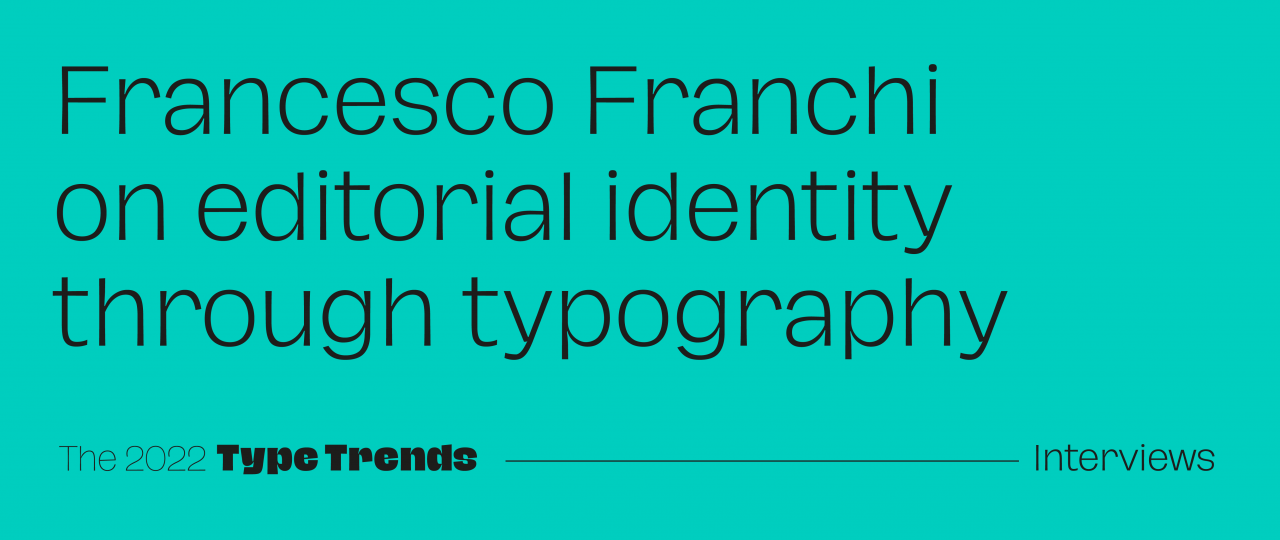
Francesco Franchi is a journalist and deputy creative director of La Repubblica. He graduated from the Politecnico in Milan with a thesis on graphic journalism for newspapers, an academic project that over the years he has transformed into a real profession. He took his first steps at Leftloft in the years when the infographics were starting to spread in Italy as well. In 2008 he joined Il Sole 24 Ore as Creative Director of IL. Intelligent Lifestyle, a magazine that has won many international awards for its innovative design. Since 2016 he has been part of the editorial team of La Repubblica, which he redesigned twice in three years. He is a member of AGI and is the author of books including Designing News and The Intelligent Lifestyle Magazine.
 Img 1
Img 1
In your rebranding design for editorial projects, the meticulous research work at the origin of each individual project is evident and then relocated in a contemporary key. How influential do you think typographic trends are, in this process of “contemporaneity” interpretation?
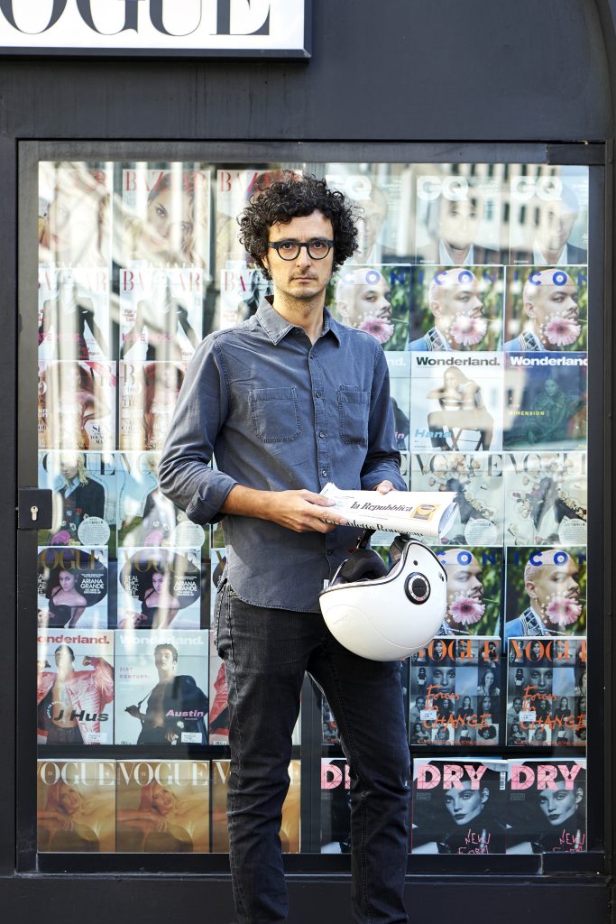
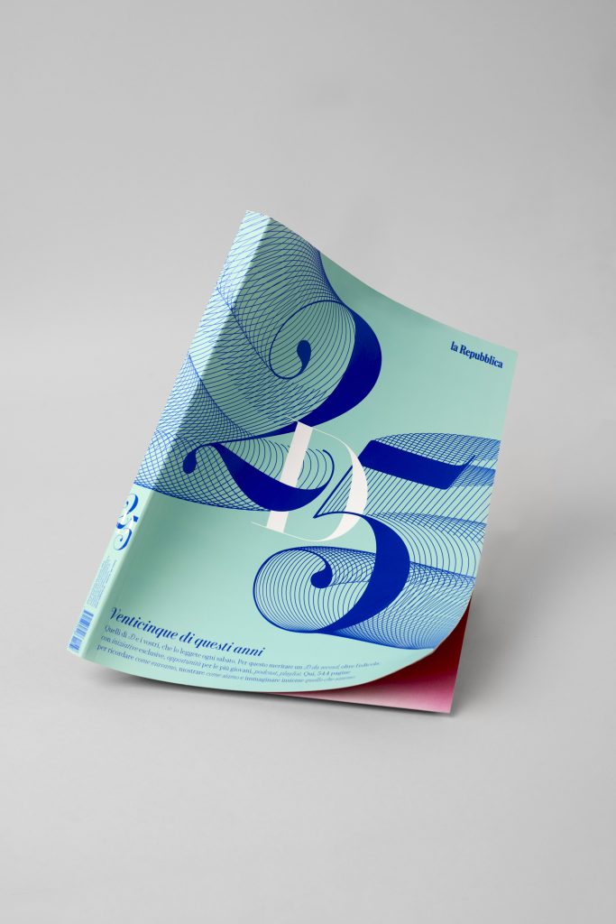
I would say that, to me, typography is mostly the starting point in a project. Take for example the last major redesign project which I was lucky enough to be part of, La Repubblica. This redesign started in 2016 with the cultural weekly editorial Robinson, but, right from the start, involved the whole newspaper and its myriad of weekly inserts (twice over three years), and later involved the magazine D and the new products common to the entire Gedi group — both in their paper and digital versions. The common factor that united and gave an identity to all these projects was the typographic family: the Eugenio font, in all its forms and uses. Eugenio is the typeface that in 2017, together with Commercial Type, we designed specifically for our newspaper. The name is not only a tribute to the founder, Eugenio Scalfari, but it is much more. It is the project of a change that started from the very origins, from that first newspaper that, since January 14th 1976, has arrived on our newsstands, revolutionizing the way of doing journalism.
 Img 2
Img 2
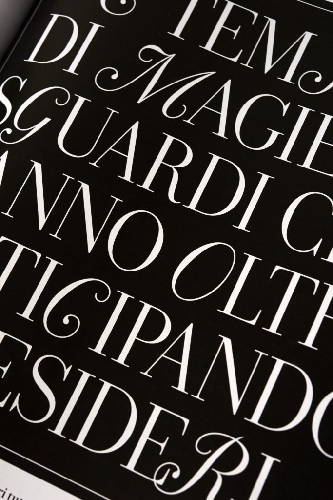
It was immediately evident that La Repubblica was not like the other newspapers. Everything was different, starting with the graphics, which used the Bodoni font, characterized by subtle serifs, instead of the sans used by other newspapers. The new graphic project, conceived together with Angelo Rinaldi, started from there, from those original typefaces, to relaunch and reinterpret them in an innovative and contemporary way. Last year, on the occasion of the 25th anniversary of the magazine D, Eugenia was born too. The font is now the protagonist of the new feminine editorial, which has become part of the Repubblica family. Eugenia is Eugenio’s calligraphic cursive. The idea, once again, was to start from the symbolic character of the Italian typographic tradition, the Bodoni, to think of something new. In fact, Eugenia is a character with a contemporary design, but that refers to the serifs of the typeface used since 1970 by the Parma designer and publisher Franco Maria Ricci, first for his series of books Morgana and then for the art magazine FMR, published in 1982.
 Img 3
Img 3
Strong attention to typography and extensive use of infographics. Why this binomial, so characteristic of your editorial production, is important for you?
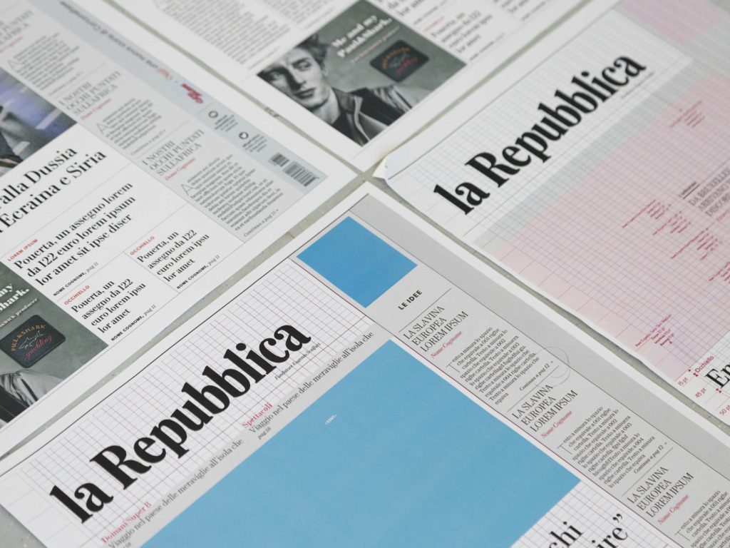
Because they are the identity elements of an editorial project, those that visually translate and package the journalistic content. The perception of objects passes through the perception of their shape, which is not the simple configuration of their shell, but the language that makes them understandable in our society. The making of a newspaper is not one that encloses, wraps and protects the content, but it is a form that originates from the content itself and from journalistic ideas, communicating the identity of that newspaper and transforming it into a product that readers will be proud of showing — as well as other consumers define themselves through the right accessory they own or wear. Attention to detail means rigor and quality, factors that are very important for a newspaper. The graphics must represent the identity of a newspaper and the graphic design must make each page and each element within that page part of a whole. So that, when you find even a small scrap of a newspaper page on the ground, you can immediately understand which newspaper it belongs to.
 Img 4
Img 4
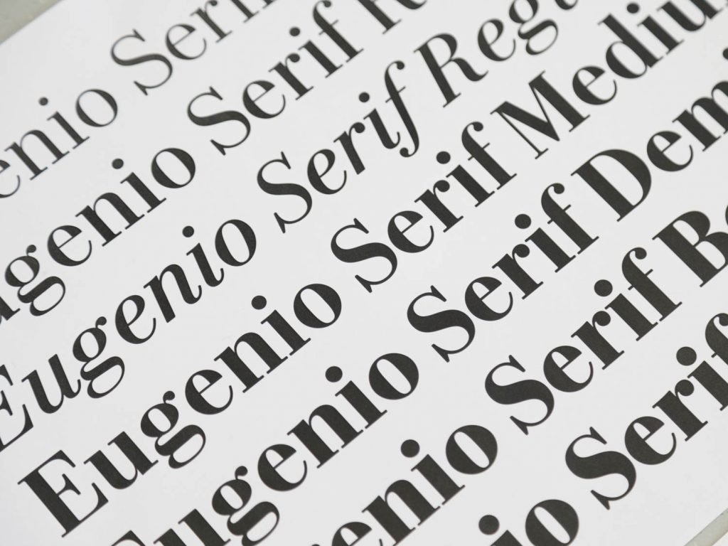
Can you name your favorite 10 quality typefaces for editorial design?
1. Eugenio 🙂 (Commercial Type) 2. Guardian Egyptian (Commercial Type) 3. Publico (Commercial Type) 4. Lyon (Commercial Type) 5. Burgess (Colophon Foundry) 6. Basis (Colophon Foundry) 7. Bradford (Lineto) 8. Sharp Grotesk (Sharp Type) 9. Founders Grotesk (Klim Type) 10. Financier (Klim Type)
Image Courtesy of Francesco Franchi
Portrait: James Mollison
1, ph. Rocco Rorandelli
2-5, ph. Stefania Zanetti
This is an extract from the 2022 Type Trends Lookbook, developed together with the educational team of Typecampus and including a series of 9 interviews with renowned designers and type experts who discuss the present and future of type design and the visual industry.
READ MORE
this blog post is typeset in
Calvino text font family
Click here to find out more
Calvino text font family
Click here to find out more