Interview with Dr. Nadine Chahine
this blog post is typeset in tarif font family
Dr. Nadine Chahine is an award-winning Lebanese type designer. She is the CEO at I Love Typography Ltd and the principal at ArabicType Ltd. She has an MA in Typeface Design from the University of Reading, UK, a PhD from Leiden University, The Netherlands, and a Master of Studies in International Relations from Cambridge University. Nadine’s work has been featured in the 5th edition of Megg’s History of Graphic Design and in 2012 she was selected by Fast Company for its 100 Most Creative People in Business. In 2017, Nadine was selected by Creative Review to their Creative Leaders 50. In 2021, Nadine was elected to the board of Type Directors Club in New York.
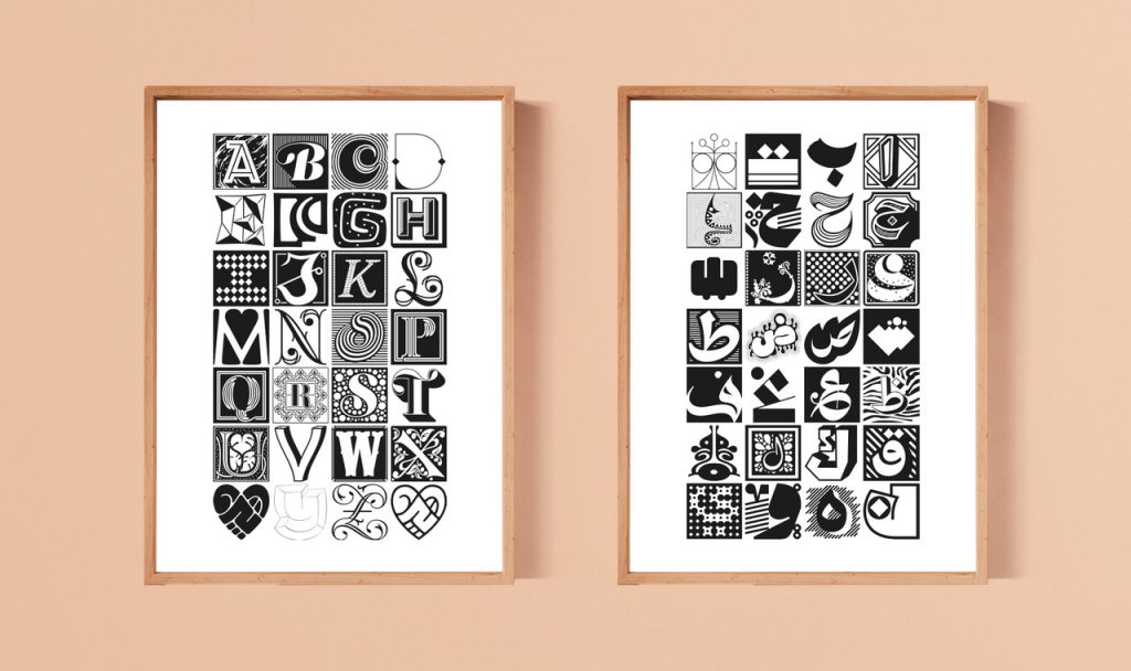
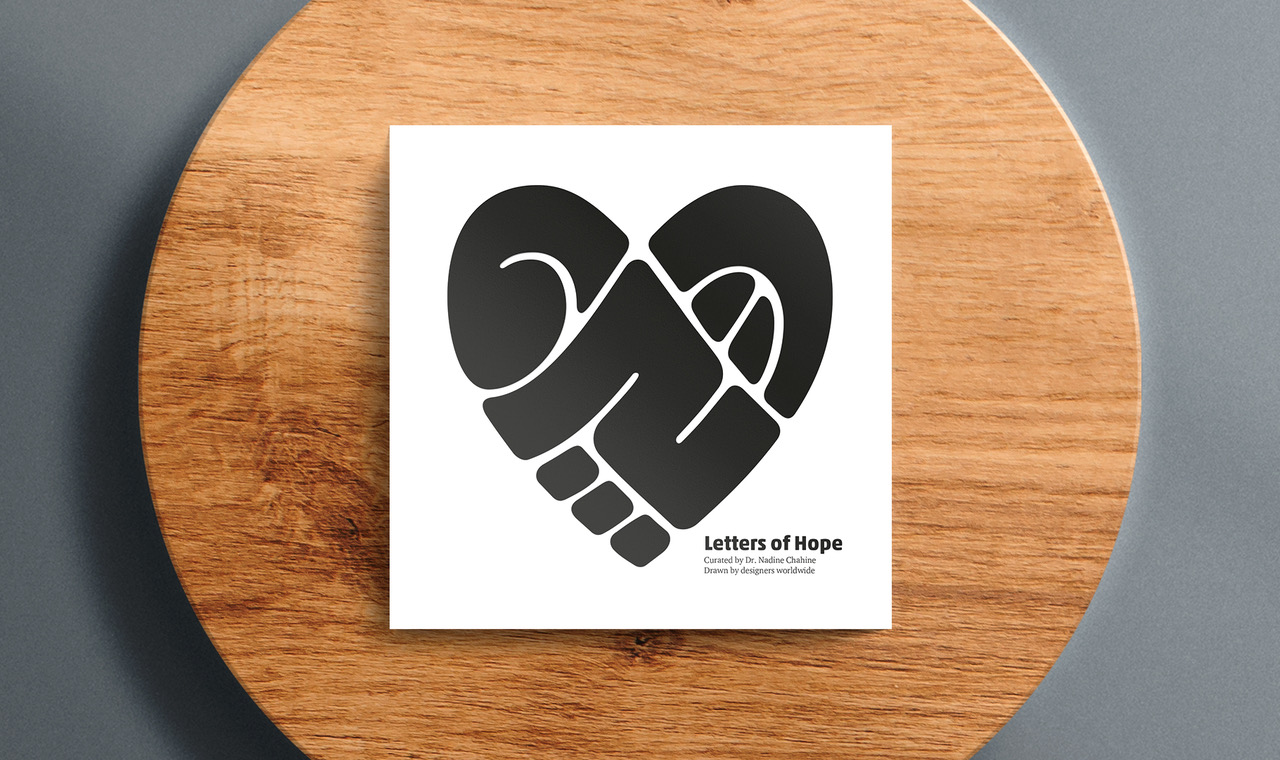
 Img. 1,2
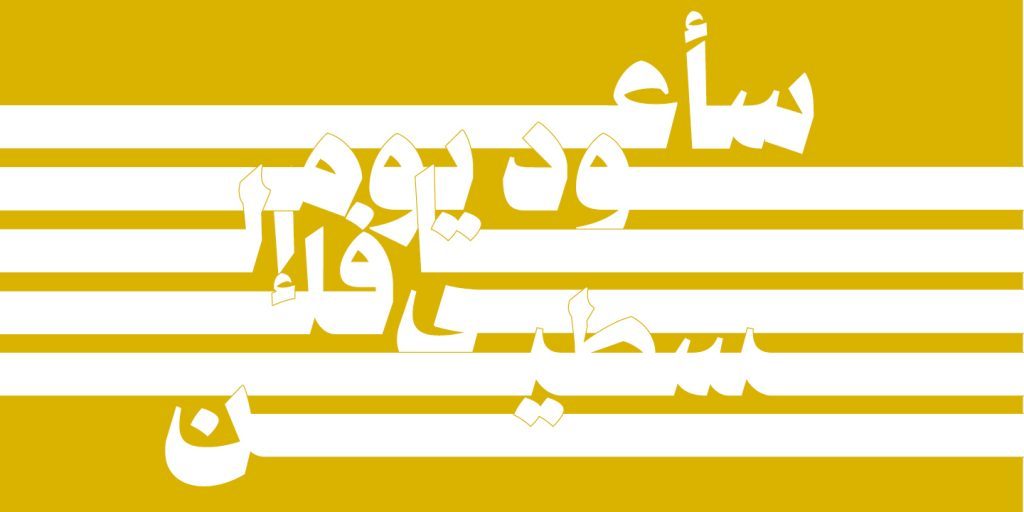
Projects such as that of Li Beirut have shown how, in the face of large-scale tragedies, the typography community has been able to respond with strength, speed and quality to support the victims of the blast in 2020. What do you think about this relationship between typography and social causes? Can typographic community play a consistent role in social and political issues even beyond emergencies?
I feel very strongly that those who are able to amplify important messages should do so. Type is intimately linked with language and visual communication and as such is in a prime position to help give shape to words and ideas that we want to communicate. This is the highest service we can give to our communities, and I do hope that a growing number of designers will take an active role in social and political activism. We live in very difficult times, and we need to step up to the challenge of supporting our communities. Type is more than custom typefaces and library releases. It’s about communication, and it would be great to look beyond the commercial aspect of our work.
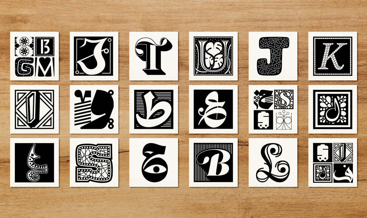
 Img. 3
As an expert in Arabic characters, in this era of strong expansion of the typographic market, could you tell us the curiosity or tendency that has struck you most in the recent productions of non-Latin characters?
I’ve been very impressed with the quality and diversity of new designs and that gives me hope for a future where typography and design blossom in our part of the world. This is so important, and so gratifying to see, and I love that there is a new generation of designers that is is passionate about type!
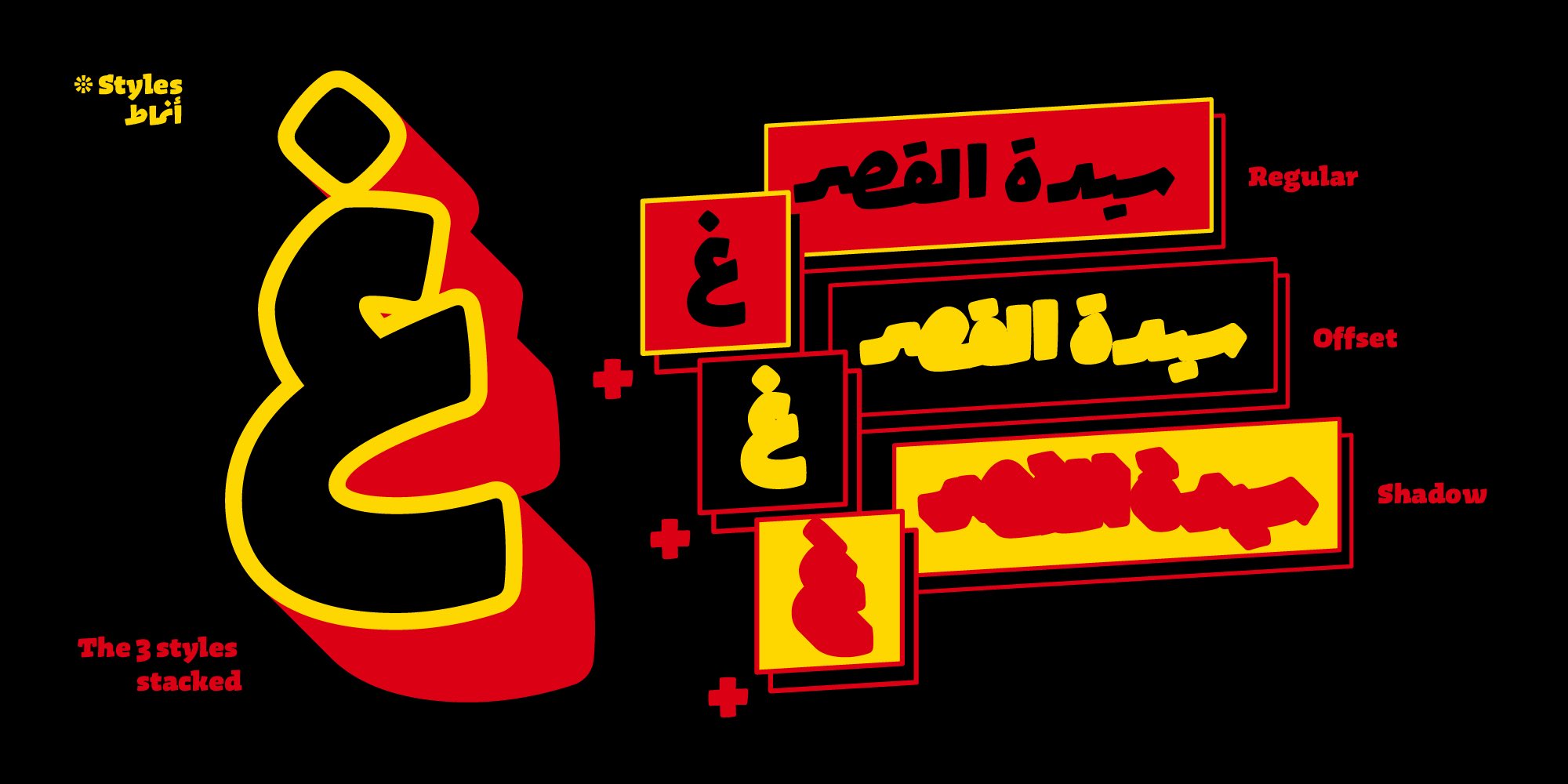
 Img. 4
Can you name five non-latin typefaces that are being relevant in this context?
In the context of Arabic typefaces, I am a big fan of Hudhud by Maha Akl and Lifta by Omaima Dajjani. Both are brilliant new designers that I expect a great future for. I am also bowled over by Sakkal Kitab by Mamoun Sakkal who has managed to design a classical typeface that has a beautiful sense of modernity in it as a well. It’s a masterpiece of type design and one to be studied in detail! Klaket by Toshi Omagari brings a fun flavour to the Ruqaa style and shows how one can be inspired by calligraphic references without needing to copy the exact styling. I also love Mizan by Kristyan Sarkis and am looking forward to when the whole system will be ready. And one extra: Graphik Arabic by Wael Morcos and Khajag Apelian. Really great typeface and I’m particularly fond of that one!
 Img.5
Img.5
Image Courtesy:
1-3, Li Beirut by Nadine Chahine. Courtesy of Nadine Chahine
4, Lifta font by Omaima Dajani
5, Klaket typeface by Toshi Omagari
This is an extract from the 2022 Type Trends Lookbook, developed together with the educational team of Typecampus and including a series of 9 interviews with renowned designers and type experts who discuss the present and future of type design and the visual industry.
READ MORE
this blog post is typeset in
Tarif font family
Click here to find out more
Tarif font family
Click here to find out more