Interview with Bill Gardner
this blog post is typeset in coco-sharp font family
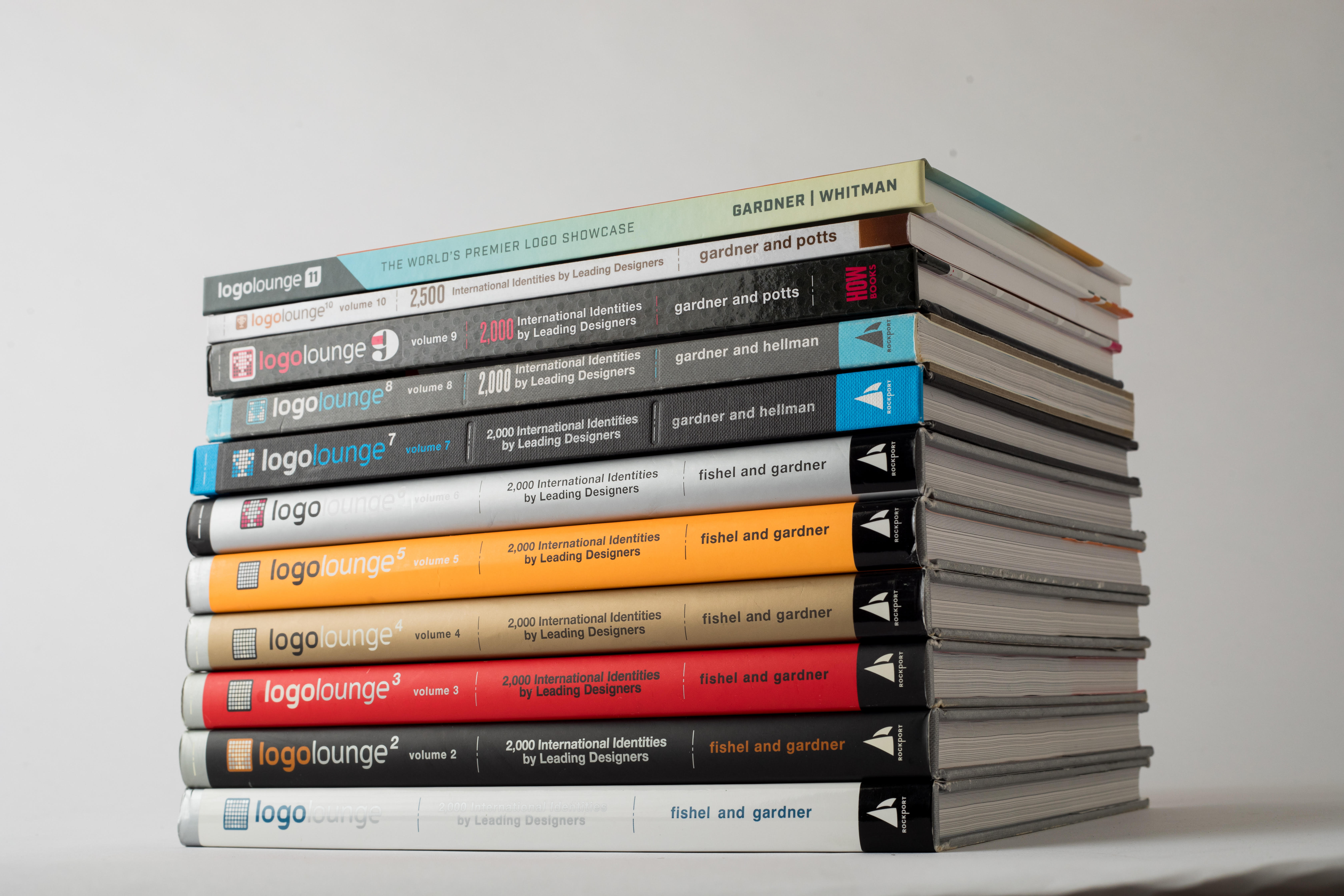
As the owner and president of Gardner Design, Bill and his team have produced effective and award winning results for such industry leaders as Cessna, Spirit AeroSystems, Bombardier/Learjet, Thermos, NFL, Facebook, Google, Pizza Hut, Coleman Outdoor, Kroger, Hallmark, Cargill Corporation, SeaWorld, and others. He understands the nuances of brand practicalities better than anyone in the business and leads his team to always first consider the business that the design is supporting. As the founder of LogoLounge.com – the international, searchable compendium of logos – Bill authored the affiliated bestselling LogoLounge book series, volumes 1-13, and is the author of the annual LogoLounge Logo Trend Report. 2013 marked the release of the highly anticipated Logo Creed, a foundation textbook for students, educators and professionals alike. Bill is also the author and presenter of LinkedIn Learning’s series of online courses concentrating on branding and identity design. In 2014, Bill became an AIGA Fellow Award recipient for his contributions to the local, national and international creative community. Bill also judges design competitions and speaks nationally and internationally on identity trends and logo development. In his spare time, he serves on several community boards and has completed a six-year term as the Territorial Vice President of the International Brotherhood of Magicians.
These have been quite messy years, or as you said in your 2021 Logolounge report, years of Drama. Nonetheless, in a scenario of visual experimentation that is trying to keep the pace with these confused times, there were also a lot of brands which chose to opt for minimal, neutral kind of visual solutions and identities. You talked about this as “blanding”. What is it exactly for you, on what does it depend?
I originally coined the word blanding as a perfect descriptor of draining all of the creative soul from an entitie’s logo or wordmark. Please note I didn’t say visual brand assets. My take is that many of the brands that scraped their logos down to the Spartan bones also had some fairly engaging visual assets that could still serve as the eye candy for the brand to build on. As an example, Peter Saville’s Burberry wordmark solution in 2018 presented the name in a ubiquitous all capitals, sans-serif and designers couldn’t help but note he had a similar solution for Calvin Klein the prior year. But at the same time that logo was being eviscerated of personality and the charging Burberry knight was relegated to a scrap heap, Peter had a plan. He crafted a truly wonderful field pattern based on an old Thomas Burberry monogram and suddenly there was a new visual focus to the brand. Keep in mind Burberry obviously had it’s signature tartan and color palette and add to this the TB monogram and you can start to see the “Bland” wordmark has purpose in this visual family. It informs and acts as a silent partner in a brand that first and foremost, must sell fashion. Burberry and other fashion centric blanding stories like, Balenciaga, Balmain, Jimmy Choo, Yves Saint Laurent, and Valentino to name a few, have to be seen in context because they have the strength of visual assets that allow flexibility to change with the market. In fashion, selling a visual product that needs to illicit diverse aesthetics may actually find a less demanding mark to be to their advantage and offer a greater flexibility. This is where the difference lies with the thousands of followers that didn’t have the rich visual context to fall back on. Those that eschewed their legacy logos for a perfunctory sans-serif wordmark may have been followers that didn’t know why this phenomenon was occurring. They were just along for the ride because seemingly so was everyone else. Near the beginning of this trend in a one month span of 2016 Google, Verizon, and Lenovo all introduced new wordmarks using unremarkable doppelgänger fonts that across the board had surrendered any level of prior originality. Because all three had been developed simultatniously it was not a case of mimicry. I do believe that the secondary and tertiary waves of this effect over subsequent years were generally less informed and were following a perceived trend without strong validation of need or outcome. It is likely the followers in those subsequent waves that will find themselves the most enthusiastic to jump at the next trend. This is likely because they never recognized the benefits of those that made the blanding jump based on logic as opposed to conformity.
Talking about trends, there is one definition you gave about their nature that we appreciated a lot, that is “trends swing like pendulums”. Can you tell us more?
Let’s use for example the idea of a logo being rendered using dimensional highlights and pings that might simulate a glassine or chromed or reflective surface. I suspect we can all picture this type of mark. As it becomes popular to utilize this skeuomorphic appearance, eventually we will reach a point of saturation. Any attempt to find separation through technique becomes challenging in this environment. It also means that the propensity for using these visual cues start to reflect a brand that is dated and possibly lost resonance with its audience. In an attempt to combat this malaise a natural reaction is to counter and remove all essence of realism or superficial effect and render the same mark in pure flat tone. No embellishment whatsoever. Using Audi’s four rings or ABC Network’s disc as prime examples of this over the last year, you see a new vibrancy to the complete brand design because the design pendulum has swung back to a polar solution. And if I were to pull out a crystal ball, I’d forecast in a number of years when there was a saturation of matte logos, someone will re-craft their logo with glassine highlights and the race to the opposite side is on again. Great designers hate a vacuum and know to fill a void when it occurs. There is no genius to this theory but let me expand on the realities of the swinging pendulums. When a pendulum swings it slows down as it reaches the extent of its arc before it stops and then slowly picks up velocity as it returns the other way. This parallels the actions of a design trend. You will see a swing start to retard as it reaches its end and that cue is pretty visible to a savvy designer and to the public as well. And now to blow your mind further, there are hundreds of pendulums swinging at any moment. Thick letters are getting thinner. Serifs are coming or going. Texture is in or it’s out. Single weight lines are shifting to mono-weight lines. Gradients may be coming passe. Desaturated pallets are gaining vibrancy. There is a counter to nearly any design decision you make and these pendulums have you dancing to keep up with them. Not only do you question every nuance of your design but you may be wondering where the pendulum is in its arc. Is it early swing or close to its apex. I share these thoughts not because we need to be slaves to the actions of trends, but rather because if we are not aware of the proclivities of trends, one of these pendulums will broadside us when we are not vigilant in our observations. Better designers are considered trendsetter because they stay just ahead of the pendulum as opposed to riding on it. I often remind designers that the person credited with leading a parade is only a step or two ahead of those following them. That’s not genius, but rather common sense and smart observation.
As someone who’s been collecting and analyzing thousands of logos, what should designers look for while creating logos for the future?
It’s an interesting prospect to discuss long term trends. By definition, trends are about the direction something is developing or changing. They really are about a shift and the longer a “trend” sticks around it is less of a trend and more of a settled fact. A shift in the direction a glacier is flowing over decades might be considered a trend, but in the mercurial field of branding a highly specific trend is much more fleeting. Here are a few very general observations that I think we can anticipate regarding visual branding. You will see that there has been a bit of a shift away from letting a symbol type of logo do the heavy lifting for a brand. For years we’ve had clients labor under the impression that the creation of a Nike Swoosh or and Apple apple are the panacea to all their branding ails. And for sure, there have been tremendous icon logo centric solutions that have changed the landscape of marketing. But other elements of the brands visual vocabulary are carrying a more significant part of the burden. Smart brands are becoming more reliant on the graphic elements that traditionally play the supporting role. Pattern, color, illustration, and animation in particular have often become the first identifier in a visual brand arsenal.
As much as I admire the simple Instagram icon you’re able to identify this brand by the gradient wash of violet thru orange quicker than the mark itself. Collins Mail Chimp refresh gave them a a fine monkey head for a logo but I am more likely to identify the brand by the strong yellow fields and the signature gestural illustrations. I also anticipate designers starting to reinterpret our use of graphic devices in branding. When we think of a logo or a mark we visualize a nugget or encapsulated image. It may be vertical, or horizontal, or square but it has boundaries. I look for example at the newly introduced Sony Vision-S electric car. The logo for this, if that’s what we call it, is a simple graphic treatment for where two horizontal lines meet. The lines can be of infinite length but the juncture is the visual brand moniker. You know someone in Sony’s management was really uncomfortable approving this since it breaks some pretty defined rules for car logos if not for logos in general. Is it possible the next great trend is to be contrary? I will continue to identify the trends that float to the top and find reason for their evolution and rise. If anything, just know that designers are going to continue to push boundaries and traditional solutions are more and more going to be viewed as invitations to break rules. Thank God!
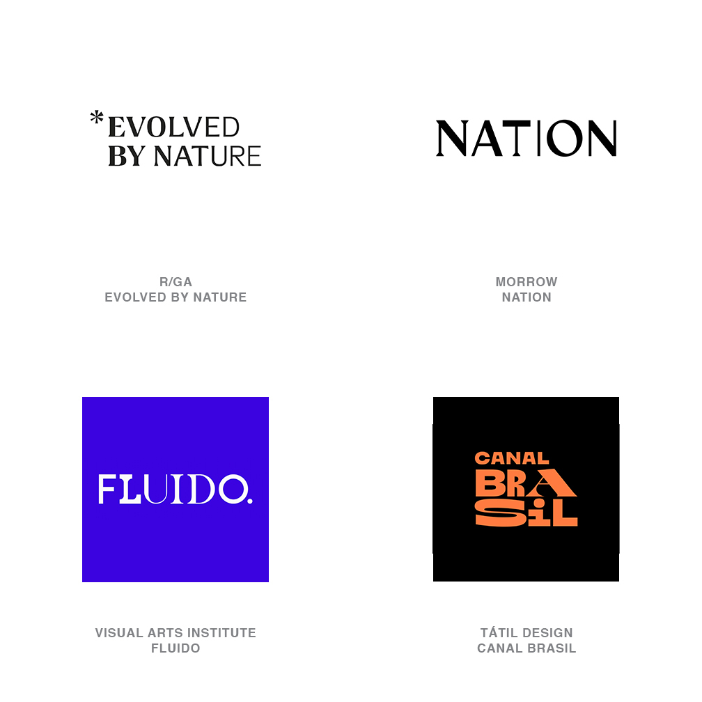
Image Courtesy of Logolounge
This is an extract from the 2022 Type Trends Lookbook, developed together with the educational team of Typecampus and including a series of 9 interviews with renowned designers and type experts who discuss the present and future of type design and the visual industry.
READ MORE
this blog post is typeset in
Coco sharp font family
Click here to find out more
Coco sharp font family
Click here to find out more