


Available Formats:
Truetype, Opentype, Woff, Woff2
A TYPOGRAPHIC REVERSE CONTRAST EXTRAVAGANZA BY ALDO NOVARESE
A TYPEFACE FOR
DESIGN HOOLIGANS
Stadio Now is the revival of a original design by Aldo Novarese for dry transfer brand R41, published in 1974. The original typeface, is an extra bold grotesque sans serif that is notable for its reverse contrast, with the horizontal lines being thicker than the vertical. This style, historically called “Italian”, result in a dramatic effect, in which the letters look slightly odd. In his never-ending quest for interesting letterforms, Novarese was intrigued by this style and created some successful and interesting variations on the idea, from the calligraphic slab Estro to the sci-fi Sintex.
In his book Il Segno Alfabetico Novarese described Stadio as a “decorative display typeface, in the so-called nineteenth century ‘Italian’ style, but sans serif. Horizontal proportions have been visibly enlarged, offering a very intriguing graphic effect”. Published in 2021 with a prerelease version offered in occasion of Novarese’s 100th birth anniversary, Stadio Now expands the original design into a multi-weight versatile family, with text and display variants and a variable version to fully explore its reverse contrast design space.
In autumn 2021 the family was expanded with the inclusion of Stadio Deva, a devanagari version of the typeface in five weights, available exclusively on Canva.com.
Stadio Now Variable
VARIABLE FONTS ARE ONLY AVAILABLE WITH THE FULL FAMILY PACKAGE, MAY NOT WORK WITH ALL THE SOFTWARE
Our exploration of Aldo Novarese’s design space began in 2019, with a visit to Archivio Tipografico in Turin, where we could get a copy of his out of print book Il Segno Alfabetico. On the pages of this complete archive of Novarese's typographic work, that provided specimens of his most famous typefaces while also featuring some more obscure and unpublished ones, we discovered Stadio, that Novarese described as a “decorative display typeface, in the so-called nineteenth century ‘Italian’ style, but sans serif. Horizontal proportions have been visibly enlarged, offering a very intriguing graphic effect”.
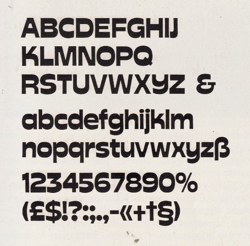
We were immediately hooked by Stadio's unique appearance and personality. Its name literally means "football stadium" and one can easily see the connection between its sturdy shapes and sports. While the reverse contrast and the extrabold weight gives letters a powerful energy, the unusual curved shapes of Y and K, the playful shapes of C,G and S, and the slight tapering of all stems give Stadio a unique dynamic feeling.

Stadio was fascinating for us also because, like many other typefaces presented by Novarese in the book, it seemed not to have ever been digitalised. There was no trace online of a Stadio typeface: our only chance was to search for information on the listed publisher Reber . A Google search quickly gave us the answer...
Aldo Novarese
After learning woodcutting, copper engraving, and lithography at the Scuola Arteri Stampatori in Turin, Novarese worked as a draftsman at the Nebiolo type foundry. He became art director there in 1952. He taught at the Scuola Vigliardi Paravia for ten years beginning in 1948. By 1977, foundry type had become largely obsolete, and Novarese left Nebiolo to become a freelance designer.
Novarese designed a wide range of typefaces. His most famous design is probably Eurostile, a geometric sans-serif design. It utilized shapes based on subtly curved rectangles with rounded corners, reflecting the modern designs that were gaining popularity at the time, influenced by the subtly curved shape of a cathode ray tube screen or airplane windows. It became very popular as a typeface that evokes technology (it can be seen on the speedometers on many cars and vehicles, particularly older models). This was an expansion and development of the earlier design Microgramma typeface (designed in a project led by Alessandro Butti), an all-caps design. (Wikipedia)
Loading...


