Type Trends 2020
At Zetafonts, we know that researching creative trends is a fundamental part of the design process for visual artists.
Every year we study the global trends inadvertising, lettering, editorial and packaging design, trying to understand and define the most common choices in typography, type design and font selection. It is a process that allows us to refine and adjust our taste to a global sensibility, making it possible to create typefaces that look contemporary and fresh on the page and on the screen.
This year we have distilled this research in a 140-page book: the Zetafonts Type Trends Look Book 2020. Its printed version has been sent to selected clients and friends, and such was the enthusiasm of the feedback that we decided to make it available to everyone in its digital form.
The Zetafonts Type Trends Look Book 2020 is not only a detailed and useful explanation of the main tendencies in typography but also a collection of our best work to show examples of use and inspire the readers with colour palettes, layout suggestions and sample applications to different fields, and showing type at work in bridging cultural values and commercial effectiveness. Divided into four purposeful sections, our Type Trends Look Book is here to help designers choose the fonts they need for their projects.
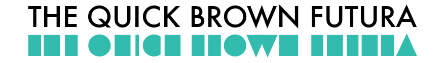
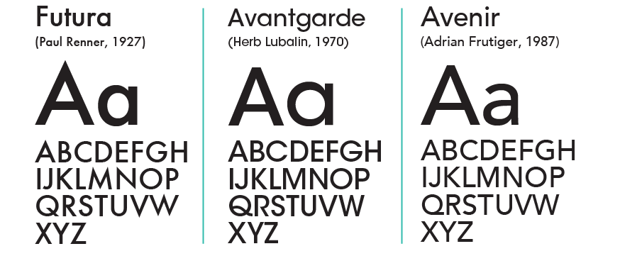
There is no doubt that mobile technology-inspired minimalist design is the undisputed dominant trend in branding and typography. It follows a rationalist approach based on structured layouts, white space usage and great attention to readability. Geometric sans serif typefaces answer all this needs offering a minimal yet powerful tool for designers, with Futura and its countless alternatives offering a contemporary vibe with just the right amount of connection to the past ideals of modernism (believe it or not, Futura is as old as your granma!).
To contrast the dominant minimalist trend with its comforting but uniform standards, a new wave of brutalist design is emerging, mixing modernist rigour with a glitchy, postmodern aestethic. Where minimalist sans serif typefaces show monolinear shapes and a very even contrast, the shapes of brutalist typefaces all push the contrast to the extreme. Also, brutal typefaces adopt and mimic the weird inconsistences of pre-digital lead types: wedge serifs, reverse contrasts, extreme inktraps and quirky design choices.
The ever-growing need for a warm, human touch in design artifacts is answered by soft, hand-drawn lettering and nostalgic, pop-culture influenced typography. Vintage and retro design solutions continue to be re-appropriated and remixed, evoking the near past with its unbroken promises. Typefaces with just a hint of the thirties, scripts coming out of post-war advertising and flamboyant serifs that quote seventies lettering. All subtly use our longing for the past and our love of pop-culture nostalgia to strike our inner chords… and sell the design!
Finally, new technologies like variable and colour fonts have made typography more customizable and personal than ever. Creating and modifying typefaces is today not only cool but also much easier than in the past, with brands choosing custom typography as a way to reinforce their visual identity and to set a recognisable and distinctive tone of voice.
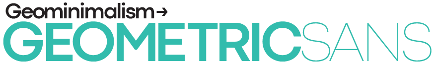
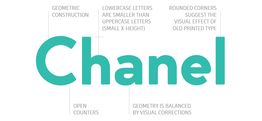
Simple sans-serif typefaces with circular proportions have been a huge favorite of designers over the last few years, gracing countless logo redesigns with their simple yet powerful shapes. Just check out the best seller list on myfont.com and look for typefaces with geometrical construction, monolinear weight and straight angles!
Why does everybody love these geometric letters?
The answer is simple: the neutral, versatile shapes of the modernist geometric sans typefaces are extremely easy to work with. They are not visually demanding, they look timeless, and – while maybe a little overused – they manage to deliver their message clearly, adding a form of simple elegance. With brands like Google and Apple following the minimalist credo “less is more”, these Futura-inspired letter shapes are now the first option for any visual designer aiming to create meaningful and striking brand identities and solid visual artifacts.
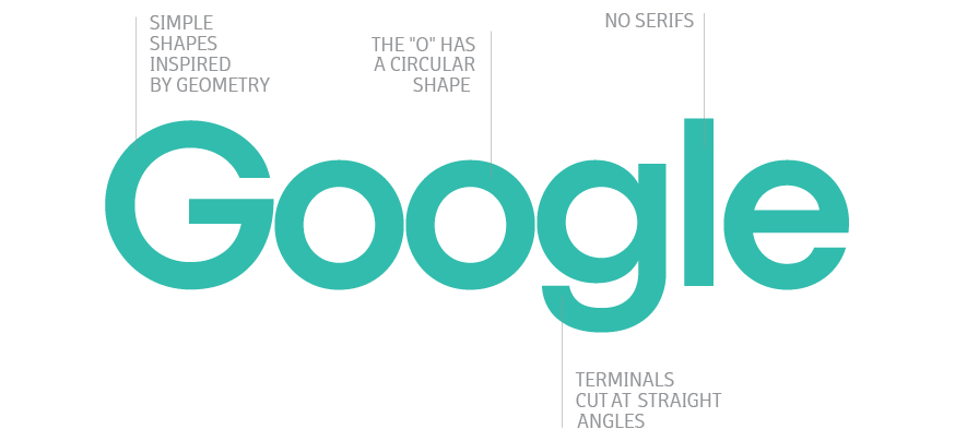
Geometric sans excel in logos and titles, allowing easy and effective weight and width variation thanks to their basic design. They are perfect for branding, especially when you need their timeless elegant vibe to design a logo for technology, fashion, apps or services. Their neutral, idealized shapes, spot-on for architecture, art and design, is not the most readable in body text: you may want to avoid geometric sans typefaces when settings long texts.
Also, their basic design is so uniform that you must learn to discover and appreciate the little details that make a geometric sans different from the bunch. Look out for signature letters (uppercase Q, R and G, lowercase a and g) to spot the main difference and fine-tune your design appearance.

The contrast between thin and thick strokes in a letter – as well as the balanced interplay between soft curves and sharp angles – has always been a way for type designers to create tension and subtle dynamism in letterforms.
A good example of this elegant use of contrast is visible in Bodoni alphabets, cut by the eponymous Italian typographer in the 18th century, and used today to grace the logos of the biggest brands in the fashion industry.
To add some spice, make the serifs triangular and spiky, taking inspiration from victorian typography and seventies lettering to create a style that trends guru Typewolf defined as “evil serif”.
There you are: contemporary elegance is served!
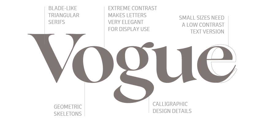
In a panorama dominated by neutral sans-serif typefaces, these bold serif alternatives can give titles and logos a strong, sculptural energy, perfect for magazine logos, blog titles and luxury products.
You can also use evil serif typefaces in advertising for strong and catchy headings, and on the web for maximum wow effect. But only for big texts: the thin lines of high-contrast typefaces are as elegant as difficult to read in small sizes, and require the usage of a low contrast “text version” often available in the most complete font families.
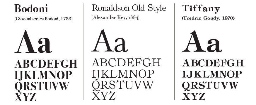
The first sans serif typefaces were developed at the end of 18th century. At the time they looked strange and unusual, hence the name ‘grotesques‘ (or ‘grotesk’ and sometimes ‘gothic’). They had a simple geometric design with even stroke weights and they were usually slightly bolder and far less polished than contemporary counterparts, the so-called Neo-Grotesques (like Helvetica). It’s easy to associate their crude appearance with old shop signage and vintage packaging: using these typefaces can therefore add a warm hint of history and craftsmanship to any design, while still keeping a contemporary, minimalist vibe thanks to their geometric construction.
Today, redesigns of such typefaces usually include hand-signage features, such as decorations, ligatures and alternates, and ways to simulate old printing techniques like letterpress. Their correct usage can easily transform a simple set of vintage-looking letters into a powerful tool for designing striking wordmarks or eye- catching headlines.
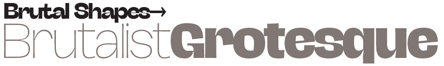
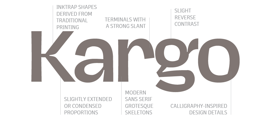
Call it bold, unapologetic, experimental or just ugly: but brutalist graphic design is here to stay. Not anymore confined to cutting-edge art magazines, this trend based on a stripped- down minimalism that borders lazyness, mixing modernist abstraction with bold gestural noise, it’s at the same time intriguing and shocking for its lack of polish and conformity.
Monochrome design, intentional overlaps, lack of hierarchy and a predilection for typography over imagery are fittingly married with the usage of typefaces that look practical but slightly “off”: here comes a resurgence of sans serif typefaces that take inspiration from the design quirks and mistakes of vintage pre-digital grotesque grotesques and 19th century wood type:
Brutalist typedesign is similar in approach to postmodern typography of the nineties as it looks for inspiration in past eccentricities, appropriating and remixing historical design details. Uneven, slanted cuts, slightly-off width proportions of letters, traditional printing devices like ink-traps or slight design errors like a lack of optical correction creating an effect of reverse contrast, as well as the occasional appearance of calligraphic, unexpected solutions – all mix up to make brutalist type look alive and proudly ‘un-digital’ .
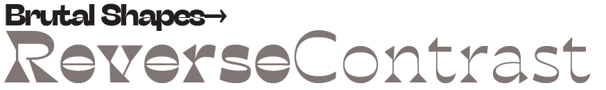
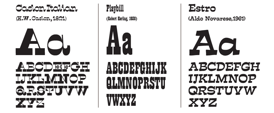
The advent of the printed commercial poster at the end of the 18th century fueled the development of new eye-catching typefaces: fat display types, slab serifs, and the so-called “Italian” reverse contrast types. In these weird typefaces the usual distribution of weights was literally reversed, with horizontal strokes being thicker than vertical ones. The resulting shapes were if not correct by academic standards, at least striking for the viewers and became widely used, having their moment of glory with the reverse contrast Clarendons, made popular by theeatre playbills and, later, becoming ubiquitous in western movies.
Playfully freakish, reverse contrast typefaces still manage to grab the attention of the viewer in display use and, when designed with subtlety, can also work well at text sizes. Like the other typefaces in the “brutal shapes” category, they combine an excessive, aggressive look with a weird feeling of familiarity, and manage to subvert the canons of beauty with an imposing personality. Try them in logo design and editorial projects any time you want to surprise the viewers and work with the feeling that the german call unheimlich: the psychological experience of something uncanny, mysterious and unsettling but strangely familiar.
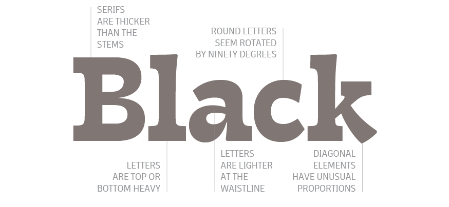
Blacker font family
Click here to find out more
[…] researching the typographic trends for our 2020 Type Trends Look Book , we noticed many sans serif typefaces taking inspiration from the design quirks and mistakes of […]